Contemporary home in clean lined geometric forms has great indoor outdoor flow
Open-plan, two-storey house by designer Darren O'Neil has long central corridor, a large outdoor room and pool

Some houses are built to catch the sun while others are designed to maximise their sites, and still others celebrate a sculptural beauty within. This home's well-considered design works well on all fronts both literally and metaphorically.
The owners asked architectural designer Darren O'Neil for a timeless, contemporary and functional family home. At the same time, it had to be energy efficient, private and offer exceptional indoor-outdoor living.
"This well-balanced home fulfils these goals, and more," says O'Neil. "Another request was that it work well with its surroundings and, to achieve this, its stacked form doesn't dominate the streetscape while the classic cedar cladding echoes the weatherboard on an adjacent villa."
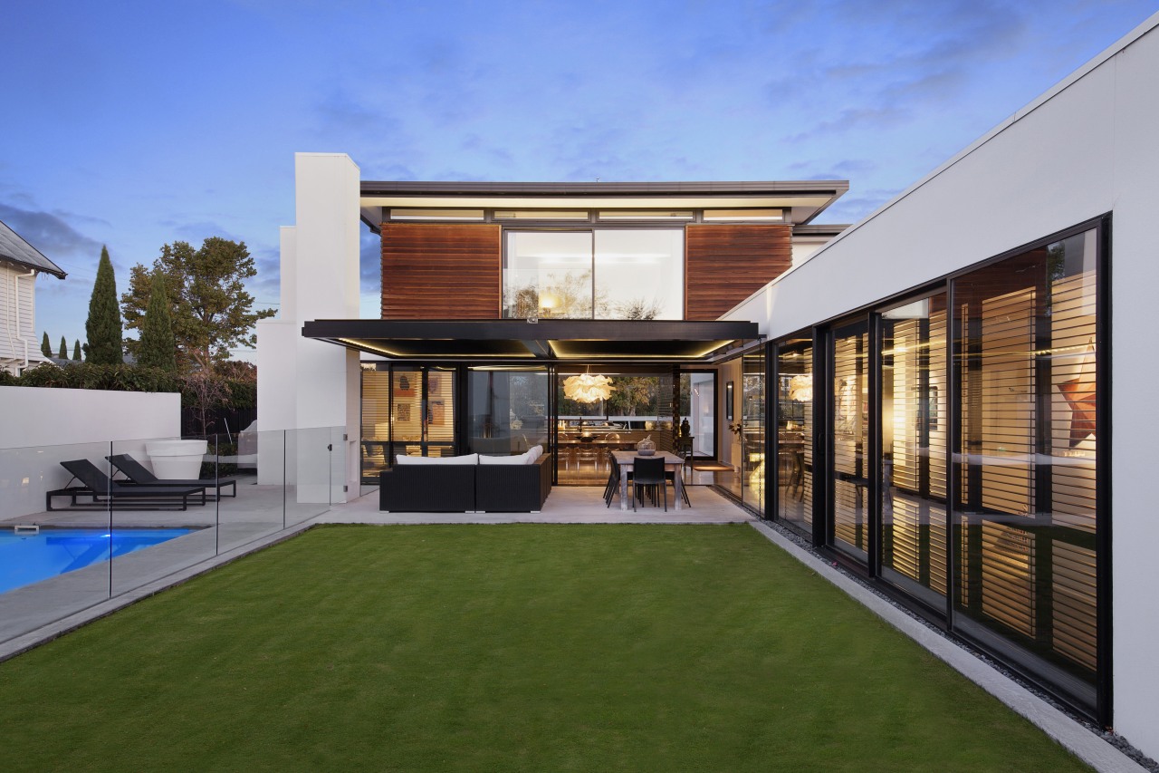
The plan follows an L shape with the base of the L facing the street. This facade has limited windows, ensuring privacy. However, on arrival at the glass front door, visitors enjoy a vista down a circulation corridor that runs the length of the home. Forming the long section of the L, this spine has public spaces positioned to the right and ground floor bedrooms to the left.
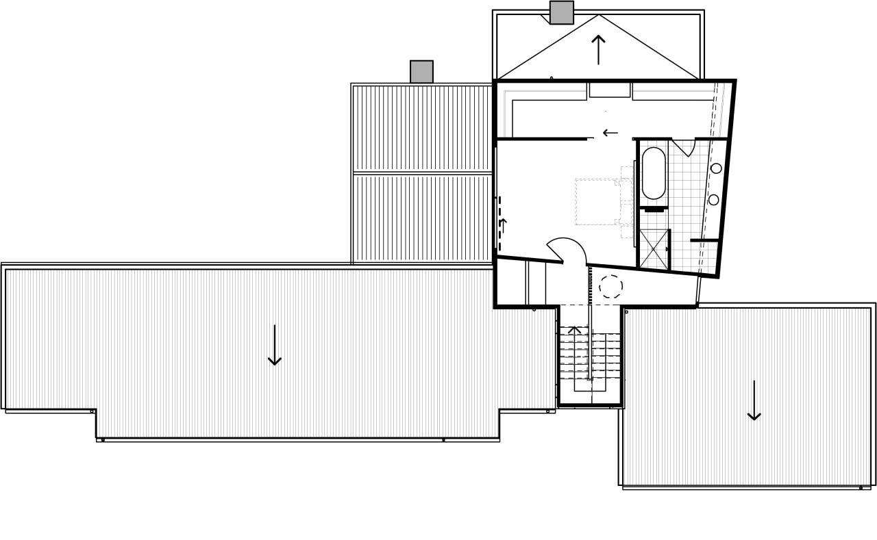
The second level, containing the master suite, looks at first glance like a regular square rising above. However, two walls are set off the 90 degrees, creating interesting angles and visual interest from both outside and inside.
It's not until walking through the home and looking back on it from the rear yard that the orderly composition of planes, boxes and strong vertical chimney elements is fully appreciated.
"No expensive surfaces were used to create this home. Instead, clever design execution and simple material selection were paramount."
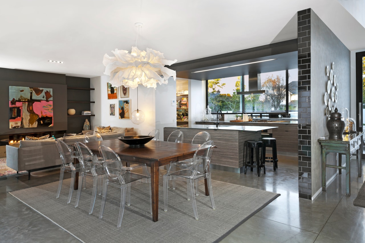
And simple the home's materials are. Most flooring is concrete, with a commercial applied sealant, and most walls are white, with the odd accent wall, such as the one to the right of the entry. The other predominant material is glass.
"In keeping with the contemporary look required, we avoided any kind of architectural detailing on the interior except for a modest skirting," says O'Neil. "The geometric forms bring plenty of visual interest on their own."
Overall, the interiors are bathed in natural light yet feel atmospheric and moody with the inclusion of prominent black shutters and soft sheer drapes. The palette is neutral with striking contrasts of deep inky references such as the black tile feature wall in the kitchen.
At the functional heart of the large home, the generous indoor living areas flow out to the covered outdoor living spaces that are nearly half the size again. With sliding doors drawn back and a flat level between indoors and out, the transition is seamless. In addition, the al fresco living and dining area has an outdoor fire and is protected from the elements by operable louvres, ensuring these spaces can be enjoyed all year round.
The open structure of the home makes the most of the site, and the two outer walls of the rear yard are finished in the same white plaster as sections of the house. This gives the sense that the house actually surrounds the outdoor living and pool area much like a courtyard house. In fact the rear wall is built in from the boundary with the modest space behind concealing pool toys and plant keeping everything tidy.

The house is well set up for family life, too. The upstairs master suite obviously has a sense of removal and there is also a second living room or family room on the opposite side of the corridor to the main public living spaces.
Energy efficiency was another requirement and this was tackled by O'Neil in several ways.
"The house affords excellent passive heating and cooling, with deep overhangs in strategic places, and the central corridor acting like a heat sink. In winter, the blinds on the western side of the corridor are raised, allowing the sun to heat the polished concrete with that heat then emanating back into the home at night."
In addition, the concrete floors have hydronic in-floor heating, which is powered efficiently and economically by a diesel generator.
Everything is low maintenance in the home, with only a minimal amount of cleaning and gardening required much like an apartment.
Credit list
Architectural designer, kitchen designer
Cladding
Wallcoverings
Kitchen cabinets
Splashback
Waste unit
Accessories
Lighting
Furniture
Builder
Roof
Floor
Paints
Taps
Blinds and drapes
Shower stall
Hot water systems
Tiles
Heating
Pool
Story by: Charles Moxham
Photography by: Jamie Armstrong
Home kitchen bathroom commercial design
Home Trends Vol. 33/1
No matter what the size of your new bathroom – a small powder room or an expansive master suite – you'll want it to be b...
Read More


