Part renovated, part brand new, this home features a central lounge that opens up to both the front and rear yards
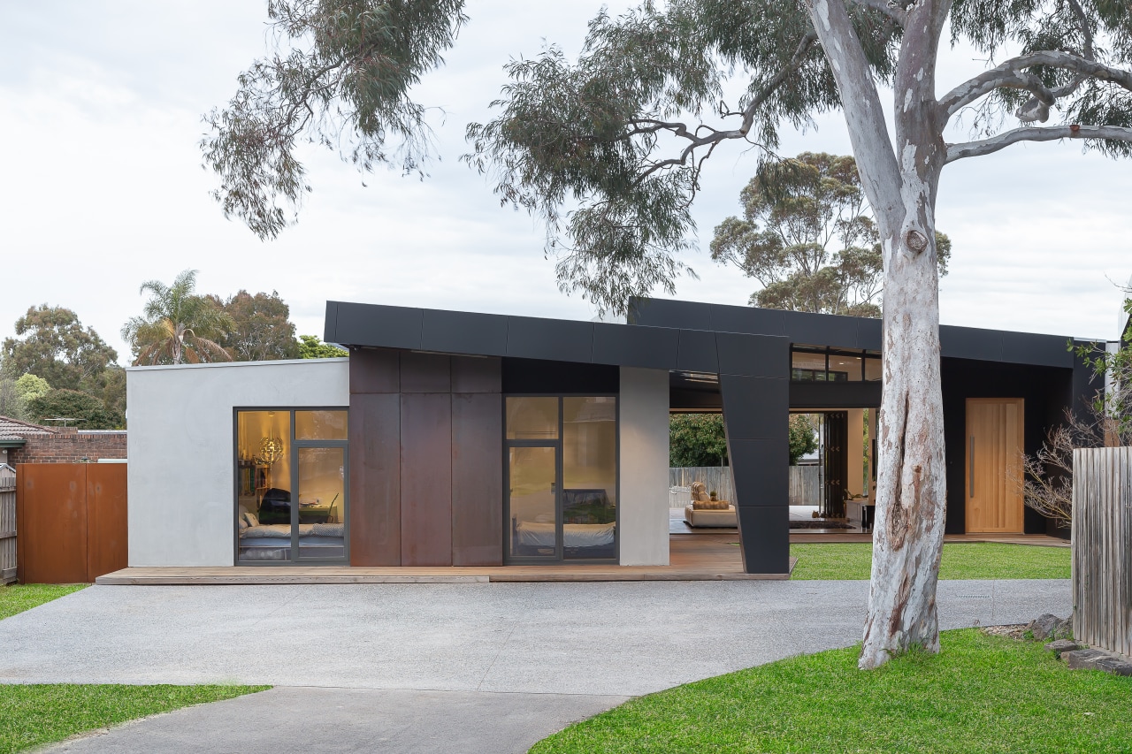
This architectural home with its over-aching roof forms and see-through heart is the result of a comprehensive renovation and extension – hard to believe the residence had its origins in the 1970s


The greenest house is one that’s already built is a saying that is appropriate for this comprehensive renovation by architect Taras Wolf. However, utilising the good bones of the home was only half the story.
“The owners’ existing 1970s-built home had become too small for their growing family despite it already having had some renovations along the way, including to the existing kitchen. Plus they needed a home office,” says Wolf.
“it was decided to renovate rather than start anew – so utilising the earlier work. Our full renovation started small but grew and grew as more ambitious ideas emerged – the budget was fairly open.”
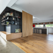
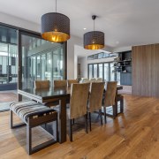
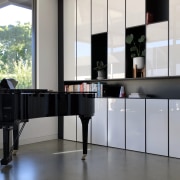
The final renovation meant tweaking and improving the existing bedrooms, kitchen and dining area on the left hand side of the home, and transforming the master suite on the right hand side. Plus a new living room with connected piano room takes centre stage, and a large brand new wing was added front right for the studio and garage.

Looking at the plans for the stretched central living volume, and given the large front and back yards, architect and owners decided to give the home a see-through quality by having large bifold doors at the front and rear of the living room space.
“The family had also found the 2.4m ceilings too low in the existing part of the home, so we wanted high ceilings in the rebuilt lounge and master suite area and for the studio/garage wing,” says Wolf.
However, a tricky aspect of the new design was how we treated the roof on the existing home and on the new wing. Often an addition is tucked away to the rear and quite modest. Here, the wing extension is seen right from the front path, so it required close thinking as to how to assimilate the new into the existing.
Plus the retained part of the existing home had an awkward Pizza Hut-look roof.
An over-arching pitch roof proved to be the solution to marry the old and new. This arrangement has one roof wrapped over the top of the other – a little like the Sydney Opera House.
“In our firm, there’s a saying we use often – Intelligent Design Management. This means that no matter how striking or singular an element, it has to perform more than one key function.”

The new angled roof line – seen on the existing and new parts of the home, and on the studio/garage – blurs the line between old and new. This is in terms of both style and scale – the size of the new studio-garage wing being as substantial as the house itself. In addition, the tapered columns that appear as extensions of the roof forms double as pedestrian arches, which lead through to the new front door, set deeper into the reworked footprint.
In fact, there are two paths to the front door – to the left or right of the square of lawn – and columns on the corners of the two buildings indicate these options.
Another important consideration was the sequence for construction.
“The garage and studio were built first to allow the owners to live on-site while the following stages of construction proceeded,” says Wolf.
“With the studio built, the open-plan living spaces were created, serving as a connective tissue between the existing building and new studio space.”
Lastly, the traditional brick veneer was updated to reflect the modern addition.
“While the final result is almost like a new house, I’m not sure that the result would have been better if we were given a brief to build a brand new house from the outset,” says the architect. “No doubt the design would have been somewhat different, but often having constraints and things to overcome actually makes for more interesting design.”
Credit list
Architect, kitchen designer, interior designer and landscape designer
Cladding
Windows and doors
Main flooring
Paint
Heating
Furniture
Benchtops
Splashback
Taps
Kitchen sink
Floors and walls
Awards
Builder
Roof
Kitchen manufacturer
Tiles
Ventilation
Security
Kitchen cabinetry
Kitchen walls
Kitchen sink
Oven, cooktop, refrigeration, dishwasher
Waste disposal
Hot water systems
Toilet
Story by: Charles Moxham
Photography by: Sophie Tomaras
Home kitchen bathroom commercial design
Best of both worlds
At home in the country
Eclectic meets elan
Home Trends Vol. 36/1
While a bathroom may no longer be regarded as 'the smallest room' in a home, the extra space now allocated to it doesn't...
Read More