Surf's up
This house links to its beach community, due to an open layout and a nautical theme
Some towns or neighbourhoods have a definite atmosphere. It is not uncommon to hear people describing places as rough, easy-going, or even pretentious. Attitudes about an area can come from the people who live there, its history or sometimes the weather.
The atmosphere where this house is located is both casual and relaxed perhaps because of the generations of surfers who have lived here, or it may be an outcome of the culture that surrounds beaches in general. Either way, this easy-going attitude can be seen reflected in the architecture.
This house, designed by Dion McCarthy and Mark Kirkhart of DesignArc, is no exception. As it fronts a popular promenade, the architects used the relaxed community feeling of the area as a design theme for the home, says McCarthy.
"The street is always busy with walkers, skaters, and children. The lower floor of the house can be seen as an extension of this. A large rumpus room opens onto a patio, level with the street."
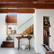
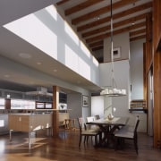
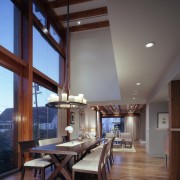
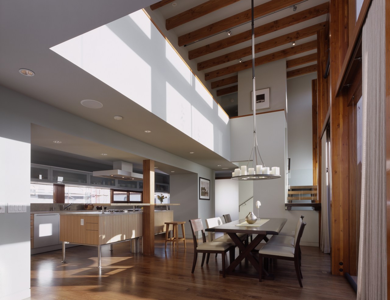
If the lower floor relates to the activity outdoors, then the central floor relates to the sea view. Double-height ceilings are provided in an open-plan living space, with large timber beams bringing to mind a nautical aesthetic, says Kirkhart.
"The kitchen, dining and family rooms are combined, resulting in a casual, open area made more open by the narrowness and height of the space. It has the vertical quality of a sail," he says.
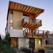
Along with the thick exposed beams seen in many rooms, the sloping roof of the house also adds to the nautical theme, appearing from outside to be much like an inverted sail.
This has allowed for a double-height ceiling in the living room at one side, and a level of privacy on the other side of the house, which faces the neighbourhood.
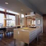
"The galley-style kitchen on the central floor runs along one wall of the open-plan living area. A long horizontal window is the same length as the benchtop, around 10m long," McCarthy says. "This takes the visual mass out of the kitchen benchtop, as the eye is drawn beyond it."
While the island is central to the room, the architects did not want it to appear imposing. They chose an island with legs, to achieve the look of a piece of furniture, making it seem more integrated into the space.
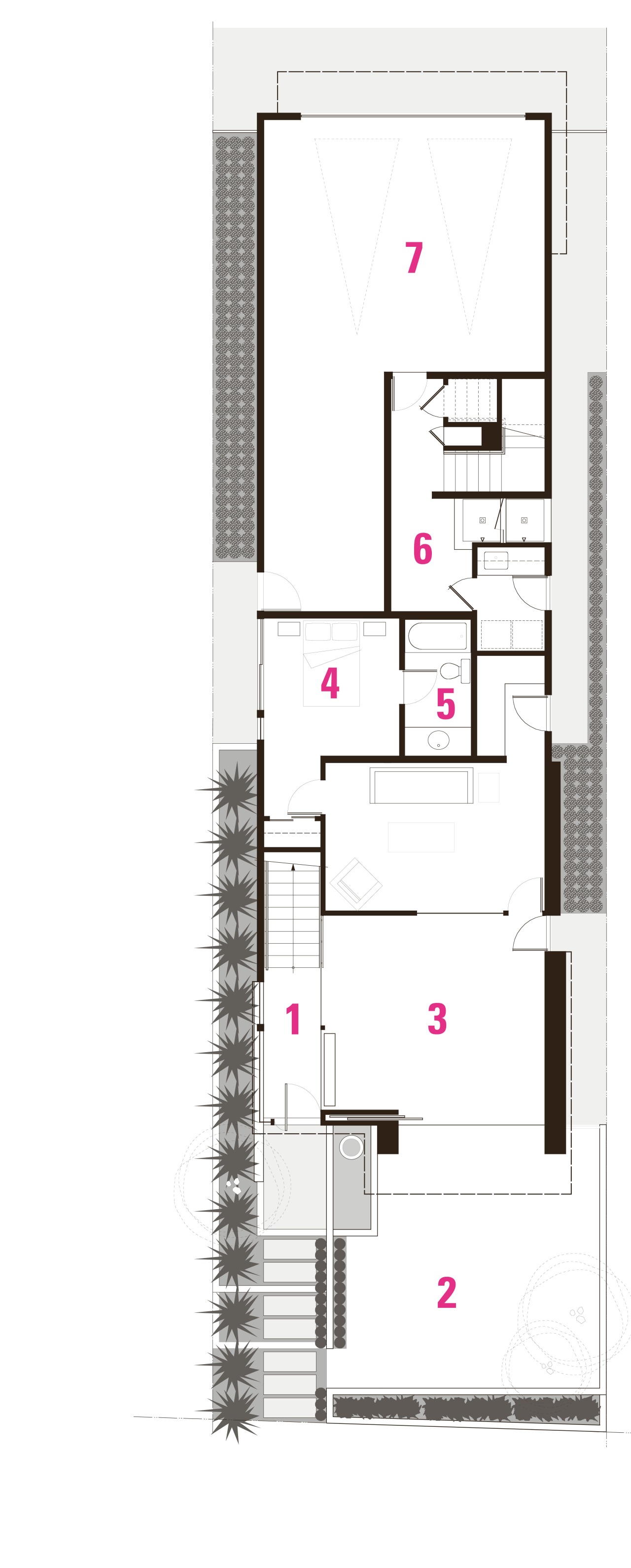
"The layout of each floor is in what we call a barbell design, with an open space in the middle and two separable areas at either end. On the central level, a den is located beyond the dining table. Cavity sliders enable this area to be closed off from the dining and kitchen," says McCarthy.
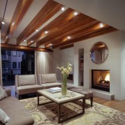
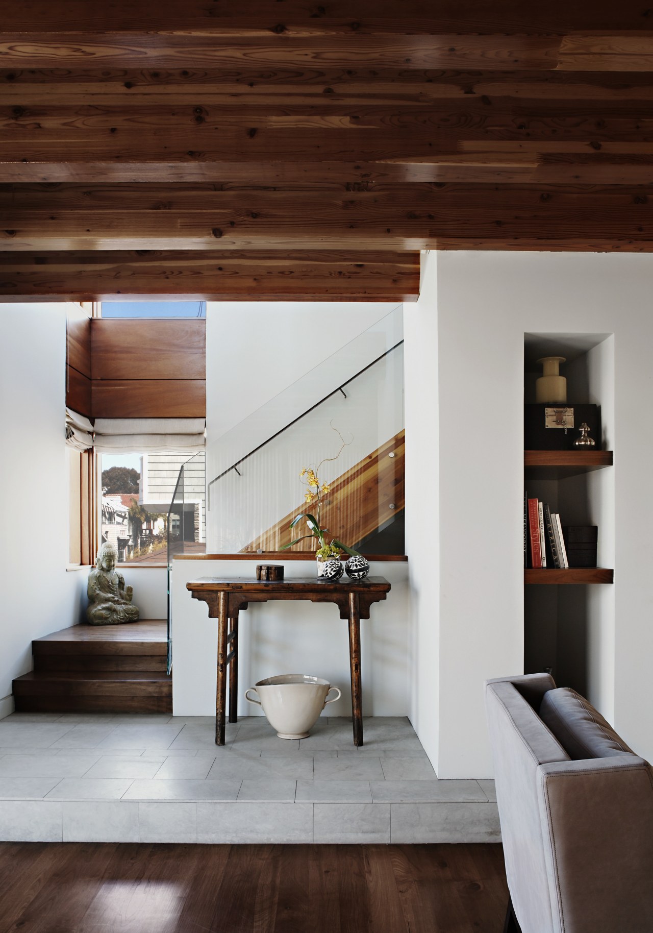
The living room at the opposite end opens onto a deck that overlooks the promenade. A circular mirror in this room relates to the idea of a porthole. Beneath the mirror, the limestone hearth continues along the wall and becomes part of the landing for the stairs which begin at the front door and go up to the master bedroom above.
"It is a fire safety requirement in this area to have a second staircase in a three-storey home, but we chose to make this an intimate element. The homeowners can go straight to their bedroom from the front door without moving through the rest of the house," says Kirkhart.
As an extension of the idea of the central floor as a sail, the upper floor can be seen as a crow's nest, says McCarthy.
"In contrast to the two lower floors, which are closely connected to neighbourhood activity, the master bedroom opens onto a small deck and looks over the rooftops. There is a sense of separation."
The master bathroom design is a testament to the casual, community feel of the area. A mirror the same size and shape as the window opposite reflects the view across the neighbourhood. When inside, there is a sense of being encompassed by an easy-going, beachside community.
Credit list
Kitchen designer
Structural engineer
Roof
Flooring
Lighting
Kitchen cabinets
Sink
Cooktop
Bathtub
Tiles
Builder
Cladding
Paints
Heating
Benchtop and splashback
Oven and dishwasher
Refrigerator and freezer
Vanity
Hot water system
Story by: Camille Butler
Home kitchen bathroom commercial design
