Nothing is black and white
This coastal family home's largely black and white interior is the result of tweaked original plans – having the owner as builder keeps things personal
Interior design by Kate Gardham, Suede + Stone
From the interior designer:
On a clifftop in Auckland’s Whangaparoa region of Stanmore Bay this new build sits with unobstructed ocean vistas.
As well as optimising the spectacular views, the modern home also needed to reflect the owners' personal style.
One of the owners is also the builder, so naturally was emotionally invested.
The owners, a young family, loved the colour black and this was the pivotal point for the interiors of this project.
Changes to the original plan
I felt the original design proposed lacked a flow and functionally that was crucial to everyday living for this family of four.
This included having a powder room close to the main living spaces for the family or guests to use and to achieve this we repositioned it to space allocated for storage cupboards.
Kitchen
Importantly, we also changed the L-shaped kitchen to a galley style kitchen, creating the best flow along with enabling straight-on drawers access straight on.
This design also made it easier to define the cooking and cleaning zones.
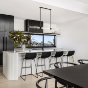
The reconsidered layout also allowed us to create a longer island and accentuate the modern approach of the kitchen, while reinforcing a solid form – reflective of the overall feel of the architecture.
A honed marble stone runs the length of the back wall, housing the cooking zone and accompanied with ample drawer storage.
On the opposite side, the preparation and washing zones are set off by the curved reeded bar back and marble benchtop.
In the main kitchen, the fridge and Blum space tower (for fresh and dry food storage) have all been integrated behind cabinetry doors.
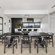
The doors are in a vertical crown cut American white oak stained in a custom darker tone to give contrast to the white island and blonde timber floors.
To provide a depth of form, the island and rangehood have been wrapped in a curved reeded profile – creating texture in the generally monochromatic kitchen.
A separate scullery sits to the left of the main kitchen and provides the luxury of separating food preparation from the main space when entertaining.
It is equipped with a second sink and dishwasher & ample storage for the avid cook and entertainer.
The kitchen and scullery have picture windows that we reconfigured to bench height – maximising natural light and views.
Connections
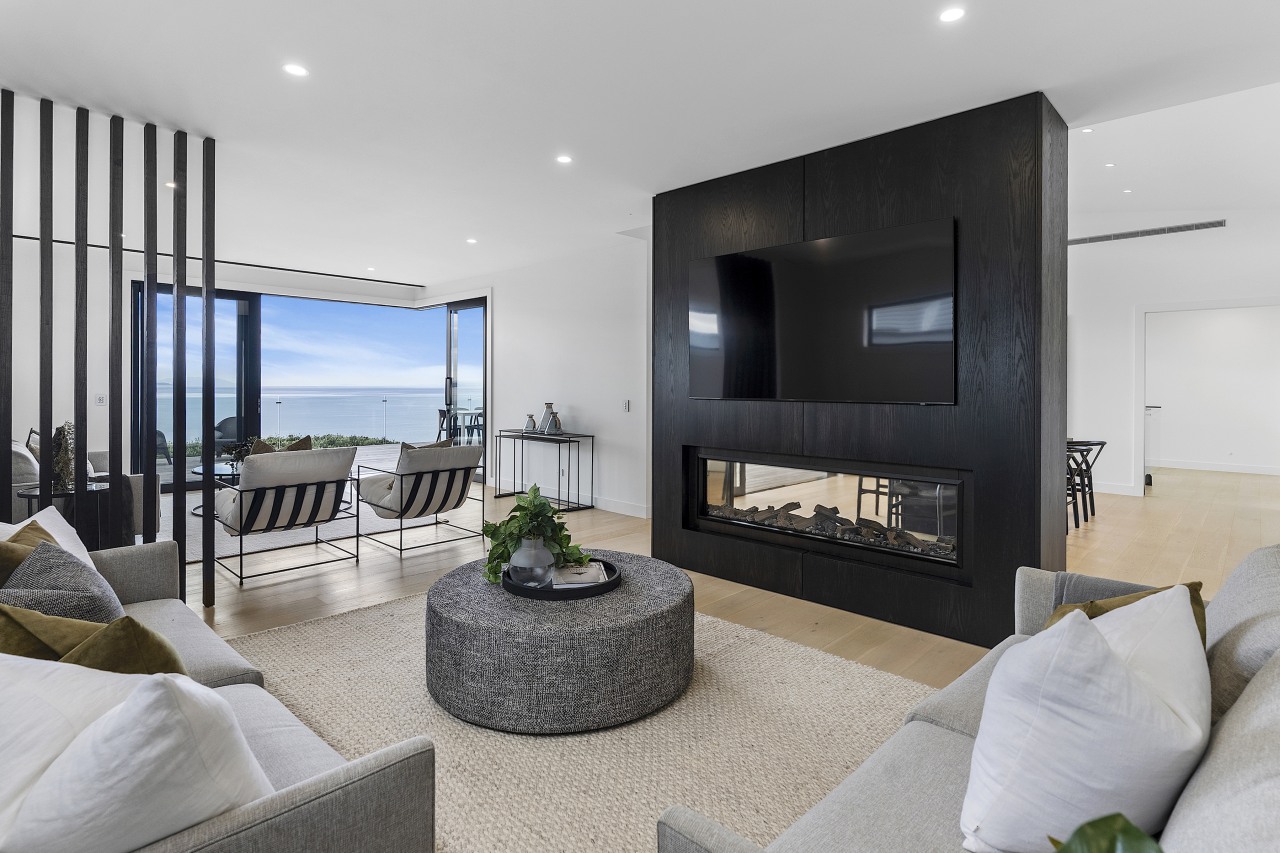
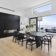
Further attention to detail can be seen in the two-way fireplace wall that has been wrapped in the same American timber veneer, adding texture and defining the dining area from the adjoining lounge spaces.
While playing on the theme of layers, the reeded detailing was carried through from the kitchen into the bathroom vanities.
These vanities have been designed as ‘pieces’ of bespoke furniture, with ample storage below.
The kit-kat tiles used in the bathroom and laundry have a connection with the reeding profile seen in the kitchen.
For the master ensuite we went for a single tile for wall and floors and with special placement of accent lights, which created lovely moody pockets of light.
Lounges
The focal point of this home was the sea views and the joinery had been set at a standard 2m height, potentially cutting off the connection to the views.
This was increased to the maximum height that the beam structure allowed for in the design while an additional window was set above the doors/beam in the dining room to give a sense of space where the ceilings soared to their highest point.
The corner wall was removed and the stacker doors were increased so that main lounge could open up at the corner point (doors opened up both sides).
This gave a lovely openness and flow from inside to outside and allowed uninterrupted views when sitting in both lounges.
There was a solid wall between the two formal and informal lounges, which I felt was a wasted opportunity for the family not to be able to take in the sea views while cosied around the fireplace.
We replaced this with a much smaller side wall, that was now to be a timber fin wall where the light and view could still be seen and filter through – resulting in a more subtle division between the two lounge spaces.
Master wing
I also reconfigured the master wing – the master bedroom now allows for a king size bed, which was much needed when the children come into the master for snuggles in the morning.
It also meant we could create a feature wall in vertical board behind the master bed.
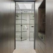
We removed the wall in the wardrobe to allow access into the ensuite that now boasts a Jack and Jill shower.
There is now timber framed opaque glass doors that recess and pocket into the wardrobe to close off when using the ensuite.
A small window in the shower was removed and replaced with a skylight above that floods lots of natural light into the ensuite and adjoining wardrobe.
Other elements
We also incorporated the toilet into the main bathroom with a new layout that allowed for a longer vanity and repositioned the wardrobe and linen closet.
The reeding profile was carried through into the timber frame and reeded glass doors for the scullery and main living area.
The owners wanted the timber floors to be a blonde sandy colour to remind them of the sandy beach below and these were custom coloured to achieve the colour that they loved.
There was a collaborative approach between architect, designer and builder (Home owner) and their own cabinet maker they engaged for this project.
Communication was key
Communication was key to executing this interior design where we would normally manufacturer our own designs.
Credit list
Interior designer
Kitchen designer
Landscaping
Roof
Bedroom flooring
Bathroom tiles
Paint
Fireplace
Control systems
Dining table and chairs
Awards
Builder
Kitchen designer
Cladding
Louvre system
Flooring
Rugs
Wallcoverings
Heating
Lighting
Living area furniture
Other
Home kitchen bathroom commercial design
Small space, big impact
Classic dovetails contemporary
Tranquil waters
