Inspired infill
Cities aren't short of awkward spaces in tight commercial locations – in response, this apartment-like home by RAAarchitects makes most, with a room per level and a sculptural connecting stair
Designed by RAAarchitects
From the architects:
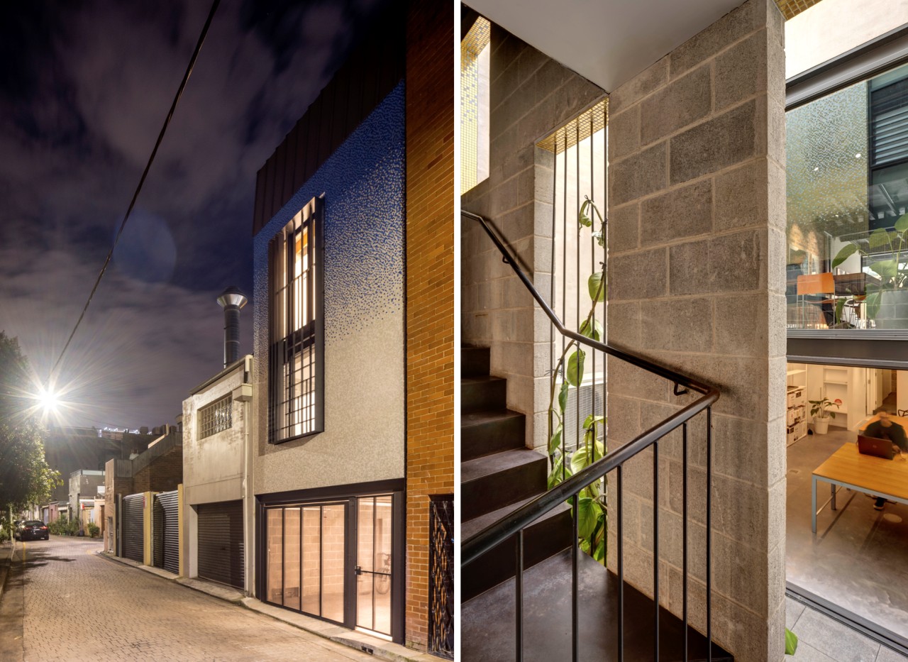
When we purchased this house in 2017 it was an unloved 1910s terrace over two storeys, surrounded by vacant shops and a grungy laneway at the rear.
It also had a large basement and car space, a 3:1 floor space ratio, a 12m height limit and mixed-use zoning.
To us, it oozed opportunity.
Size constraints
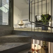
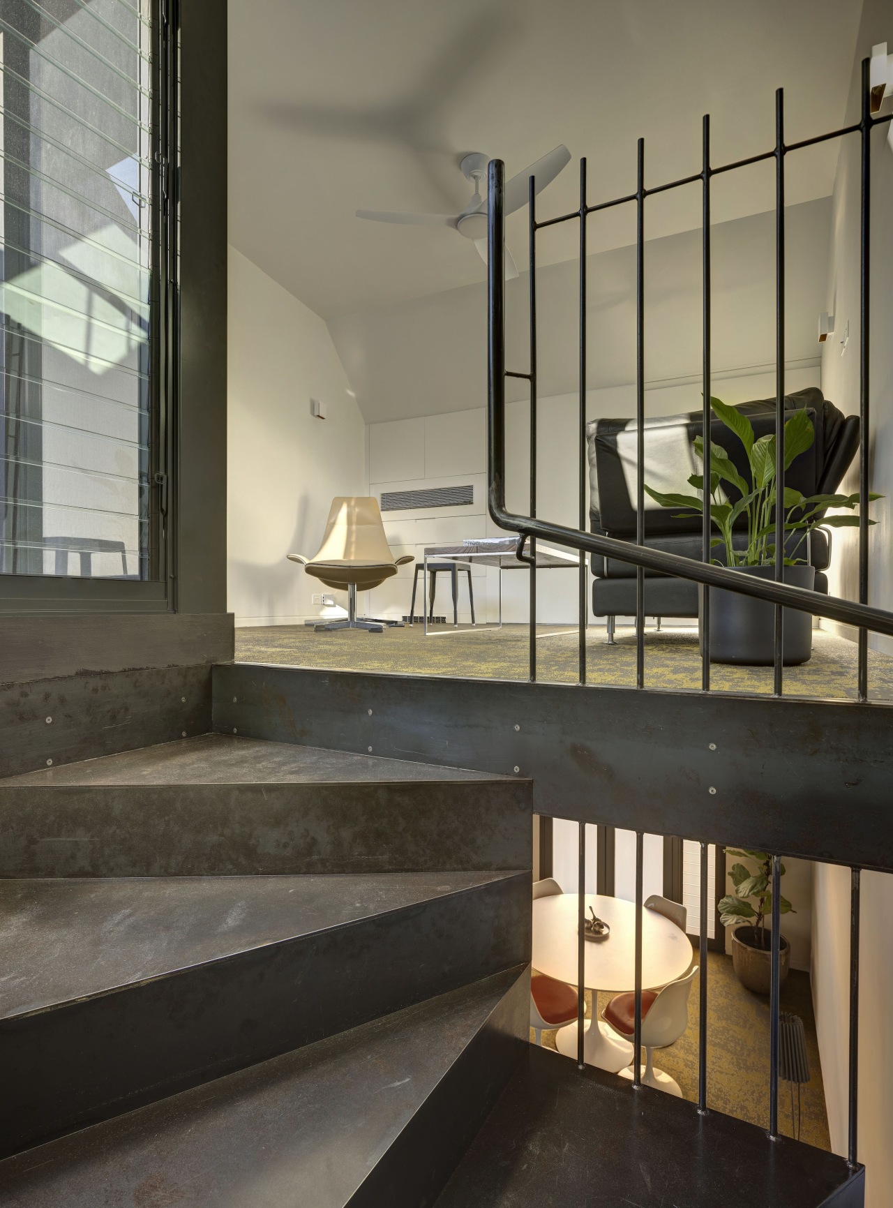
The tiny footprint (6.1 x 3.6m) and verticality of the dwelling (11m) meant a beautiful, efficient and above all compact stair was a central design element – forming the spine of the house; offering comfortable circulation in a minimum volume; and creating a focal point on each floor.
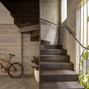
The mild steel treads, risers, vertical balustrade rods and handrails were laser-cut off-site and welded in-situ over several months before its natural rusted finish was sealed in.
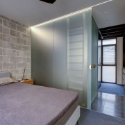
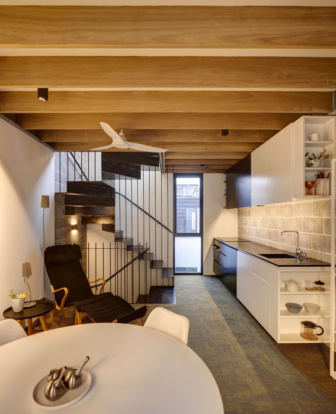
Light and ventilation increase with height – so the bedroom and facilities are at the lowest level, utilising glazed walls to maximise natural light; kitchen and dining are in the middle; and living room and balcony with city views over the adjacent rooftops is on the top floor.
Despite its small size, the house is a spacious dwelling – a feature supported by its clear separation of functions and its joyful, tactile materials.
In this dense and lively part of Darlinghurst, the entry sequence, from the street to the first level entry, generates both feelings of protection from and connection to its surroundings.
The house works like a vertical apartment, where each room is located on a separate storey.
The folded metal staircase is as much a sculptural object as circulation space (with perfect light for plants).
Each level has a different feel.
The bedroom level is inward-looking and private.
The kitchen level is sunnier with glimpses of view.
On the top level, the building opens up to the sky and the city.
Our intentions were to catalyse the (re)activation of the building across its two street frontages; to create a compact, sustainable dwelling, establishing a precedent for the area, and for other underutilised inner-city commercial terraces.
The gold tiles, visible through the open-plan commercial ground floor, highlight the building to viewers on Oxford Street.
The blue mosaic facing Sturt Street echoes the building’s past – the basement excavation revealed two large blue-tiled spa baths that were part of an iconic gay sauna, ‘253 Baths’, which operated on the premises in the late 1970s and early 1980s.
Due to the small footprint, service areas were combined to minimise circulation and in return, maximise space for the living areas.
The joinery located on the first-floor eastern wall continues from the bar through to the bedroom area.
In the circulation space, the joinery is black to match the steel stairs and in the non-circulation space the joinery is white creating a delineation between the two spaces.
Credit list
Kitchen designer
Interior designer
Cladding
Bathroom tiles
General heating
Living area furniture
Other
Builder
Kitchen manufacturer
Landscape design/install
Roof
Flooring
Paint
Feature lighting
Dining table
Awards
Home kitchen bathroom commercial design
