Ensuite and dressing area get new look and functionality that won’t date over time
A soft, watery palette, graceful curves and great space planning creates a peaceful, easy feeling for this harbourside master ensuite renovation


Located in a harbourside setting, the 1990s residence with this bathroom needed updating. The master suite was generous, but floor space was poorly utilised with many transitions, a dark walk-in robe, and awkward bay window.
The homeowners, a professional couple with two young children, wanted to transform the existing suite into a private sanctuary, says designer Darren Genner who along with designer Simona Castagna reinvented the space.
“Essentially, we wanted to create a warm, fresh, inviting space, with a sense of calm that wouldn’t date over time,” says Genner.
“We combined bathing and dressing spaces to enhance the size and functionality of the floor area. The shower enjoys complete privacy behind one side of the central blade wall, while the toilet area tucked behind the other side has a privacy wall between it and the dressing area.“

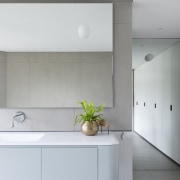
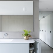
The dressing area with wall cabinetry and full-height mirror runs along the opposite side of the room to a large bay window. To brighten the dressing space, an opaque textured glass dividing wall between the shower and toilet areas admits further light to supplement the light coming through from the open vanity and bathtub area of the reconsidered ensuite.
“Bay windows were a prevalent feature of 90s architecture, but the one in this bathroom was an element the owners wanted to downplay,” says Castagna.
“Busy mornings and bath times were pinch points as the space was unusable by more than two at once. And the bay window with its awkward floor area was part of the problem.”

The new layout employs the bay window area as an entry to the shower, making good use of what was otherwise a tricky space to utilise.
“We introduced clean refined lines, such as with the datum line, to direct focus into the space and unify the area,” says Genner. “And we added mosaics to the lower walls for texture.
“The line creates an optical illusion that draws your attention away from the dated bay window. Plus the junctions are perfectly in line and flush with each other, which is no easy feat.”
A refined powder blue custom vanity with curved edges amplifies the organic lines of the bath and round mirror-mounted sconces. The vanity has a double basin and plenty of storage, including elegant, rounded corner cabinets.
The soft tones and curved elements of the bathroom evoke the home’s wider water setting.
Credit list
Designer
Bath and basins
Shower fittings
Accessories
Wallcoverings
Ventilation
Awards
Story by: Charles Moxham
Photography by: Nicole England
Home kitchen bathroom commercial design
