Below the surface
This home holds an element of surprise it turns the usual layout of a house upside down, reaching from above into the recesses of a cliff below
Everybody loves a surprise the excitement that comes from the senses being greeted with just a little more than was expected. However, this is not usually a feeling you would hope to encounter on entering a home.
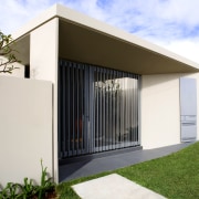
From the road, this home appears to be a small, contemporary, one-storey building but once inside, its true form is evident. The owners of this home originally had development approval to go up one more floor, but then they had a brain wave why not go down?
The top floor is built close to the street, with the garage aligned with the road. After drilling six metres into the rock below, it was possible to create two more floors, which extend down the cliff face to a pool and patio area built on a rock platform.
Architect Phillip Rossington from Tzannes Associates co-directed the project with Alec Tzannes. He says the owners didn't want to impede on the views of neighbouring homes.
"It was important to keep within the envelope of the existing building, but building down into the steep cliff was very difficult. The builders had to erect platforms to build from and to store materials on, as they were building on where they stood," he says.
Entry from the street is through a triangular courtyard. The front door then opens into a foyer area, which offers a first glimpse of the extensive harbour views beyond. This floor is devoted to living and entertaining. Oriented to the north over the water, the roof is scooped to let sunlight in until late in the day. On the southern side, clerestory glazing allows the room to be bathed in an even, natural light. Louvres can be opened to allow cross-ventilation.
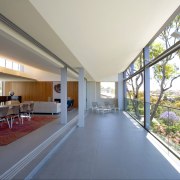
A deck runs the entire length, with eight sliding door panels that can be stacked right back to expand the living space. The tiles used on the deck are a non-slip version of those used throughout the home. Rossington says the owners didn't want carpet, so they chose a simple tile in an understated colour. This, and the subtle colours used throughout the home, allow their extensive collection of artwork to take prominence.
An entertainment centre and a fireplace, decorated by a favourite piece of sculptural art, are built into the timber joinery.
"The spotted gum used in this room and downstairs in the parents' quarters warms the otherwise grey tones of the interior," says Rossington.
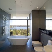
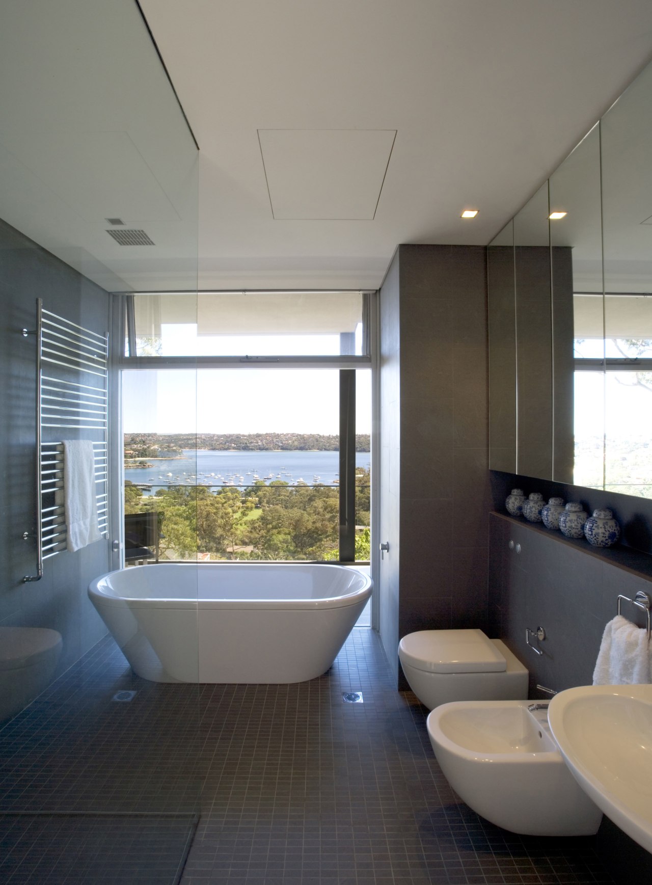
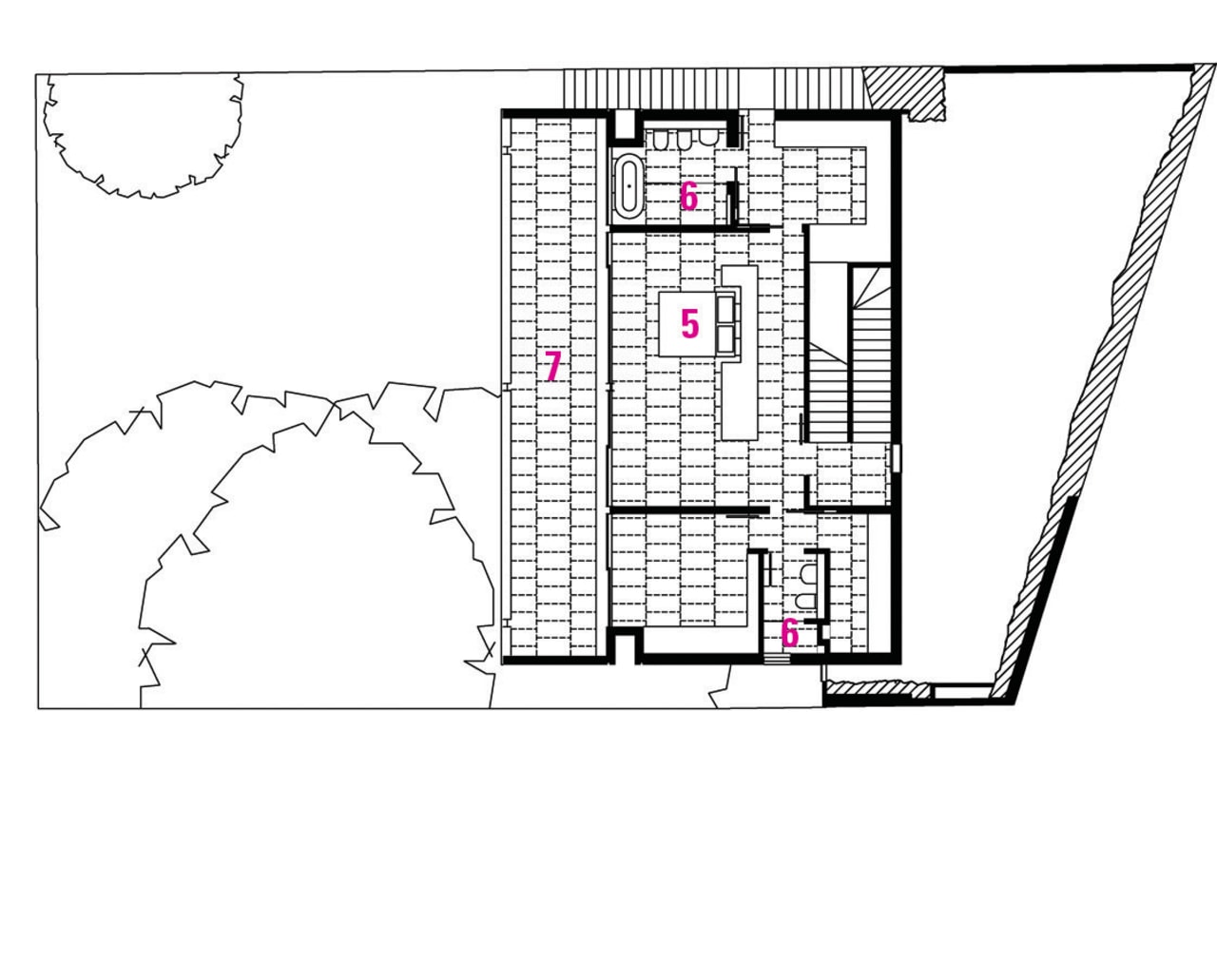
Downstairs, the owners specified a desire for separate floors for themselves and their children. The middle storey is the parents' haven, with his-and-hers bathrooms and walk-in wardrobes. A study is located on this floor, allowing for easy communication when working late. The southern wall accommodates artwork while the northern side is given over to the view. Again, a balcony runs the entire length, extending the space.
"Balconies are important for creating outdoor spaces for this home, as the only lawns are at the very bottom of the plot," says Rossington.
The owners' twin daughters have reign of the lower storey of this house, which is still six metres from the garden level. Their identical bedrooms are placed at either end of the floor, with a shared living space in the centre opening out onto the pool patio.
"This living space is more casual than the one on the top level. There is a built-in window seat, and the girls have a kitchenette at their disposal," says Rossington.
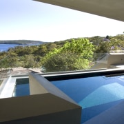
The shapes of the swimming pool and surrounding terracing are determined by the rock platforms they are built on. This irregular shape creates steps in the pool, allowing swimmers to take in views from the shallow end. At the other end, the pool depth plunges dramatically. As the pool is not large, swim jets have been installed to provide resistance for lap swimming.
An existing staircase leads down to a pool equipment room and a level lawn. Timber cladding on the sides of the pool allows for plants to eventually grow over the box-like form.
Rossington says the view of this house from over the harbour is quite spectacular.
"It's as if there is a box hanging over a base. And when you are in the house there is a feeling of being thrown out into that view."
Credit list
Builder
Roofing
Lighting
Blinds
Splashback
Taps
Cooktop
Refrigeration
Shower fittings
Bath
Taps
Accessories
Cladding
Tiles
Heating
Benchtops
Kitchen sink
Oven and dishwasher
Ventilation
Bathroom vanity
Shower enclosure
Basin
Story by: Trendsideas
Home kitchen bathroom commercial design
Radical yet respectful
Sculptural centrepiece
Curvaceous and connected
