Beautiful on a budget
Save, save, splurge ran the design course – resulting in a luxe ensuite that didn't break the bank. Clever design decisions naturally played a part
Designed by Suede + Stone
From the designer:
This home is situated on a lifestyle block out in the countryside of Waiuku.
It has garden edibles like figs & olives, which makes it an ideal home to entertain and to pick foliage from.
The 90’s brick home was very dark, oppressive and outdated.
The original bathroom featured charcoal tiles with red striped accents – it was confronting and very masculine to say the least.
The dark colours made the home feel cold and closed in.
There was a solid tiled wall separating the shower space from the rest of the bathroom which again added to the room feeling closed in and creating dark shadows.
As a designer it’s great to have a gentle reminder when you are faced with a challenge of having to work with extremely tight budgets.
It requires sourcing cost-effective options and solutions as opposed from the norm of custom making everything.
This bathroom design was primarily based around making those all-important decisions on where to save, so that we could splurge on other areas that will give the owners the highest value to enhance their living both functionally and aesthetically.
Light & white
The brief was for a contemporary space that was light, white and airy while also keeping the budget in mind.
The owners lacked both lightness within the space and natural light – one owner couldn’t even see clearly to put her make up on when getting ready in the mornings.
It pushed us to deliver the best space for our homeowners and to illustrate that you can still create something beautiful on a smaller budget.
White is the most popular bathroom choice for a reason.
Bathrooms tend to be among the smallest rooms in the house, so a light and bright canvas makes the room feel bigger than it is.
White is also often a calming shade, which is what you want when retreating to the space for some much-needed 'me time'.
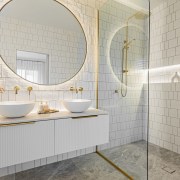
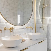
The resulting white palette has been punctuated with touches of brass and accent lighting.
While the bathroom is not 'all-white', the theme is carried through from the textured wall tiles to the floating reeded vanity and crisp white sink.
When creating a white contemporary bathroom, it is crucial to think about texture.
This bathroom features a Carrara marble vanity top and movement in the Orobico grey honed flooring which stops the room feeling washed out.
Opting for varied Subway wall tiles, laid in an offset stacked pattern, instantly modernised the space.
A frameless glass shower-screen ensures the bathroom retains an open, spacious feel while a floor-to-ceiling window floods the room with light.
When approaching this bathroom design, we decided that the vanity and mirror above need to be the central element to the space with the materials, colours and textures tying back to this so that when the door opens the site lines are attractive when looking in from the bedroom.
Budget – save, save (splurge)
Save – we kept the original plumbing position shower waste and toilet to keep costs down so that we could use the budget to remove the shower wall and add in a floor length window.
Save – sourced off the shelf products to keep to the budget restrictions. We have sourced off the shelf items for the mirrors, vanity, basins and ABI tapware which was cost effective for the owners but still gave us the overall look and feel they were after.
Save – where we couldn’t splurge on luxury Italian tiles, we were still able to create visual interest with mixing up the tile sizes and pattern to give texture and interest – I love the organic shape and feel of the matt tiles.
Splurge – rays of sunshine stream in through a new floor length window – a plantation shutter was installed for privacy so we didn’t have to use opaque glass – getting natural light into the room was important to the homeowners.
Splurge – the existing shower wall was removed to open up the bathroom to give a sense of more space to the ensuite – it was replaced with a curved glass shower screen which in turn allowed the natural light to filter in.
Outcome
This bathroom is now light, white and airy and is packed with texture and pattern to bring depth and visual interest to the contemporary look and feel my homeowners asked for – the owner now has plenty of light and storage in her new vanity for doing her makeup.
Credit list
Designer
Basin
Shower fittings
Bedroom carpet
Quiet bathroom fan system/heating
Shutters
Home kitchen bathroom commercial design
Continuity meets subtle separation
'Worthy of Architectural Digest'
Small space, big impact


