Workers unite
A key design driver for this new distribution centre and company head office was the need to unify all departments under one roof one business, one focus, one staff


For many companies, warehouse operations remain completely separate from head office and this applies to staff as much as buildings. But one large office products supplier has turned this idea on its ear. The new head office and northern distribution centre for OfficeMax is designed to unite employees, not separate them.
OfficeMax chief financial officer Sarah Herrod says centralising operations provided an ideal opportunity to rethink the way the company worked.
"The new building brings together staff from two distribution centres and three offices, spread over three locations," she says. "The community aspect was extremely important to us. We saw this as a chance to improve communication and encourage employee interaction through face-to-face meetings. We wanted a very open office, with much more shared space, including a shared cafeteria and breakout zones and fewer separate offices."
Architect Jeremy Craig of Ignite Architects says the desire for one workplace to reflect one business focus became a key driver for the design.
"We literally put everyone under one roof," Craig says. "We made the office space a continuation of the distribution centre by extending the warehouse roof right across the entire building. The roof culminates in large steel portals that project out the front to provide a brise-soleil. This provides shelter from the sun in the north, which was essential as this side of the building is fully glazed to maximise the view of the estuary."
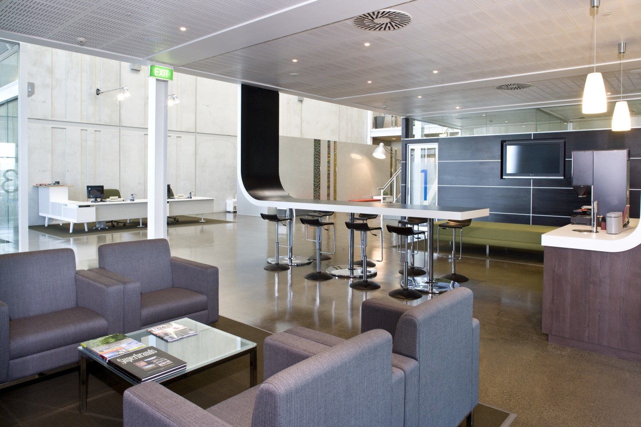
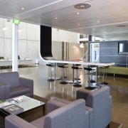
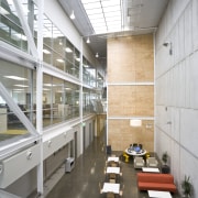
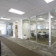
On the inside, the architects created an internal street with an 8m-wide atrium, which all workers pass through en route to both the offices and warehouse. Skylights above the street allow natural light to penetrate the centre of the building, helping to achieve a bright, airy interior.
Office workspaces on all levels open directly onto the atrium, providing a transparency in keeping with the open nature of the company's work practices. In addition, staff breakout zones and casual meeting areas are positioned on the bridges above the atrium. And the street is open to the staff cafeteria that serves all staff.
"The transparency of the interior ensures everyone feels as though they are part of one team," says Craig.
Open stairwells further enhance the openness, and provide opportunities for casual staff interaction. The designers positioned the lift on the opposite side of the atrium to encourage staff to use the stairs. Even the fire stairs were designed to be used on a daily basis.
Sustainability was another key driver for the design. Although the building was designed before a Green Star rating tool was available, every effort was made to choose environmentally friendly materials and finishes.
The subdued material palette of concrete, steel, glass and timber was chosen with this in mind, but it also conveys another message, says Craig.
"Rather than spending money on fancy finishes, we wanted to show that this company is 100% focused on its business functionality hence the exposed steel bracing in the atrium, the exposed services and ceiling, and the extensive use of polished concrete. There are also precast concrete panels, both outside and inside."
The precast concrete panel wall on the interior separates the distribution centre from the offices. The concrete has been scored in a repetitive pattern that is reminiscent of bar codes the system used to track all product as it passes through the warehouse.
"The concrete wall has an important aesthetic role to play," says Herrod. "It reminds everyone of what is happening on the other side it keeps the focus on what the business is really about."
The services core is another sculptural feature within the atrium. Panelled in sustainable plywood, the core is a prominent vertical element that balances the strong horizontal lines of the office floorplates.
"With its timber plywood panelling, the core visually plays off the precast concrete wall," says Craig. "It also references industrial packaging."
Craig says the position of the core, on the opposite side of the atrium to the workstations, was critical.
"Staff have to cross the atrium bridges and pass alongside the breakout areas, which further increases the likelihood of impromptu meetings."
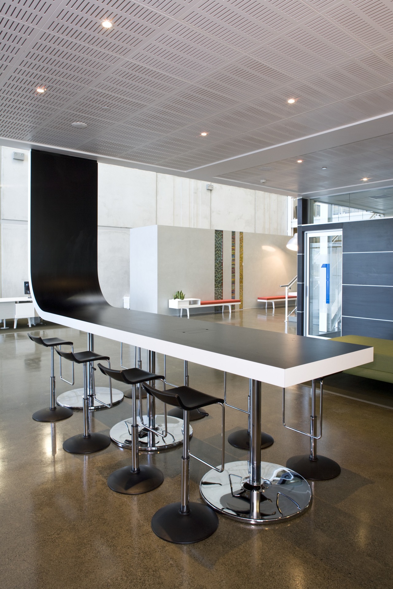
David Gunn, business development director of interior design firm Stack, says the office layout is mostly open plan, but there is no sea of desks.
"Workstations are separated into different areas, punctuated by meeting rooms, utility rooms and occasional offices," he says. "In addition, central storage units feature work tops, so they can double as meeting tables. There are many places where teams can collaborate on projects as required."
The designers have also ensured there is plenty of natural light offices are fully glazed and there is a 1.2m-wide walkway around the perimeter of each floor.
"Rather than having one or two people enjoying the view, this layout means everyone can share it," says Gunn. "With power and data cables running through the floor, we were able to position workstations exactly where they were needed."
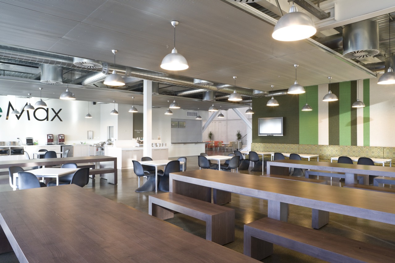
Stack introduced bright graphics in key areas. Glazed strips in the wall near reception are filled with colourful stationery items, such as rubber band balls and pencils. Accent colours also appear on stools, sofas and rugs, which contrast more subdued shades, such as the timber laminate tables and bench seats in the cafe.
The cafe is also defined by exposed services and large suspended acoustic panels that help create a sense of intimacy.
Credit list
Architect
Kitchen designer
Mechanical and electrical engineer
Construction company
Kitchenettes and joinery
Roofing
Hardware
Flooring
Ceiling
Paints and varnishes
Feature panels to mailpod
Reception furniture
Desking systems and office furniture
Breakout area and café furniture
Lifts
Interior designer
Civil engineer
Quantity surveyor
Fit-out contractor
Cladding
Window coverings
Wallcoverings
Veneers
Reception lamp
Step ladder to library
Meeting and boardroom furniture
Filing systems
Phone tables
Story by: Colleen Hawkes
Home kitchen bathroom commercial design