Total transformation of 1980s duplex penthouse results in attractive open-plan interiors and vastly improved layout
A major renovation project is not just a chance to replace a dated decor scheme – even more important is the opportunity to right the wrongs of the original space planning and circulation pathways

When you walk into a space that’s undergone substantial renovation your immediate response is most likely going to be a visual one – how good it looks. But what may not be immediately obvious is the major work that often goes on behind the scenes to resolve planning and circulation problems in the original design.
And the duplex penthouse apartment featured here certainly had its share of problems when the current owners bought it. As well as its very dated 1980s look, the apartment had a ‘tortuous’ layout plan, according to architect Andrew Wilkinson.
The kitchen was closed off from the living area, the staircase was also closed in, the powder room opened to the living area and access to a guest room and bathroom on the main floor was by a step-up over the plumbing services.
What it did have was a great location overlooking Manhattan and Central Park and a rooftop terrace for outdoor living on the second floor – though access to this was through the master bedroom.
“The owner came to me with quite specific requirements for the renovation,” says Wilkinson.
“On the first floor they wanted the kitchen opened up and integrated with the aesthetics of the rest of the apartment. Plus they wanted a more natural and rational connection between living areas, the guest room/office and the bathroom and powder room.”
Pivotal to resolving the awkward space planning of the original design was Wilkinson’s treatment of the enclosed spiral staircase, which also had the powder room located directly underneath.
“The position of the stairs was a given because of the opening in the concrete slab,” he says.
“We removed all of the existing framing to reveal the opening and worked with that to make the ascent to the second floor something special.”

This reworking of the stairs also gave guests direct access to the rooftop greenhouse and out to the terrace without going through the private space of the master bedroom – a much more sensible way to reach the public outdoor living spaces.
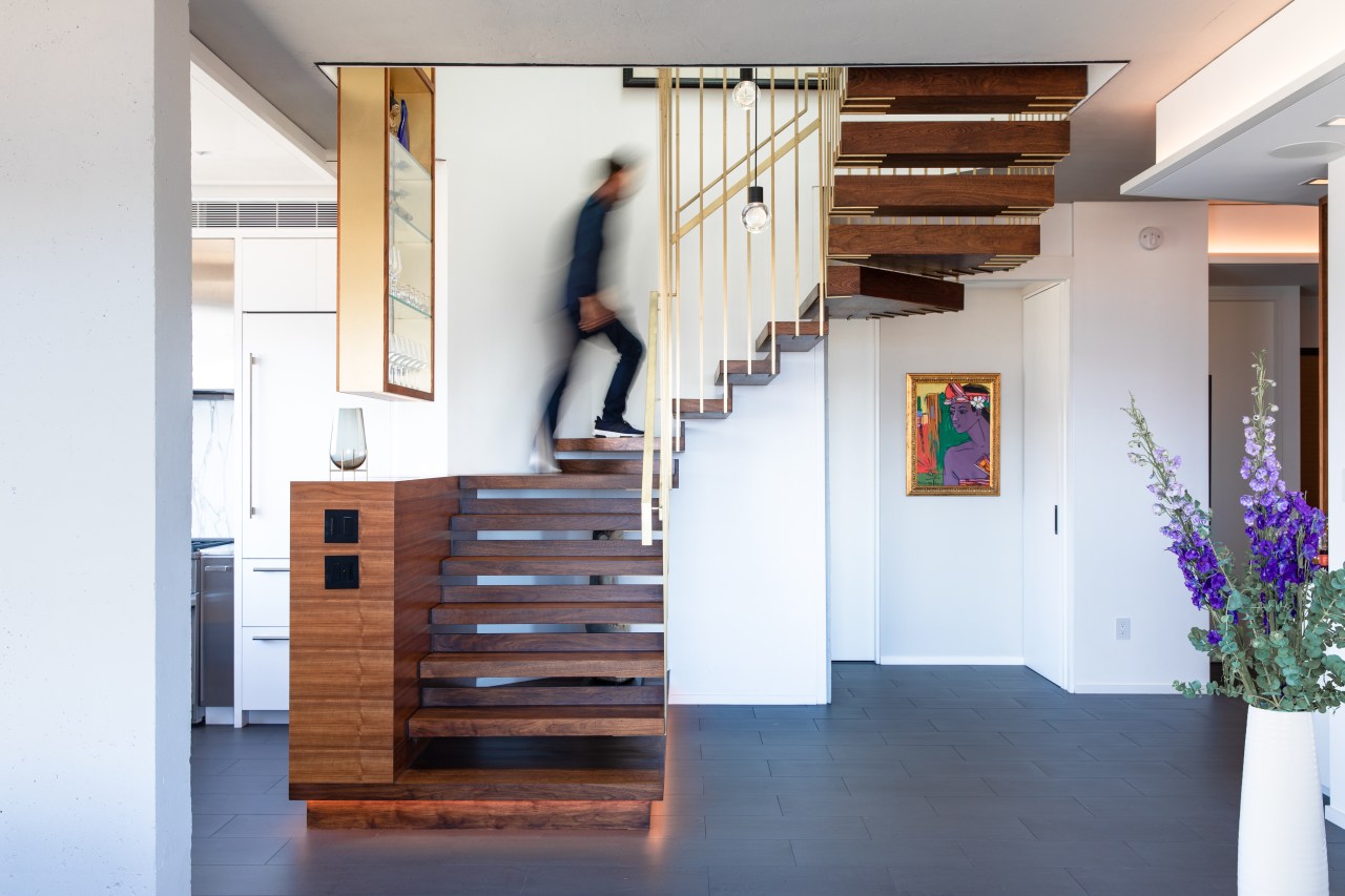
Wilkinson then set about designing the staircase as a sculptural artwork that would give strong visual impact at the entrance to the apartment.
Steel rods dipped in brass and burnished to a satin finish drop down 6.5m from the perimeter of the rebuilt skylight directly above the stair, with new support structures engineered and installed to suspend the stairs from the second to first floor.
The bars form the balustrading around the staircase and support the handrail. They also fold under the walnut treads to cradle them and contribute to the floating effect of the design.
Joinery at the base of the stairs serves dual function – giving bulk and definition to the stairs on one side, while adding more cabinet space to the adjacent kitchen on the other. Similarly, a display case in the kitchen continues up into the stairwell.
Full demolition of the existing interior took it back to the concrete floors and columns and allowed the kitchen to now open up to the rest of the living spaces.
“The owner has an affinity for SE Asian architecture , and my style has Asian influences too. So the aesthetic I used for the apartment is a light version of that, but not a literal translation.”

Columns and ceiling were left exposed and raw and contrasted with slicker surfaces such as the dropped ceiling in the living area. Finishing this in Venetian plaster gives it a slight shine to reflect light back into the room.
The panel also has a practical function – helping delineate the living and dining areas as well as concealing lighting.
Wilkinson points to the fireplace as another design coup. Completely boxed in when the apartment was bought, it was exposed, rebuilt and refurnished with the same marble cladding used on the kitchen splashback.
“We set out to create something that would visually enthrall people,” says the architect. “But we’ve also created a plan that is so much better and more dynamic.
“Architecture is a practical art. If it falls short on the practicalities you end up with a hollow result.”
Credit list
Architect
Project team
Cabinet company
Wallcovering
Lighting
Kitchen cabinetry
Splashback
Oven, ventilation and dishwasher
Refrigeration
Bathroom vanity
Faucets
Toilet
Flooring
Greenhouse furniture
Interior designer
Builder
Flooring
Paint
Blinds
Countertop
Sink
Cooktop
Microwave
Basin
Shower fittings
Accessories
Main level furniture
Terrace outdoor furniture
Story by: Paul Taylor
Photography by: Mark Wickens
Home kitchen bathroom commercial design
Tranquil waters
'Worthy of Architectural Digest'
Small space, big impact
Home Trends Vol. 35/4
Real estate agents often say the kitchen is one of the major factors that sways potential buyers of a home. But these da...
Read More


