Shaped by coastal views and the weather, this large new home comes with several architectural flourishes
Protected from the wind at the back and taking in views to the sea from its glass-walled interior spaces, this home has effectively created its own sheltered microclimate

Perched on an exposed coastal site, this large home has a wrap-around design that creates its own cosy internal environment.
House designer Mick Rule of Romano Homes says that when the owners bought the property they were looking to renovate the existing house.
"However, when we walked through it together we realised a renovation would never fully realise the site's view potential."
That certainly couldn't be said of the expansive home that went up in its place.
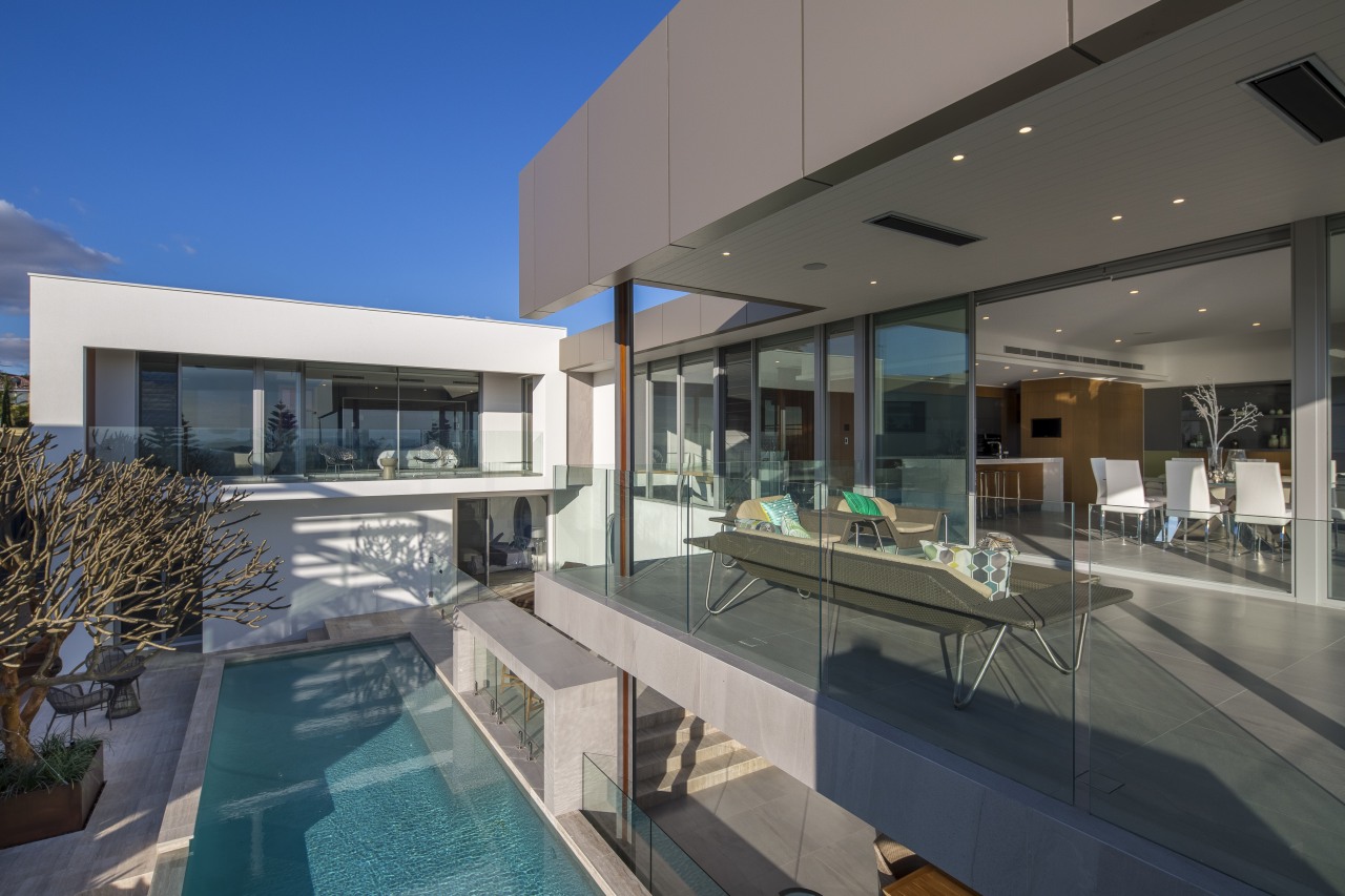
"We designed the house in a U-shape, wrapping around and sheltering the pool and terrace from sea breezes. The pool is on the north side of the home, which opens up its interiors to the sun and sea views through stretches of floor-to-ceiling glass, while the south side is more enclosed with fewer windows, as that's where the prevailing bad weather comes from."
The latter facade is clad in travertine tiles and zinc the design language here is simple rectilinear shapes.
Restrictions of another kind helped shaped the distinctive roof that slopes two ways with a gutter placed in the middle.

"The highest point of the roof conforms to local building restrictions and we ran the 3º sloping form down from there. We also ran the ceilings up to follow the roof line creating beautiful full-height interiors.The home's various internal spaces are also configured to optimise the sea views."
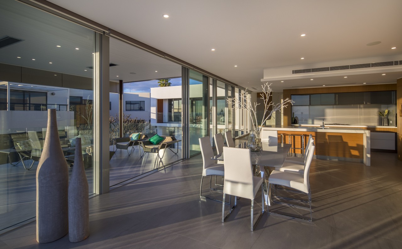
Living spaces are positioned upstairs in the middle section of the house. The master suite is upstairs in the east wing, which occupies the highest point on the heavily sloping site.
The other side of the U is shaped by a covered terrace, which includes a narrow element that extends out from the terrace over the pool, much like a diving board. This provides a lighthearted point of interest or folly and frames the views seen from within the pool.
"When looking out from the pool, this extended element cuts across the horizon line creating the pleasing illusion that the sky and the sea merge," says Rule.
Downstairs in the home, there's a pool kitchen, a terrace area and a pool-side bar. Three of the five bedrooms are also on this lower level.
"This specific arrangement of spaces futureproofs the home in two ways for the owners. Firstly, when they are older, they can occupy the upper floor only and have guests or family downstairs, or rent out this level which has a kitchen and bathroom as well as the bedrooms. And secondly, if the owners ever do decide to sell, the option of a home with a potential second income would be a major drawcard."
Futureproofing was considered in yet another way, too, says the house designer.

"While the home is set over three main levels the garage, gym and wine cellar are in the basement there are really six levels. That's because each floor is split into two to avoid substantial rises or drops for wheelchair users. All six of the home's half levels are accessed by elevator."
The design of the complex home and its response to external weather variables were made possible by the use of the AutoCAD's 3-D modelling software. And this software programme was also responsible for another feature of the surprising home.
"In the pool kitchen and terrace area we had considered replacing a solid wall with one of glass but it was decided this would create too open a feel," says Rule.
"So we took another tack, opting instead to introduce feature circular windows or portholes that show views to the pool and other areas."
"These are set in surprising areas there's one in the floor as you enter the home, for instance. In addition, by using the AutoCAD facility to see how the sun plays on the home as the days and seasons turn, we were able to ideally position the portholes for attractive light-play through the interior."
Despite the home's relative complexity and fun idiosyncrasies, it still manages to achieve a fairly minimalist feel.
Much of the exterior as well as the floors are finished in a strong large-format porcelain tile with the look of stone. The broad use of this material, contrasted with touches like western red cedar soffits, give the home its timeless material character.
Credit list
Architectural designer, interior designer and kitchen designer
Kitchen manufacturer
Pool design and installation
Cladding
Floors
Paint
Benchtops
Sink
Blinds
Bath
Taps
Bathroom wallcoverings
Ventilation
Kitchen designer
Landscape design and implementation
Roof
Wallcoverings
Cabinets
Splashback
Taps
Basin
Bathroom floor
Lighting
Awards
Story by: Charles Moxham
Photography by: Andrew Pritchard
Home kitchen bathroom commercial design
With deep affection
Radical yet respectful
Sculptural centrepiece
Home Trends Vol. 33/6
Renovating a tired and dated kitchen will not only add to your enjoyment of cooking – it can also totally transform the ...
Read More


