Renovated and modernised Herne Bay bungalow, by Darren Jessop
To provide a seamless transition between old and new, the architect of this traditional bungalow renovation created a modern interpretation of a return veranda at the rear of the house
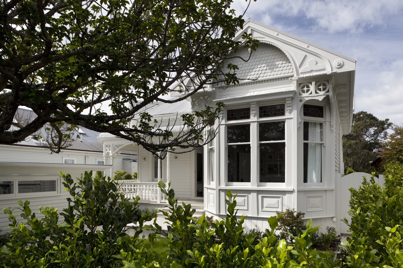
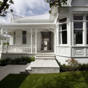
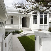
Even in the early 1900s, architects knew a thing or two about street appeal. The traditional bungalows they designed had character in abundance, and often featured return verandas, bay windows and intricate fretwork.
Around the back it was another story, however, with small, dark kitchens and a total absence of any kind of indoor-outdoor flow.
Architect Darren Jessop says the rear of this house was typical of the genre attractive at the front and a nightmare at the rear.
"The house did have many good features it had plenty of character at the front, lovely windows and a wide hallway. But it needed to be restored to its former glory," Jessop says. "It was also not well suited to modern living. The service rooms were inadequate and the house was far too small for the new owners."
Extending the house at the rear was the logical option, and a way to gain extra space without compromising the architectural integrity.
In designing the addition, Jessop says he took his cue from the return veranda, replicating this form with a modern interpretation.
"The extension, which has nearly doubled the size of the house, features its own return veranda. It also has a similar gabled roofline, but the interior was given a much more contemporary treatment."
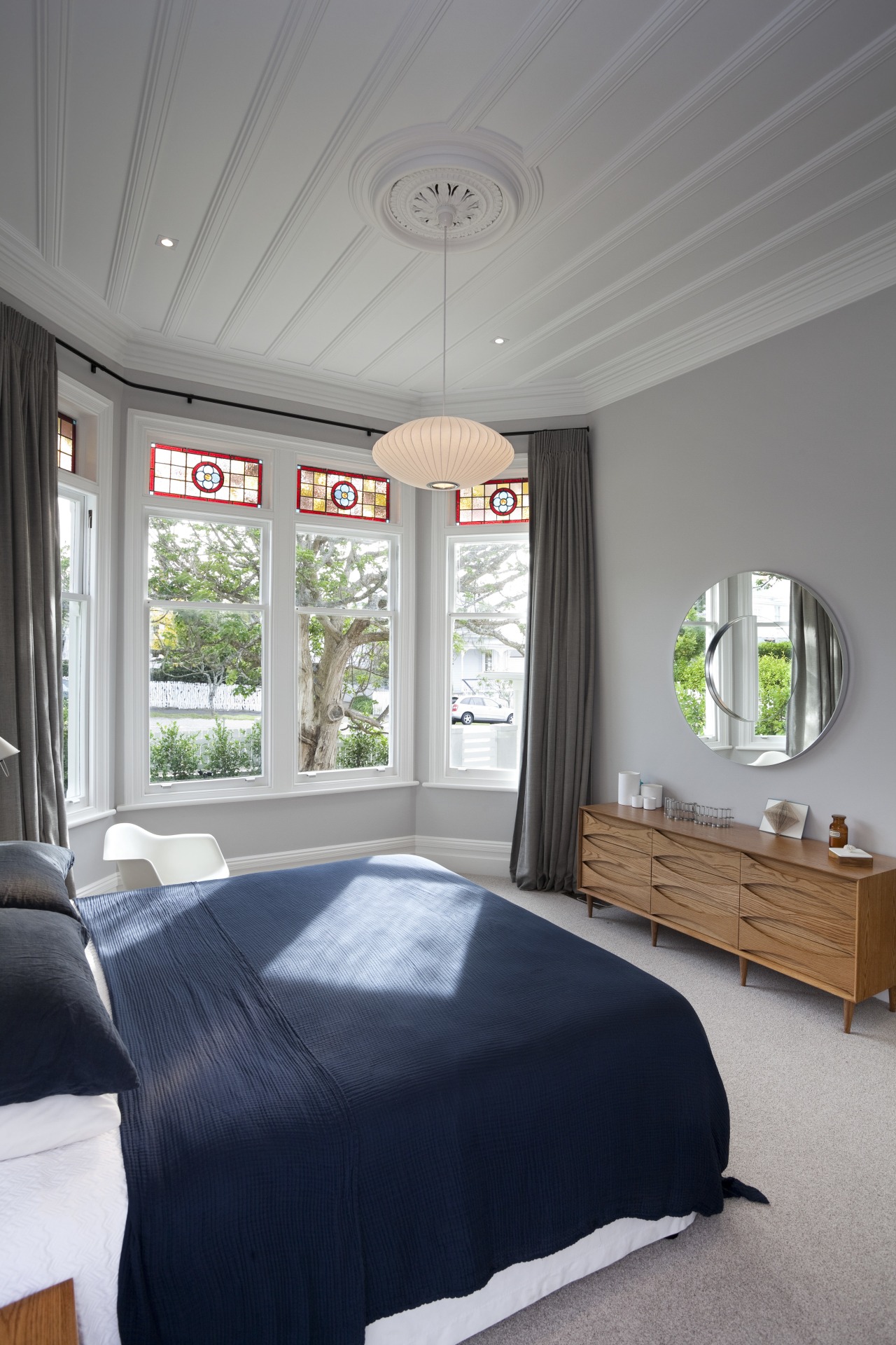
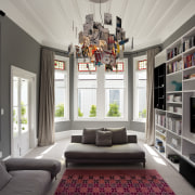
Jessop says there is a clear transition between the old and the new. The old part of the house, which accommodates the bedrooms, bathrooms and a den, still features its original detailing, including leadlight windows, ceiling roses and board-and-batten ceilings. But these rooms have been updated with more modern interiors and colors by designer Sonya Cotter.
Because the site has a slight gradient, the new kitchen and family living areas at the rear are a few steps lower.
"These steps mark the transition between old and new," says the architect. "But while the floor is lower, the ceiling height remains, which gives the whole space a very light, airy look. In this part of the house the ceiling also follows the roofline, with a glazed gable at one end."
Skylights above the kitchen ensure the area is flooded with natural light as well.
To maximize the sun, Jessop created a semi-internal courtyard that can be accessed directly from the kitchen and family room.
"This outdoor room sits between the old and new parts of the house. It has a fireplace, barbecue facilities, outdoor heater and a louvered roof so it is both sheltered and sunny as required."
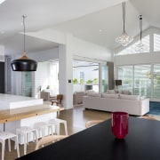
The kitchen adds a touch of drama to the extension, with black lacquered wall cabinets contrasted by a white island, white lower cabinets and a marble backsplash. To keep the look uncluttered, appliances are integrated where possible, and doors to the scullery and laundry are concealed within the cabinets. There is also a hidden wine cellar that is accessed through a trap door in the kitchen floor between the island and rear cabinets.

Different light pendants enliven the family living space one features spun wood, the others are glass.
"The family entertain a lot, so we created a number of zones for the children and adults," says the architect. "There is always somewhere to go for a little peace and quiet."
To shield the sun and provide privacy from neighboring properties, Jessop added sliding louvers.
The horizontal battens on the clerestory window in the gable are fixed, however.
Light is not compromised by the veranda. A 13ft-long skylight in the roof of the veranda keeps the living room bright and airy.
A new poolscape was also included in the renovation, and a large lawn for the children. A mature tree with a swing was retained.
Credit list
Interior designer
Builder
Cladding
Tiles
Living room lights
Splashback
Vanity
Story by: Colleen Hawkes
Photography by: Jamie Cobeldick
Home kitchen bathroom commercial design
Tranquil waters
Continuity meets subtle separation
'Worthy of Architectural Digest'


