Procter & Gamble Singapore Innovation Centre interiors by Orbit Design
A central staircase, meeting rooms and an easy connection between offices and labs support a workplace strategy of creative collaboration and innovation

Business success today relies heavily on encouraging innovation and having the flexibility to implement changes quickly. And a major factor in achieving those outcomes is the workplace environment.
When Procter & Gamble decided to build an innovation centre in Singapore, the goal was to come up with a radical design that reflected the company's innovative spirit.
The company says the new building needed to address the challenge of a tropical climate and be sympathetic to Singapore's cultural heritage, but in a contemporary way.
"While this is a highly sophisticated building from a technological point of view, we also wanted to create an inspiring and stimulating work environment to help drive creativity and innovation."
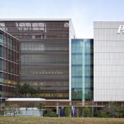
The 32,000m² facility is Phase 4 in the Biopolis biomedical research hub, masterplanned by architect Zaha Hadid. It is Singapore's largest private research centre, and is the first P&G centre to be built in a tropical and urban environment.
One of the results of that is the intelligent facade design which uses clear glazing and louvres to give maximum access to daylight while controlling glare and heat.
While P&G's own architecture team worked with IDC Architects on the building itself, Orbit Design was commissioned to design the interiors and integrate corporate graphics and branding.
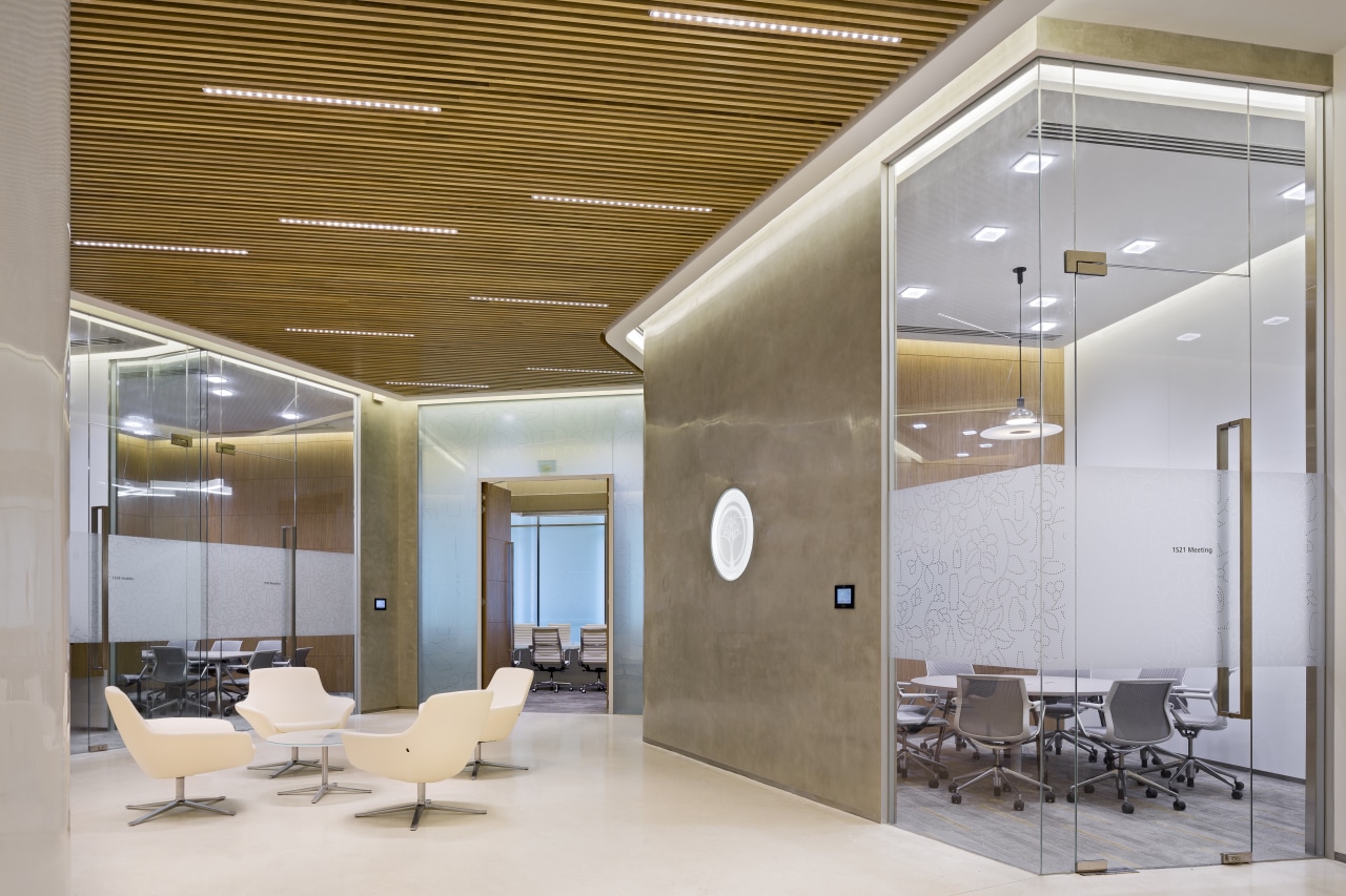
Orbit design director Simon Drogemuller says this involved providing a host of functions from research laboratories to training rooms and offices.
"These were to house an army of engineers, researchers and scientists who develop beauty, hair and skin products," he says.
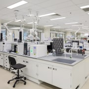
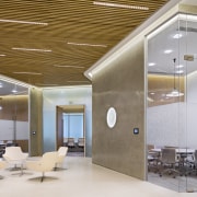
But instead of splitting these functions into separate wings, lab and office space was allocated to each floor. The lab areas were internalised in the building core, while the open-plan work areas were placed around the perimeter.
"This open and flexible plan contributed to the innovative thrust by encouraging creative collaboration among P&G staff," says Drogemuller.
The biggest challenge in creating this open workspace was taking standard workstations and customising them to meet specific requirements. For example, much time was spent designing the partitioning between the labs and workspaces. These needed to provide storage for products and be very durable, yet still allow maximum connection and visibility between the areas.
For P&G, the centre presented an opportunity to demonstrate that the company is at the leading edge of modern office workplace strategy.
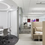
"As well as having open workspaces, the desks are not assigned," says Drogemuller. "Staff have lockers where they can store personal items, but they don't have a fixed workstation. When they arrive, they log in, choose a desk and the phone system automatically connects them to that workspace."

This gives workers the flexibility to work in positions most suited to their roles on a daily basis, or to form new teams for collaborative work, without having to make changes to the desking.
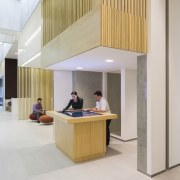
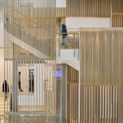
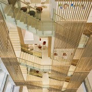
Probably the building's most impressive feature is its main staircase, located in the heart of the facility and linking all floors. It's a dominant feature of the entry atrium, and its base overhangs the reception area.
"The staircase is clad in a vertical wooden louvre carapace, which references Asian design," says Drogemuller. "This created a design motif that recurs throughout the innovation centre."
The wooden slats on the staircase add another layer of connectivity and transparency to the design, highlighting the movement of staff as they walk up and down the stairs.
The design encourages regular interaction in the multiple group meeting spaces that are arranged around the staircase and atrium. With a 6m floor-to-floor height, some of these spaces have been located on mezzanine floors in the atrium.
For Simon Drogemuller, the success of the design is in how it encourages new ways to work.
"Removing the barriers between offices and labs, and having an abundance of collaboration spaces encourages staff to work together right across organisational boundaries," he says.
Credit list
Project
Interior design
Interior fit-out
Civil and structural engineer
Quantity surveyor
AV and acoustic consultant
Landscape consultant
Interior and furniture consultant
Flooring
General lighting
Foyer furniture
Huddle room furniture
Lab and facility room shelving
Workstation seating
Architect
Main contractor
Base build mechanical and electrical
Mechanical and electrical engineer
Facade consultant
Lab consultant
Landscape contractor
Timber screens
High-gloss concrete wall surfaces
Joinery
Private lounge pendant lighting
Breakout space furniture
Private lounge furniture
Workstations
Story by: Paul Taylor
Home kitchen bathroom commercial design
Thrice as nice
Marvellous in marble
The beauty of understatement
Commercial Design Trends Vol. 30/12
Commercial Design Trends is aimed at our professional readers, and showcases commercial buildings. The book features reg...
Read More

