Optical illusion
The designers of this holiday home used changes in the volume of adjoining rooms to connect them spatially, but separate them visually
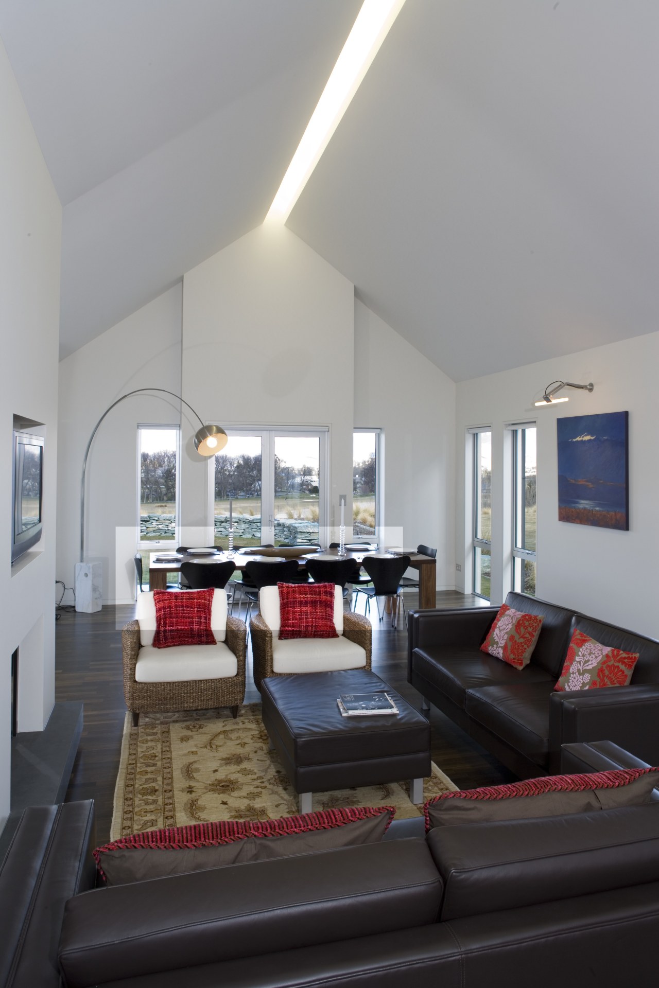


Discussing internal volume sounds like an analysis of a room's acoustic qualities. But the volume of a room has nothing to do with sound. It is volume measured not in decibels, but cubic metres in other words, differing volumes of space, created by ceilings of differing heights and shapes.
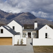
The architects at Modern Architecture Partners Ltd, Kerry Mason and Rebecca McLaughlan, employed this principle when designing this house at Millbrook Resort.
"The clients' brief was for modern lines simple, stylish and uncluttered. They were inspired by another house we had done at the same resort, so we used that as a starting point," says Mason.
As with most resorts or communities, there was a building code in place that dictated what the exterior of the house must look like. This particular code called for gables, which offer the opportunity for tall interior spaces. Often, the gable form is underplayed with a flat ceiling, but the architects chose to play up this volume. The challenge then became how to define the adjoining spaces.
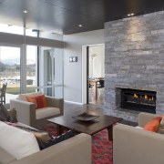
"The kitchen is a good example of this challenge. Logistically, you want it located adjacent to the main living spaces, but as a service space, you want to create a degree of separation, even if only perceptually. Lowering the kitchen ceiling achieved this, and gave the space a more intimate feel. It also has practical benefits, in that it houses the air conditioning and extraction units," says McLaughlan.
Keeping an area open but still maintaining individuallydefined spaces can be a tricky proposition, especially when you are trying to keep the material palette constant throughout.
"It is possible to create character through marked changes in the colour and texture of the materials, but we prefer to do it through subtle elements, like the surface finishes and the ceiling height," she says.
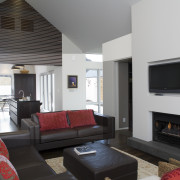
These subtle variations are well illustrated in the lounge.
"We wanted the lounge to have sense of formality, so it is a lot darker than the rest of the house. This was achieved through the use of Waitaha schist on the fireplace, coupled with dark timber ceilings. The paint is a darker shade than the adjacent master bedroom a subtle shift to indicate that one is a more formal space, and the other is more relaxed and private."
The house was designed to serve two purposes. Primarily it had to function as a cosy holiday dwelling for the homeowners, but they also wanted the flexibility to convert the house into a more appropriate format to accommodate guests, especially the couple's young grandchildren.
The architects achieved this flexibility by using sliding doors and a pavilion layout for the house. Because most of the time the owners are there alone, they didn't want the house to feel big and empty. So the guest bunk room is compartmentalised from the rest of the house. Not only does this make the house feel more cosy, but it also cuts down on maintenance and heating.
Moving through the house, the details become apparent. McLaughlan says it is these features that give the house a sense of depth.

"It has so many hidden gems. The bunk room, which is often quite a utilitarian space, has a real sense of excitement about it. The wine cellar, which is only a little bigger than a cupboard, is dark and timber-lined, with sparkly little lights for identifying the bottles. There is also a glass floor in the study. All these elements are almost doll house-like, because they are such small, intricately detailed insertions," she says.
The area of the house that exceeded the expectations of everyone, save perhaps architect Kerry Mason, was the loft studio, built as a space for the one of the homeowners to pursue her love of painting.
"This was the area that really came alive in the building. I'm not sure the homeowners, the project manager, or even myself, really understood what this space would look like from the plans. The result, with its inspirational view to the mountains of Central Otago, was a lot more charming than we imagined," says McLaughlan.
In any building project, especially one set in an extreme environment, the challenge is to integrate the location with the design of the house.
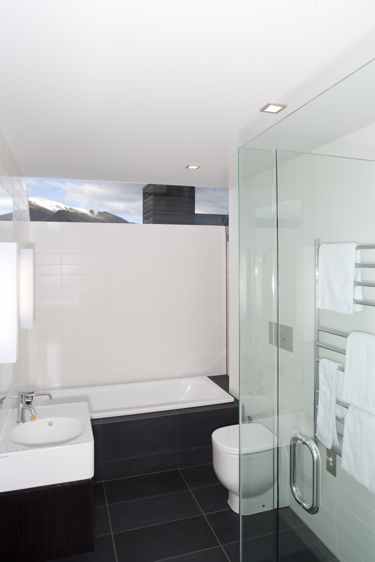
The bathroom is a good example of the way the view has been used to not only add natural light to the space, but also to anchor the house to its surroundings. Clearly, privacy is important in a bathroom, so framing the mountains in a window at the top of the wall is a good compromise.
Credit list
Project manager
Kitchen manufacturer
Flooring
Heating
Cabinetry
Splashback
Taps
Ventilation
Dishwasher
Shower fittings
Bathroom tiling
Taps
Toilet
Builder
Entry tiling
Wallcoverings
Audiovisual
Benchtops
Kitchen sink
Oven
Refrigeration
Waste disposal
Baths
Basin
Hot water system
Story by: Trendsideas
Home kitchen bathroom commercial design
