New lease of life
Formerly a collection of small boxy rooms, this remodeled family living area has transformed a 1920s house and the family's lifestyle

Gracious family homes built in the 1920s are highly sought after, especially in Boston's more prestigious suburbs.
But all too often, families learn to live with disconnected rooms, simply accepting this is the price to pay for a slice of history and a top location.
However, it doesn't have to be this way, as this remodeling project shows. Architect John Meyer says many older homes are exceptionally solid and well built, and are not as difficult to remodel as people might expect.
"These houses are strong enough to support the structural steel beams needed to open up the interior," he says.
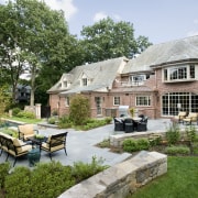
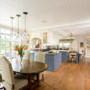
"For this project, walls were removed, ceilings raised, and an addition created to completely open up the kitchen to a spacious family living area. We also introduced large steel-framed glass doors to provide a strong connection to the outdoors and the pool terrace. The owners wanted the whole space to flow."
To maintain a link with the past, the cabinetry is a pared-back Shaker style.
"The owners wanted something simple and a little low key," says the architect. "While solid, the cabinets have enough delicate detail to fit in with the Tudor architecture we wanted to retain a sense of that era.
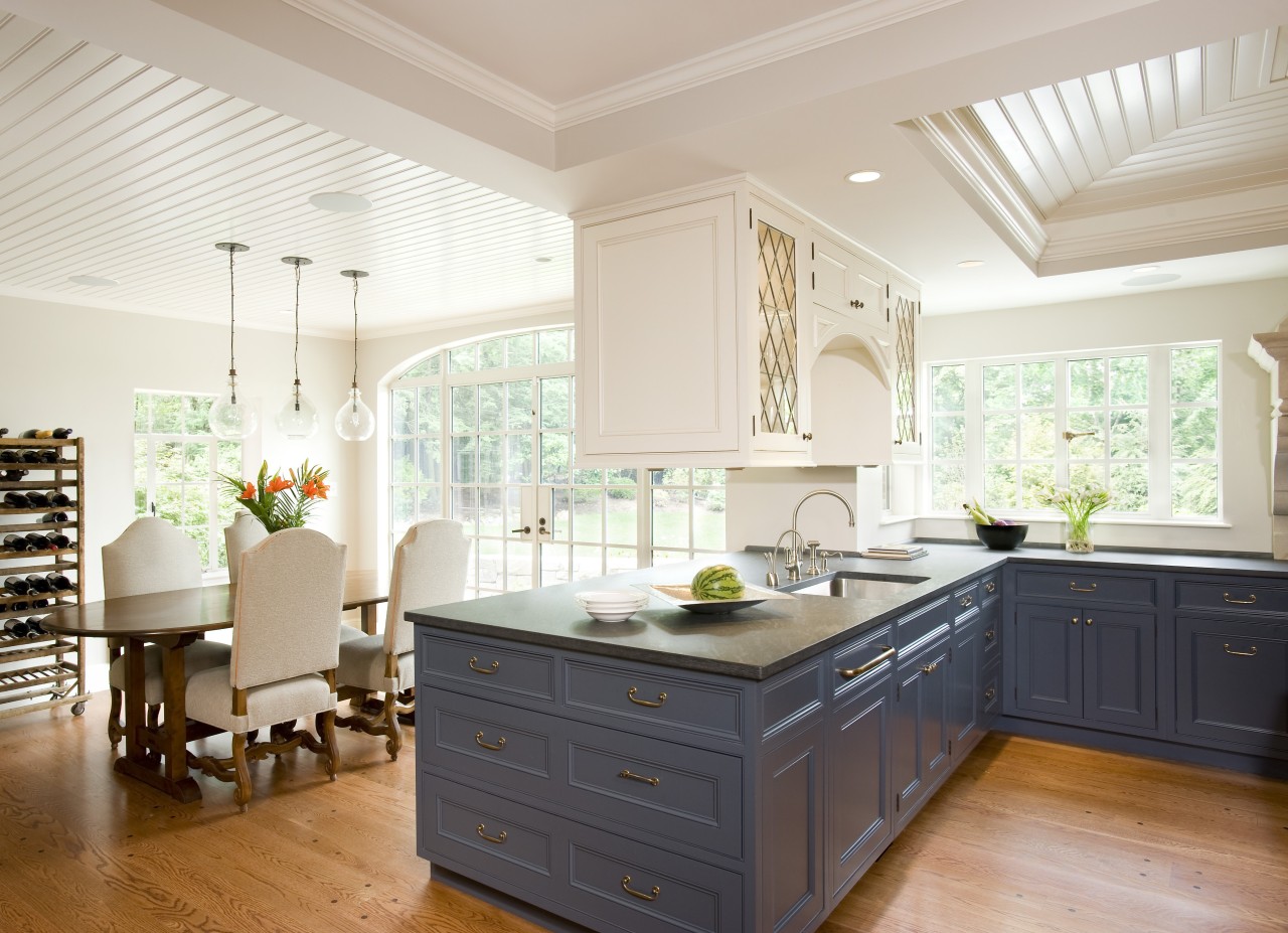
"There is a beadboard detail around the doors, and there are turned legs at one end of the island, which create the look of a traditional farmhouse table. And the overhead display cabinets with leadlight windows are another link. The cabinets appear to float above the peninsula, with an arched opening in the middle serving to animate the space."
Meyer says the overhead cabinets help to define the kitchen within the overall living space. They also break up the great expanse of ceiling, as does the coffered ceiling above the kitchen, which makes the room seem more spacious. The large steel ceiling beams required for the remodel were boxed and painted to resemble large wood beams.
To introduce a colorful accent, the lower cabinets were painted blue. The color complements the decor of the rest of the house, which is quite dark.
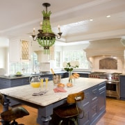
"The blue helps to anchor the cabinets to the floor it sets them apart from the white overhead cabinets that float above," says Meyer. "The white marble countertop on the island is also part of the liveliness. It's a bright contrast to the gray-toned granite of the perimeter countertops.
"This space needed to create a strong contrast to the darker rooms. We wanted people to walk in here and experience an explosion of light and space."
Meyer says the large, open living area is also a much better fit with modern lifestyles, which invariably center on the family living space and the outdoors.
The architect has retained other links to the original house, however. Brickwork that had been partially hidden has been exposed. This can be seen on one side of the kitchen and in the butler's pantry between the kitchen and dining room.
"We took that motif and used it as an accent throughout the house," says Meyer. "For example, it appears on the backsplash of the hearth-style cooking center. Some of the bricks in the butler's pantry were salvaged from the Old North Church, the historic church where, during the Revolution, Paul Revere lit the lantern to warn troops of the enemy approaching."
Functionality has been assured with the remodel. There is ample counter space so more than one person can work simultaneously. And because the kitchen opens up to the alfresco dining area on the terrace, it is easy to move dishes between inside and out.
Credit list
Architect
Kitchen decorator
Builder
Hardware
Backsplash
Faucets
Dining and lounge chairs
Bar stools
Lighting
Ventilation
Dishwasher
Water dispenser
Interior designer
Cabinet company
Cabinetry
Countertops
Sink
Flooring
Dining table
Desk chair
Wall coverings
Range and warming drawer
Refrigeration
Waste disposal
Story by: Colleen Hawkes
Home kitchen bathroom commercial design
US Kitchen Trends Vol. 30/3
Kitchen Trends is dedicated to providing inspirational design ideas, products, services, and information for kitchen bra...
Read More