New glass walled apartment rises from steel structure of warehouse conversion below
Two storey unit atop renovated warehouse features cantilevered internal stair, glass walls on three sides, vinyl plank flooring and a glass elevator

For a major renovation, or in this case major addition and transformation, the bones of the existing structure can have a dramatic impact on all design choices, even down to the flooring.
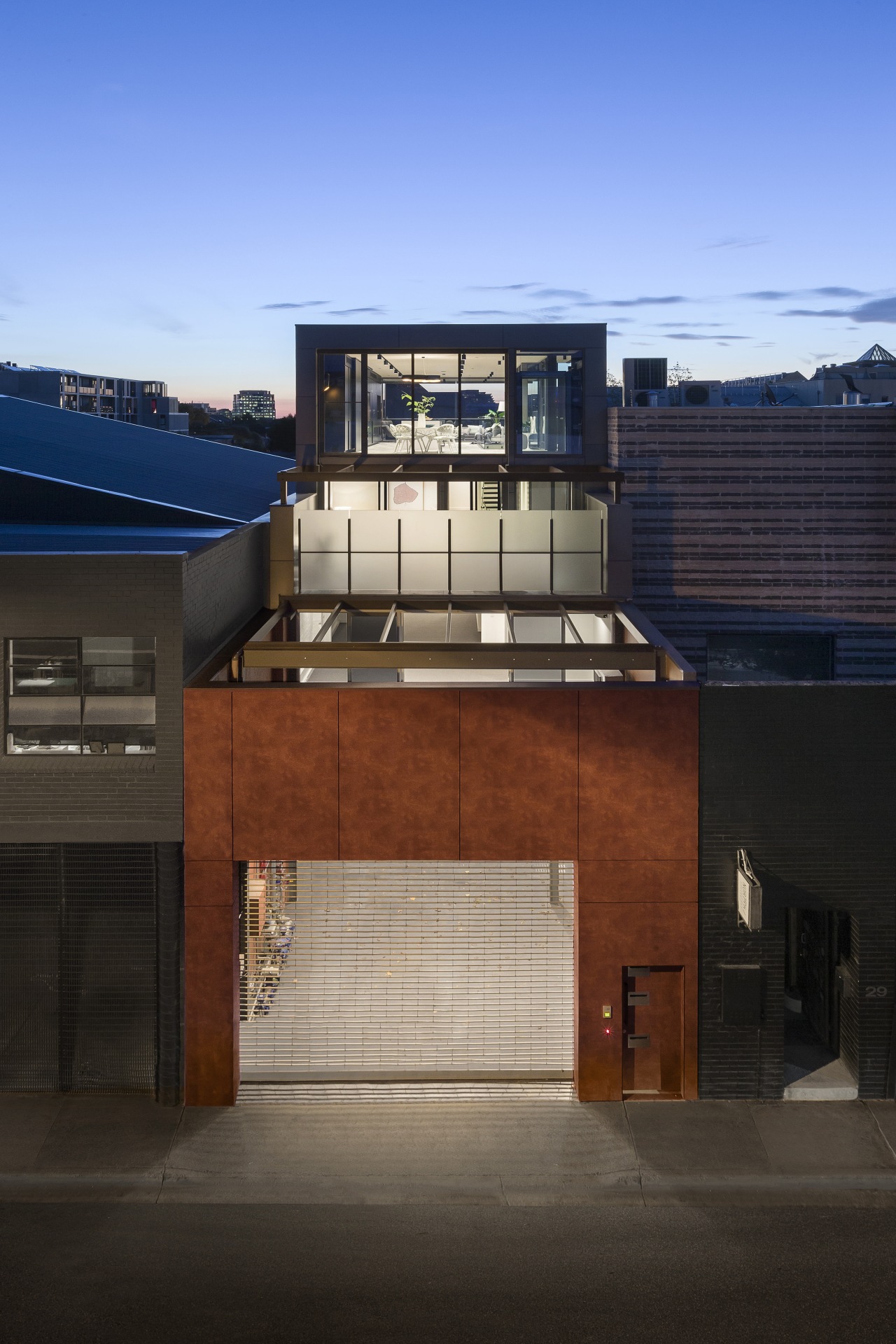
This eyrie-like residence by LSA Architects is essentially a brand new two-storey apartment nestled atop an existing steel-framed warehouse. Linda Simons, principal architect at LSA Architects, led the upmarket, inner-city project.
"The brief was for a sleek, minimalist design to match the urban setting of this warehouse redevelopment," says Simons. One of the key elements of the design was to draw on the city views and create a sense of space on what was a rather narrow allotment."
As part of the wider project, Simons also modernised and refurbished the commercial spaces on the lower floors which had previously had an intermediary life as a recording studio. However, it was the good bones of the warehouse which allowed LSA to create such an open feel in the apartment above.

"Because the warehouse was framed in structural steel we were able to simply extend this framing upwards to support the new floors. The strong steel structure meant we could create the upper floors with massive expanses of glass walls and doors completely opening the apartment to the surrounding cityscape."
At street level, the front entry and garage surround fit perfectly into the semi-industrial location. The dramatic front facade is in a high pressure commercial grade laminate which is graffiti-proof and has the look of Corten steel.
Entry to the apartment is via stairs shared with the offices below or a glass elevator. Connection between the unit floors is also via the lift or a feature steel and wood cantilevered staircase.
"The lift was a tricky part of the project. Due to structural constraints this had to be freestanding with its own steel frame," says Simons.
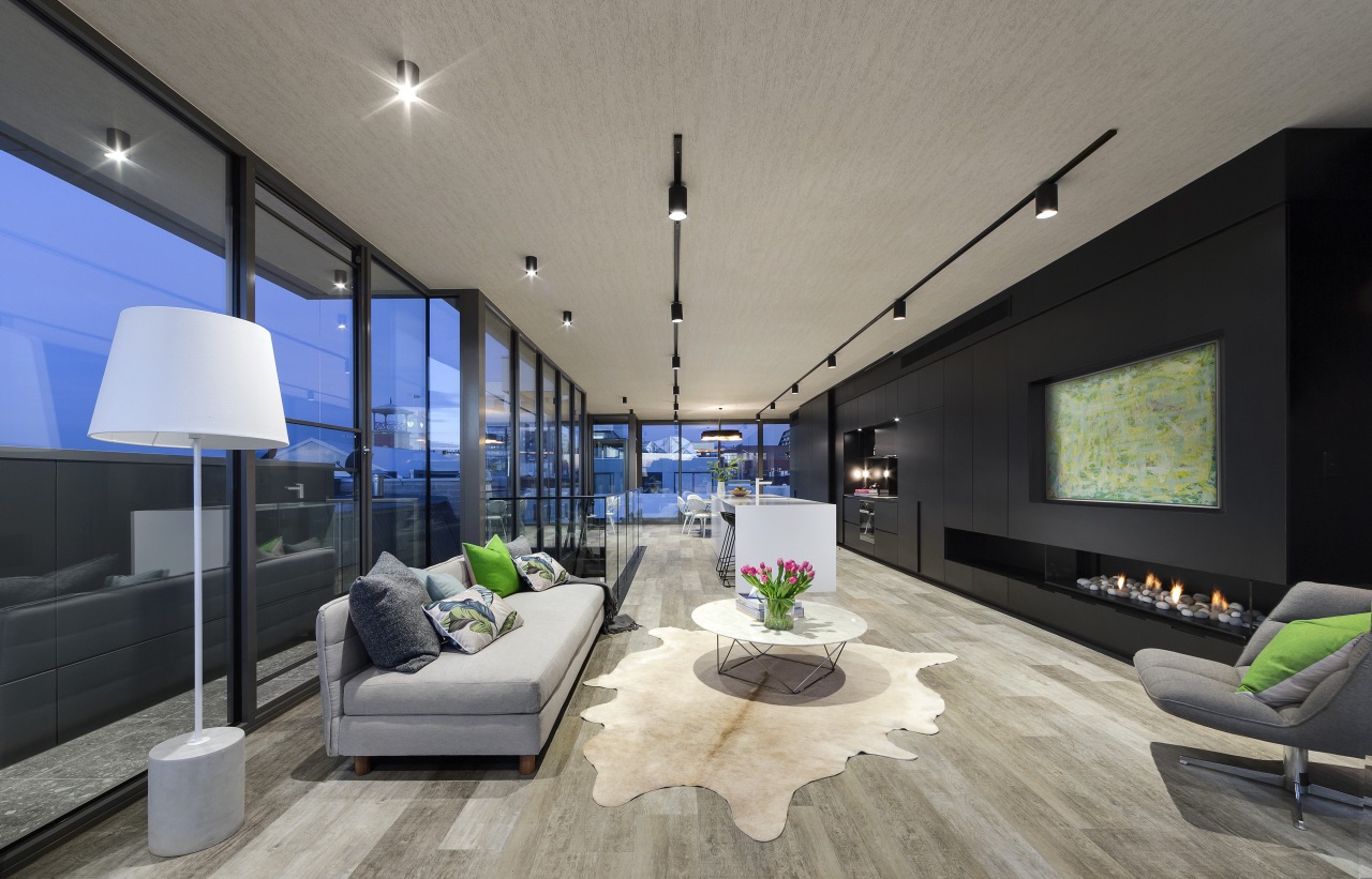
In a design that's all about the views, the apartment's kitchen, living and dining zones take up the entire top floor, with floor-to-ceiling windows on three sides.
A hardworking wall of seamless dark cabinetry was designed for the remaining boundary wall. Adding to the unit's connection to the wider surroundings, a large deck extends off one end of the living floor.

"Naturally, with so much glazing involved, control over heat build up was important. We solved this by introducing external drop-down motorised venetian blinds to shade the glass walls on this level. These retract into external pelmets for a clean look when not in use. As wind could run through the blinds and be noisy, they also have a sensor which retracts them when breezes reach an unacceptable level.
As the top floor is long and narrow, the island is set beside the staircase the section with the narrowest free floor area. This leaves either side as open, uninterrupted spaces.
"The owners wanted a focal point in the room that would both look sophisticated in the evening and immaculate during the daytime. To achieve this and to create atmosphere in the living zone, LSA incorporated a sculptural gas fireplace into the built-in joinery."
Overall, the apartment's interior look is warm-industrial with a monochromatic colour palette to add to the sense of spaciousness.

Both the floor and ceiling played important roles in the interior design. To connect with the original building's warehouse aesthetic, a vinyl, commercial-grade wallpaper with an unusual 2-D concrete texture was applied to the ceiling.
"In terms of flooring, the steel structure does allow for a small amount of lateral movement, so timber boards were unsuitable as they may have potentially warped under sideways pressure," says Simons.
"Similarly, with so much sunlight entering the apartment at this level timber might have warped under that exposure. So to achieve the warm look of wood without the negatives we chose vinyl plank floorboards. These are laid individually, like timber boards, and have a similar visual warmth to a wood-plank floor, but are virtually indestructible."
The level below has the same ceiling and floor treatments as above. This is the bedroom zone and two have their own balconies with giant sliders connecting the indoors and out.
With buildings close on both sides it was important to get natural light down into the lower bedroom level. To achieve this, the side of the addition is stepped in, creating a light well.
To further optimise solar penetration into the bedrooms, which are positioned on the darker side of the building, glass internal walls were introduced. These allow the sun to flood through from the circulation side of the space.
To further optimise light on this level, walls are painted white and mirrors are strategically placed to reflective light into the bathrooms.
Credit list
Story by: Charles Moxham
Photography by: John Wheatley
Home kitchen bathroom commercial design
Sculptural centrepiece
Radical yet respectful
Curvaceous and connected
Home Trends Vol. 32/6
Whether it's a new build or a renovation, your home design project is one of the most exciting – and possibly challengin...
Read More


