In black and white
Refined materials and varied sources of inspiration produce a modern take on a classic design scheme

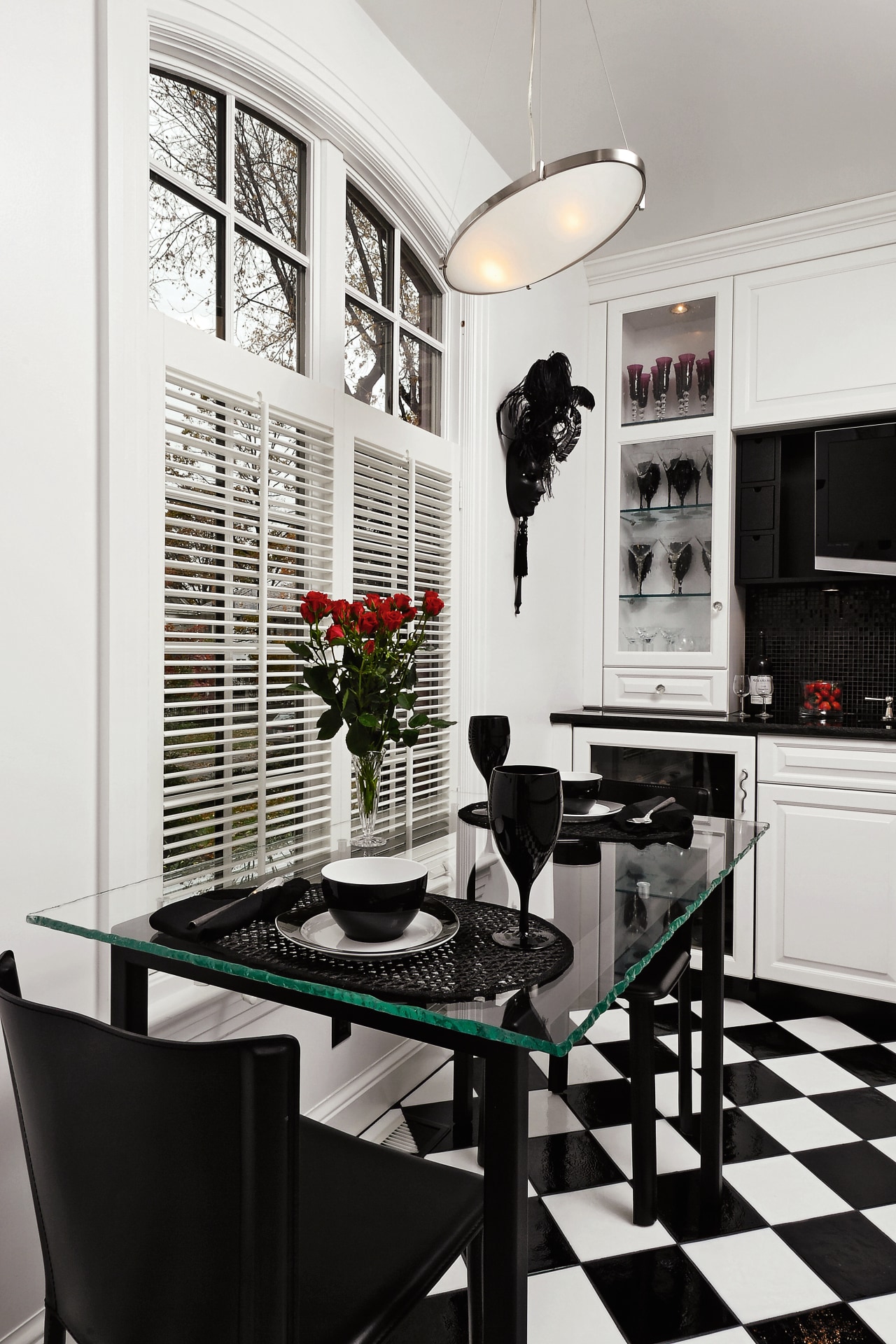
There is a reason why certain design schemes endure. The black-and-white chequerboard motif is perhaps one of the longest lived, with links to the Knights Templar, who used it to represent the coequal powers of light and darkness. Whatever the symbolism, there is no denying that the bold contrast between the two colours is visually compelling.
From a design standpoint, this contrast allows myriad style variations ranging from classical to contemporary, says designer Ania Gaguine of Jennifer Gilmer Kitchen & Bath.
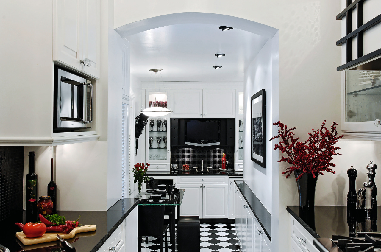
"For this kitchen, we took a very classical approach to the design, using an English door style on the cabinetry, seeded glass, and of course the black-and-white colour scheme. There is also an eclectic side to the design that was achieved by using the stainless steel professional range, sink and mixer, and adding contemporary lighting fixtures, modern furniture and a custom hood, which has Asian influences."
For the homeowner, Barbara White, the decision to go with the black-and-white scheme was never in doubt.
"My last kitchen was black and white, and it's a colour scheme that resonates with me, so it made sense to continue along that theme. It is also a scheme that, because of its clarity and regularity, I feel best suits the galley layout."

Gaguine says that amalgamating the disparate styles within the space was possible in part due to the simple design scheme, and also because of the galley layout, which had to be strictly enforced to comply with local regulations.
"The original kitchen was very small just over 2m x 3m for the size of the house, which had been expanded over the years. When the owners and architect decided to enlarge the kitchen, they added a 5m-long room, which is mostly quite narrow. This gave us a very unusual space to work with. Luckily, the spaces have different ceiling heights and with the step down to the breakfast room, this breaks the continuity of the galley layout."
White says she can't identify one specific point of inspiration for the mix of themes. Instead, she has a tendency to act on instinct when working with a designer.
"Things just happen with me, to the extent that I'll just like the look of something. The rangehood is a good example I almost didn't go with it, but then I thought why not go for broke, and it has turned out to be the feature that I like the most."
One of the perceived drawbacks of a galley kitchen is a lack of storage space. Not only did the addition of the breakfast area result in increased storage options, it allowed for storage in the kitchen area to be tailored to food preparation and cooking, says Gaguine.

"The breakfast area has accommodated the pantry storage through a series of 10cm-deep, bench-high cabinets, while taller storage can be found to the right of the bar area. A Sub-Zero under-bench wine cooler and a refrigerator take care of beverages. In the kitchen area, the base cabinets have been equipped with roll-out shelvesand inserts for cutlery and spices for easy access.
"The renovation was tailored to the lifestyle of the owners, who in general, do not prepare large meals, so it made sense to keep the kitchen the same size and in its original location. The addition of a breakfast area to house storage elements, a full bar and flat-screen TV has increased the day-to-day usefulness of the space in a way not previously possible," says Gaguine.
The end result is that the unusually long and narrow layout is actually a stand-out feature, while the combination of patterns, high-contrasting finishes and colour adds drama to the space.
Credit list
Kitchen designer
Cabinetry
Flooring
Lighting
Kitchen sink
Range
Refrigeration
Waste disposal
Story by: Justin Foote
Photography by: Bob Narod In black and white Refined materials and varied sources of inspiration produce
Home kitchen bathroom commercial design
Tranquil waters
Small space, big impact
Classic dovetails contemporary


