Change of heart
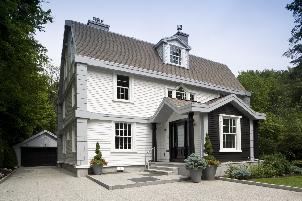
The classic facade of this stately residence offers little indication of the total transformation of the interiors and rear of the home
A radical modernization of an interior where zoning regulations require retention of the classic exterior may seem a difficult design undertaking. However, adhering to clean lines and a simple tonal palette can ensure that the traditional and spectacularly modern work together in harmony.
The architect of this upscale remodeling project, Icelander Bjorn Skaptason, was asked by the home-owners, also from Iceland, to transform the interior into living spaces that provide enjoyment and ease of living in 21st-century terms. Skaptason had worked on the owners' previous home in Iceland and as a result was asked to undertake this refit.
"The exterior had been comprehensively restored around eight years ago. That project focused on architectural details, repairing gutter systems and installing steps, a patio and retaining walls," says Skaptason. "But this remodel addressed the entire interior, starting at the granite front door steps, as well as the site, including the driveway, and terraced garden at the rear."
Builder on the project Doug Hanna had also worked on the earlier remodel. He says that the home's interior was gutted before this extensive rethink could be introduced.
"Substantial construction work was carried out throughout, particularly in the basement area," says Hanna. "This had to be lowered, as the original space had been constrained by low ceilings.
"It was a major job, because the rear of the house had to be propped up with timber trusses while earthmoving equipment excavated down several feet. In addition, the basement area was extended borrowing space from under what was to be a new patio at the rear of the house."
New concrete foundations were laid to support the remodeling and the kitchen area was extended all without disturbing the timber siding on the front of the house.
Hanna's team also stripped out all four levels of the residence, right back to the supporting frame for the original floors. In some cases stresses on load-bearing walls were realigned, with added steel supports introduced all setting the scene for the fresh interiors.
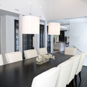
"With the original small rooms and passages swept away, we created wide, open-plan spaces that connected well visually and in terms of circulation," says Skaptason. "On the first floor, we created a central space around the stairs with most areas in proximity to this. The dining area was moved to the back of the house, adjacent to the kitchen, maximizing the benefit of floor-to-ceiling contemporary glass doors overlooking the new patio and a large swimming pool."
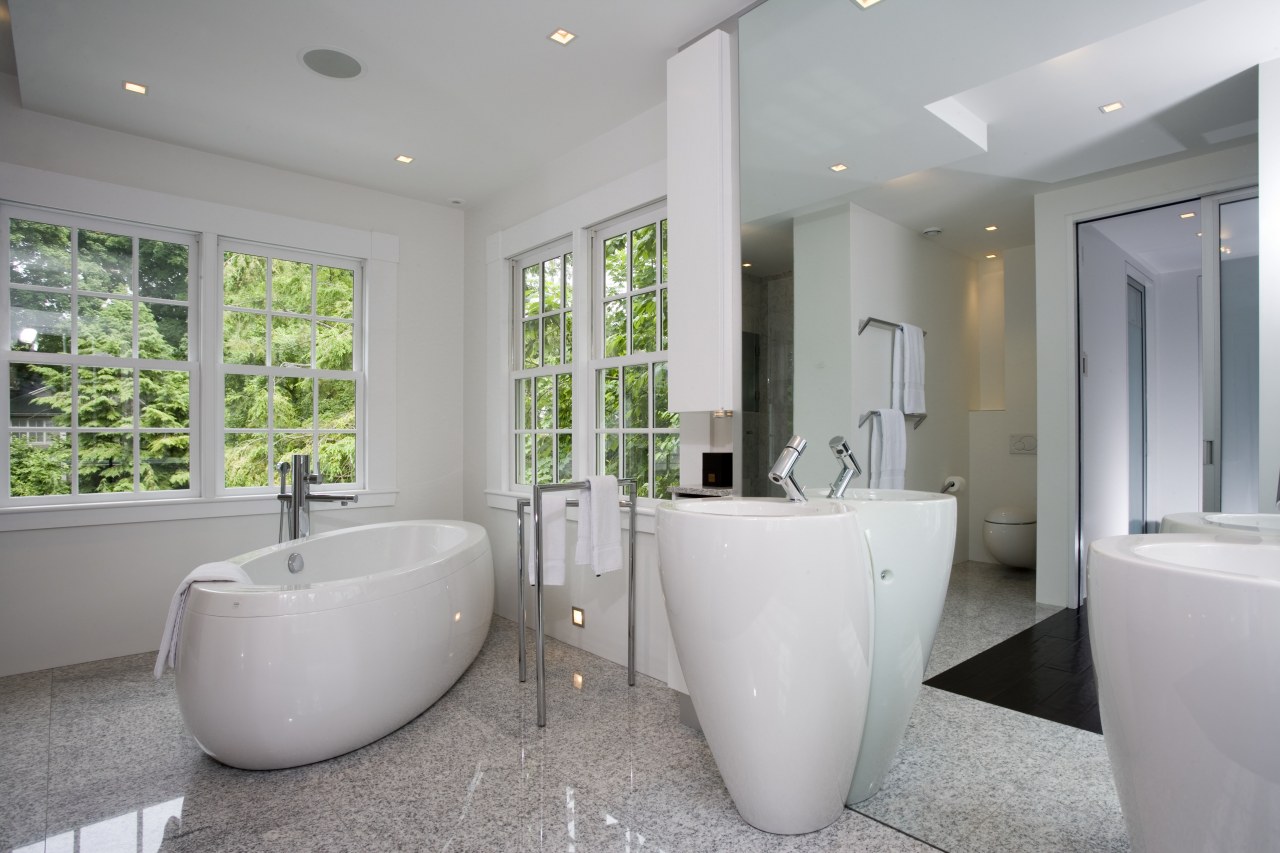
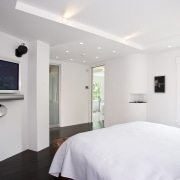
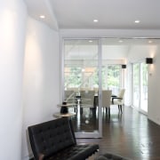
The reinvented living spaces are a picture of minimalist serenity with white walls, dark-walnut floors and ceiling planes that shift in level. The effect is simple, spacious and sculptural.
"Our approach to the living areas follows through on other levels of the house," says the architect. "The upper floors and freshly dug-out basement were also stripped back and modernized with the same emphasis on shifting ceiling planes, white walls and dark floors."
"Essentially, the design encourages the eye to read the spaces as volumes. In some cases, ceilings are pulled back slightly from the walls to allow glimpses from the stairs back down into the living area the house is full of architectural surprises."
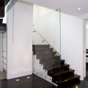
Other design elements include an undulating wall in the living area and a dramatic central stair with a glass balustrade that looks as if it has been slotted into the space.
"There are three similar staircases in the home, each linking different floors," says the architect. "An added feature of the first-floor staircase is the inclusion of the home's original plans, which are etched onto the glass of the balustrade."
Words etched or printed on glass also feature in other areas of the residence.
Continuity of materials and finishes is what draws the home together. Identical granite tiles are used on the outside and inside of the home from the classic frontage to the modern patio at the rear and on many of the interior surfaces in between.

Color also plays a part in uniting the disparate architectural styles. The white exterior links with the white interior walls, and the dark walnut floors can be seen as an echo of the feature jet black facade facing the street.
A less noticeable aspect of the remodel is behind the scenes, or rather behind the walls. Panel controls are the only sign of the newly installed smart-wiring throughout. A heated driveway can be cleared of snow at the touch of a button.
The new basement has a generous wine cellar, a gallery-style hallway and a machine room that houses the 25 computers that run the residence. An emergency generator set in the back yard ensures that if the national grid splutters, life goes on in the home uninterrupted.
Seen from the rear, the house effectively melds the new patio, modern doors and framing with the existing facade above white, gray and black hues combine to harmonious effect.
"Color is key to this project in several ways," says Skaptason. The sculptural ceilings, pulled-apart elements, the undulating wall all create light-and-shadow play that is gentle on the eye.
"We spend so much of our day bombarded with color and movement, it seems logical to create a home environment that provides respite from the insistent visual clamor of urban life."
Credit list
Builder
Excavating, site work, concrete
Heating
Paint
Roof
Steel
Glass
Lighting
Blinds
Oven
Microwave
Ventilation
Shower stall
Wallcoverings
Demolition
Electrical
Plumbing
Landscaping
Chimney and stucco masonry
Flooring
Lighting control
Kitchen sink, faucets
Cooktop
Dishwasher
Shower fittings, faucets
Features
Story by: Charles Moxham
Home kitchen bathroom commercial design
Radical yet respectful
Sculptural centrepiece
Curvaceous and connected
