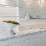
Anatomy of a deconstructed kitchen
Designer – and TIDA International awards judge – Mick De Giulio runs through the key factors in the evolution of this one-of-a-kind kitchen design
Tell us a bit about the house for which this kitchen was designed, and your overall involvement in the design process?
It's new construction.
The owner came to me originally, even before enlisting the services of an architect, and she had a few images of ideas she had for her new home.
A lot of the images were like stables and farmhouses – and we often referred to the exterior as inspired by 'a Belgian farmhouse'.
I suggested we use architect Michael Abraham, who I have worked often with in the past and is one of the most creative people I know. All three of use worked together with comments on everything from the exterior to the interior.
I helped the owner all the way through, not just the kitchen but also spaces such as the master bathroom, guest bathrooms, wine room and fireplace area – so it was an all-encompassing project.
It's stucco on the exterior, a plaster and wood interior and with wood and steel windows; done in a very unique European style. Contemporary, but warm contemporary.
How did your design process evolve?
The architect drew two big squares on a piece of paper – not even to scale – and said 'here's your area to work with’, and because I had worked with Mike so many time in the past, I understood his thought and process.
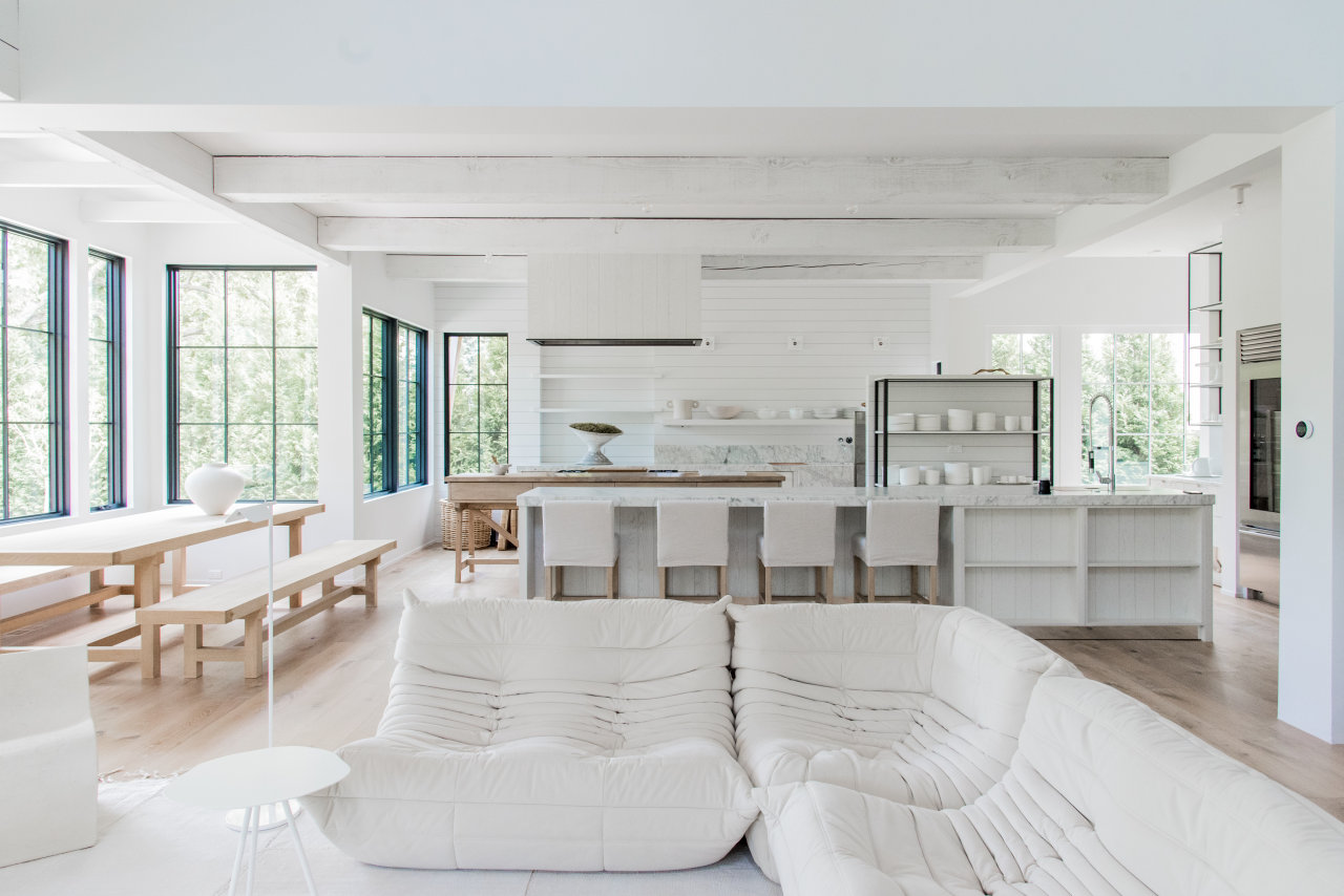
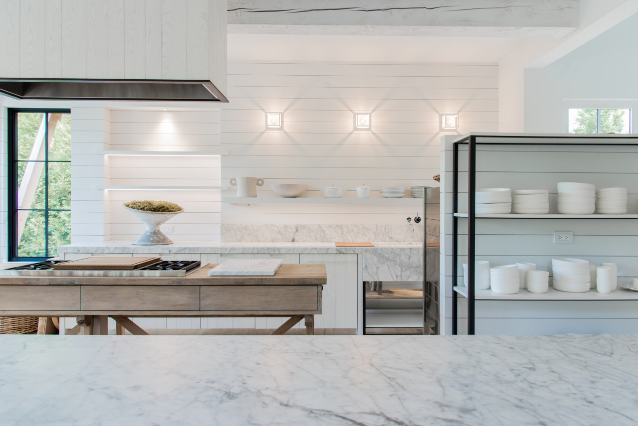
The layout has the outer island where you sit, and the inner island with the cooktop in front of the back wall with the sink area.
There are Sub-Zero refrigerators off to the side, which have glass doors – very simple, no decorative front panels, just honest stainless steel and glass doors.
I'd worked with this client before, so I knew how she used her kitchen. She was someone who did cook a lot. They are European and are all about connecting as a family with their meals.
So the layout and design is very functional.
I developed a special product for this project which is a translucent paint over a plain sawn white oak, so you can see the grain coming through, creating a texture to the finish.
All of the cabinets throughout the entire home were made this way.
We used random width planks for the doors rather than plain, solid veneer. So that adds texture as well.
There's also additional cross cuts against the grain that adds even more texture, which you don't really see until you're close to it and touch it.
But that subtle layer of texture added a lot of warmth to the house.
How does the kitchen fit into the overall plan?
Well, we really started with the kitchen, which then drove all of the decisions for the rest of the house, such as the cabinet finishes and flooring that would be used throughout.
It's an open-plan kitchen, but with a butler's pantry for servicing functions and coffee.
The main kitchen is open to the butler's pantry to the side – there's no door or strict delineation between the two spaces.
The kitchen connects to the family/sitting area, so both all spaces enjoy the presence of the fireplace.
Everything is off-set. Instead of the usual single axis, multiple axes were created so we could offset elements without being completely random, and still create balance and symmetry.
This gives the feeling that the various elements are layered into the space.
The other key feature is giving the elements more transparency.
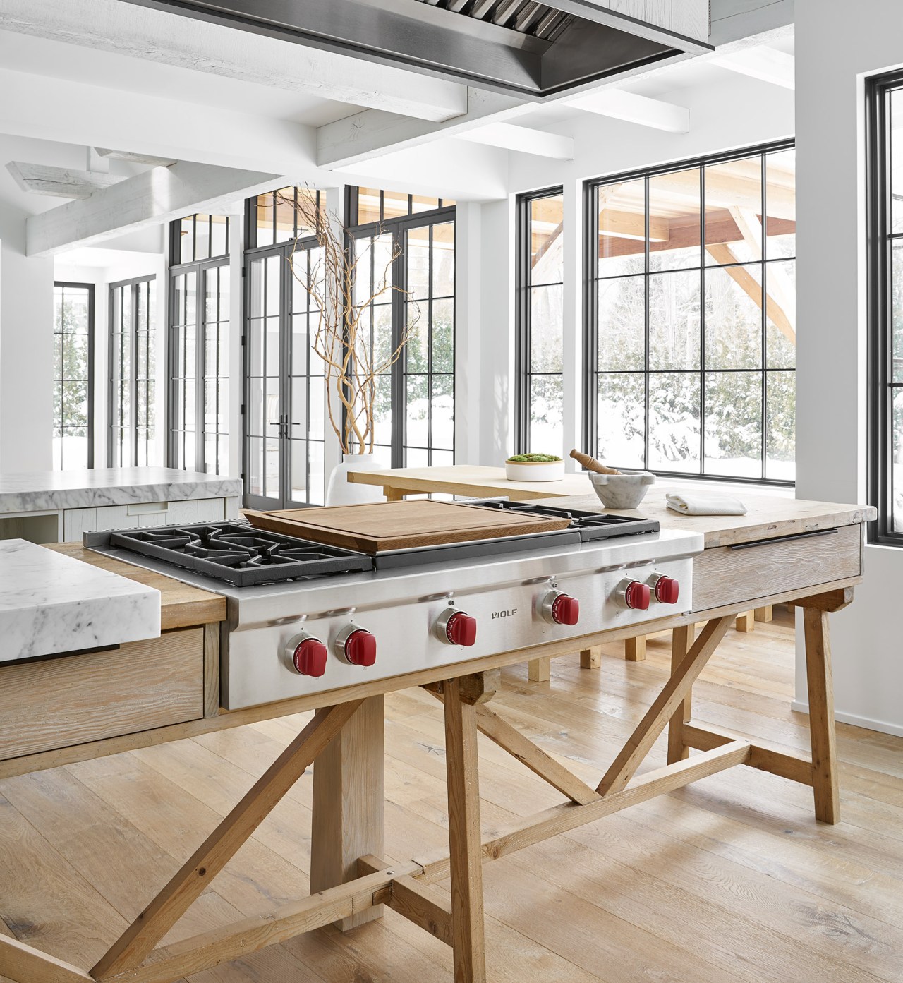
Like the cooktop sitting on top of a farm table structure with legs, and made of reclaimed wood.
Next to that is a very contemporary polished and brushed steel 'console', which houses the steam oven and a single oven. And that's also built on legs.
These two pieces are really stylistic opposites sitting next to each other.
They're behind a very narrow island – only 81cm – but about 3.65m long.
With elements like the cooktop table and oven console, it's almost like you've deconstructed the kitchen. How did you get to the point of doing that?
I'd designed an inspiration studio for an appliance company nearby and in that I was free to work with more of a mindset that 'anything goes'.
I was not working for a single client and perhaps felt more freedom in the design.
There I created elements like the cooktop table and the oven console, as well as other varied, non-traditional elements.

When the owners and I walked through that studio, we reviewed the pieces that they loved and I set about to incorporate versions of those within their space.
Because of that, the final kitchen design comes off as much more ‘collected’.
The other distinctive element in the design is that it's very white. Are there some things you have to be careful of when you're doing such a white space?
It's a leap of faith in doing a space like this.
But it's not just this space, the entire house is decorated in the same way – it's all white and with light and natural wood tones.
It can be scary doing that much white all the way through a home but, with the owner leading the way, we determined from the start that it would be this ultra simplified palette.
In essence we had created a big canvas.
At times we had to hold each other to this vision – but in the end I think the end result is spectacular.
Credit list
Kitchen design
Interior design
Countertops
Sinks
Oven
Ventilation
Accessories
Lighting
Architect
Cabinetry
Splashback
Taps
Cooktop
Refrigerator
Flooring
Designed by: Mick De Giulio, de Giulio Kitchen Design
Story by: Trendsideas
Photography by: Belen Aquino; Ryan McDonald
Home kitchen bathroom commercial design
