About face
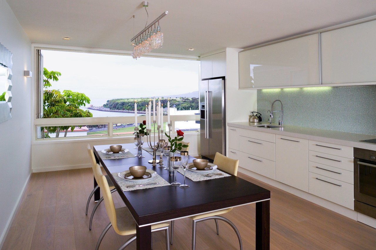
Relocating the kitchen to the front of this apartment created a light, open-plan space with full access to panoramic views

Most of us know that when it comes to buying a property, we're not likely to find something that perfectly fits the bill. The secret is to find a property where the pros outweigh the cons.
For the owner of the apartment featured on these pages, the building's construction and panoramic views surpassed the problems associated with the 1950s interior layout, says Kitchens by Design company director Linda Christensen.
"The original floor plan of the apartment with the kitchen tucked away in the rear was not conducive to a contemporary lifestyle."
Christensen says the solution was obvious, even at the initial visit stage, and her intention was to maximise the full extent of the living space by repositioning the kitchen at the front of the home.

"The owner is a very social person, so the kitchen had to reflect this. The one-wall design opens what is a relatively small area and creates maximum functionality."
Another feature that helps to create a sense of openness is the custom-made integrated cabinetry. Extending from the kitchen into the living area, the cabinetry creates a dynamic flow that draws the eye along the entire length of the room.
The cabinetry's dual capabilities of storage and display extend the functional capacity of both the kitchen and living area without altering the physical dimension of either.
Originally, the living and dining areas were split-level with mixed floor coverings. As a way of further consolidating the space, it was decided to level the floor and to use a bleached timber flooring throughout.

"What was once a series of sombre spaces with no connectedness has received a total transformation and is now a light, fresh environment great for entertaining and easy living."
The newly lightened interior has also received a lift thanks to the inclusion of full-width, bifold windows. The view is now fully accessible to the whole area and the abundant natural light plays off the various surfaces such as the glass mosaic tiles that make up the splashback enhancing the feeling of spaciousness.
"Overall, I would have to say that the general ambience of the space has been lifted to create a lovely, restful and clear feel that is the very picture of simplicity," says Christensen.
As for what was the original kitchen it's now an office.
Credit list
Interior designer
Cabinetry
Flooring
Blinds
Ventilation
Dishwasher
Kitchen manufacturer
Benchtops
Wall tiles and splashback
Lighting
Refrigeration
Table setting
Story by: Trendsideas
Home kitchen bathroom commercial design


