Street shy
Despite a modest-sized footprint and close neighbors, this home boasts spacious, light-filled interiors and a strong sense of privacy
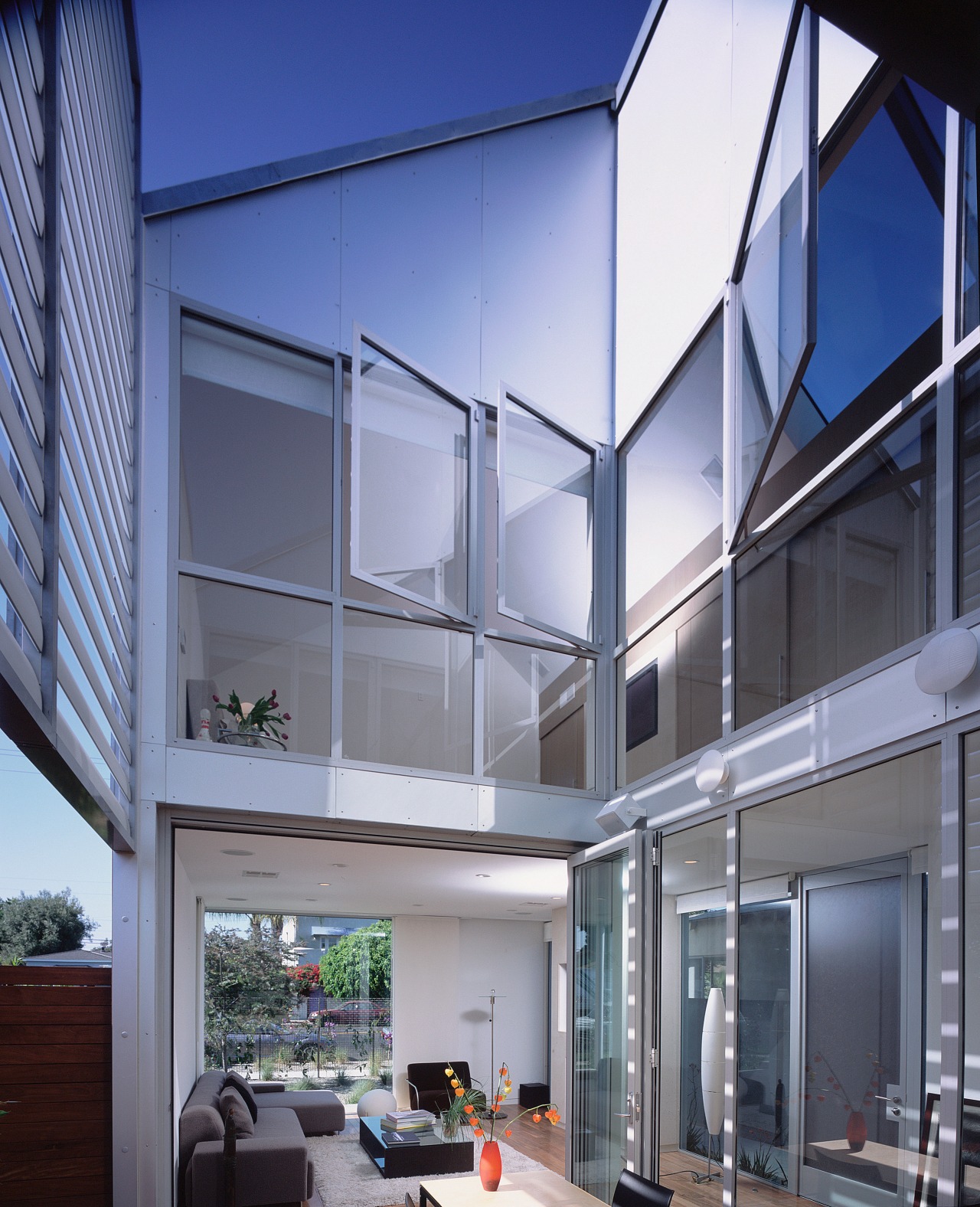
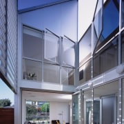
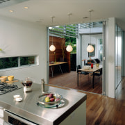
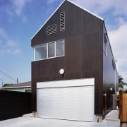
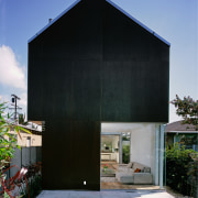
A limited plot of land with neighbors in close proximity might seem like a constricting situation for an owner whose primary goals for her new home are privacy and plenty of room to move. But by designing an open-plan house that focuses inwards – with extensive glazing looking out onto and across an internal courtyard – a feeling of separation and spaciousness can result. This was the approach taken by architect Cara Lee when designing this residence for a client on a narrow, inner-city lot with close neighbors. “The house presents a solid, dark, exterior shell to the world, with the interior all openness and light – a little like a hardy, sustenance-enclosing coconut,” says Lee. “An important aspect of this design was sustainability, and the coconut metaphor extends to this as well. The exterior is clad in a durable paneling made from fiber-core, a low-maintenance, renewable resource.” These fae§ades have been left unpainted, avoiding the need for surface refurbishment over time and minimizing emissions to the environment. “Set on a modest footprint of only 2700sq ft, the home’s spacious ambiance belies its actual size,” says Lee. “Two central elements contribute to this expansive feel. The first was effectively turning the home inside out, and having a central courtyard provide the main outlook for the home.” This courtyard is enclosed by shutters on the upper level of the house, but is open to the sky, flooding natural light down into the core of the residence. The interior is white and reflective – bouncing the natural light streaming in from the courtyard and skylight right through the open-plan spaces. The effect of looking out of the living room and through the courtyard to the kitchen on the other side accentuates the sense of space. High ceilings contribute to the airy feel, but there was also a second approach to creating the illusion of space. “A glazed panel at the front of the home is positioned to allow the eye to travel directly out to the street and neighboring gardens – effectively borrowing space visually,” says Lee. “The owner can stand in the kitchen and look through the courtyard and the living room to the streetscape beyond.” Despite this avenue of sight, the home is generally private. The internal courtyard is unseen from the street, and apart from the large glazed panel, the rest of the street-facing side of the house is closed off. Similarly, at the other end of the house, the fae§ade, barring a corner window, is completely enclosed. The front entrance is on the east side of the residence, opposite the cut-in courtyard. “Passive heating and cooling are important aspects of the eco-friendly makeup, and the courtyard’s positioning also plays a part in this.” Set on the west side of the home, the courtyard makes good use of sea breezes that come from this direction. Cross-ventilation is key, and when the sliding doors are open, breezes enter here and rise through the home, escaping through open windows upstairs or through the skylight. Aluminum shutters run across the upper reaches of the open side of the courtyard, and are angled to maximize light or shade, depending on the season. “In winter, the courtyard’s metal fae§ades attract and make the most of limited sunshine. This, combined with the living room’s natural gas fireplace, is sufficient to heat the entire house,” she says. The ecologically sound design ethos extends to the landscaping as well. Plantings were chosen for their low water requirements, and the fencing is made of recycled wood pulp set in concrete. There is no lawn to soak up water or require upkeep.Instead, gravel lines the paths to the house. At the heart of a good design is creating a welcoming place to come home to, and this can extend beyond comfort and convenience to the visual pleasure the sight of your house evokes. “This home is not about the owner advancing up the real estate ladder through buying and selling,” the architect explains. “Our client wanted a home to live in and call her own through the years. “When considering the exterior profile, we wanted it to exude the generic feel of a welcoming house, despite the contemporary make-up. A child’s eye might conjure a pitched roof, large window and plain fae§ade as a quintessential residence and this iconic symbol of a home played a part in the look of the final design.”
Story by: Trendsideas
Home kitchen bathroom commercial design
