Stone, bronze, wood and metallic-hued tiles combine to exotic effect in this luxury ensuite
Renovated penthouse master ensuite provides better connections between bedroom, bathroom and closet, plus greater storage and an exotic Moroccan aesthetic

Apartment renovations often come with two tricky design obstacles immovable walls and immovable services. For this bathroom, part of a whole apartment makeover by designer Kim Duffin, the walls were movable but the bathroom design had to work around fixed services.
"The owners wanted to achieve several things from the redesign, including the new suite being larger and open-plan with defined areas," he says.
Other requests included plenty of storage, including for shoes, twin showers and a free-standing tub. The couple also wanted elements and finishes to reflect their travels in Morocco.
"This project required careful consideration of all adjoining spaces," says Duffin. "The existing space was a collection of small rooms that lacked flow and functionality. Doorways were removed and walls reconsidered to achieve a spacious, relaxing master suite that enhances the lifestyle of the owners."
The apartment was on the top floor, so Duffin was able to use the large ceiling void to raise the height of both the bathroom and wardrobe. A coffered ceiling over the shower area hides mechanical ventilation and achieves a well-lit shower space.
"The position of existing floors wastes is always a major factor when redesigning an existing bathroom in an apartment. Adding a stepped curved shower wall allows for two shower heads to be set apart from the vanity area, while retaining the fixed waste position."
Storage comes with a high ticket price in a master suite. Here, space was reallocated from the adjoining dining room to increase the footprint and capacity of the wardrobe. Positioning mirror doors at the end of the wardrobe creates an illusion of increased depth and provides a full length mirror for dressing.
"We moved the wall between the bathroom and wardrobe to achieve a larger entry from the bedroom into the wardrobe, while also creating added depth in the wardrobe for shoe storage," says Duffin. "While we moved the vanity wall, the services had to remain fixed, so we concealed these behind a wardrobe cabinet kickboard."
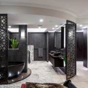
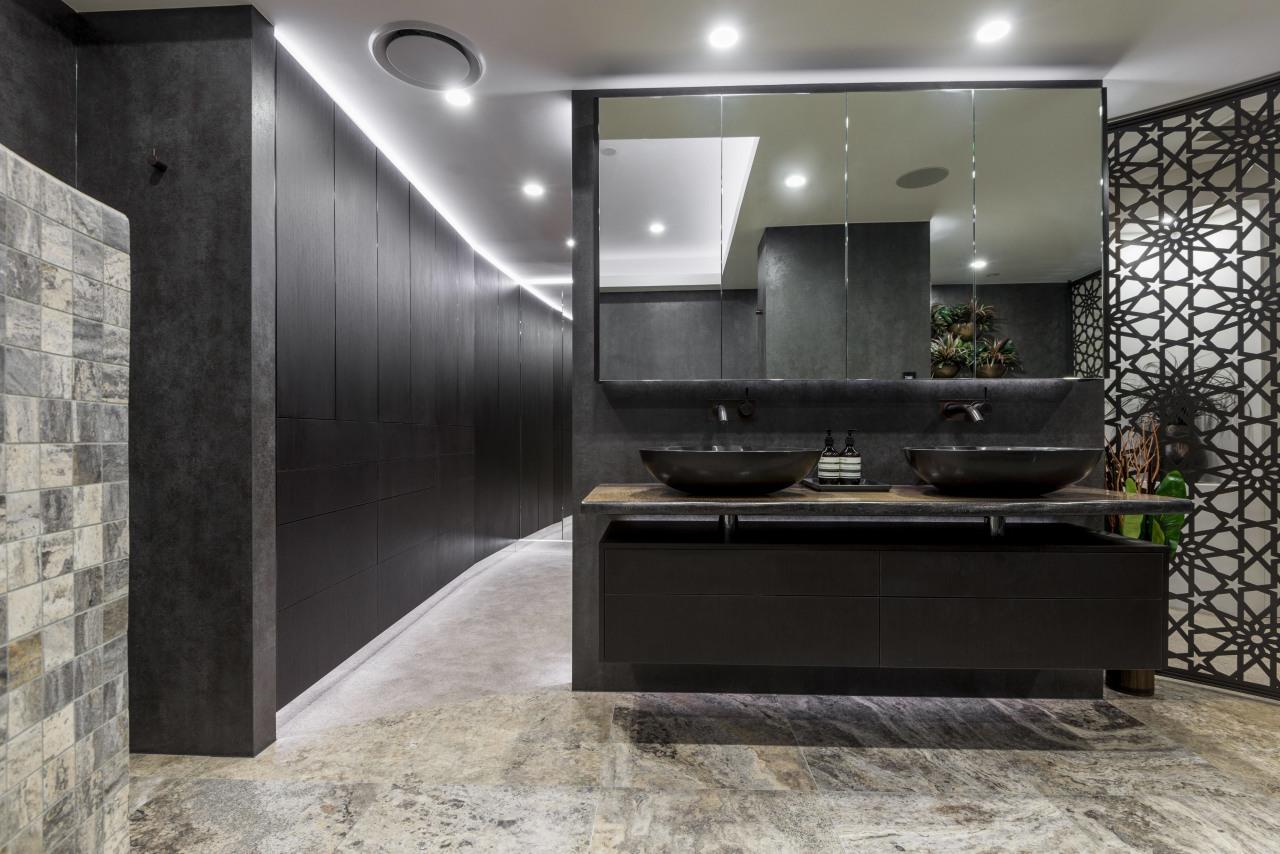
The double vanity is suspended off the floor, creating an illusion of greater space. The drawers and mirror-fronted cabinets provide ready storage, while the mirrors also reflect light and contribute to the overall sense of space.
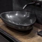
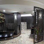
The soft lines of the freestanding composite stone bath and matching vanity basins enhance the feeling of openness between the areas.
Large format Neolith porcelain tiles clad the wet area walls and provide an easy care, low-upkeep space. Mitred joins in the panels create a seamless look throughout the lack of visible joins further enhancing the impression of space.
"Cladding a bathroom this way brings a real sense of luxury. Lustrous metallic tones in the tile add to the effect and we matched this tile with richly toned Platinum Travertine floor tiles. Travertine mosaics enable the curved wall to be tiled and so blend with the floors allowing the custom shower heads to become the focal point."
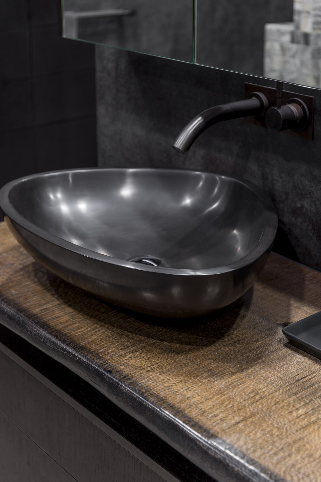
Handcrafted and plated aged bronze fittings bring out the warm copper tones in the wall panels and stone floor tiles, and help build the overall sense of luxury. Organic elements such as the lightly stained wood vanity shelf with a living edge and the curved bath plinth, plus the foliage in the bronze wall planters all soften the hard tile surfaces.
Energy-efficient LED lighting throughout the suite accentuates key design elements and creates task lighting where required.
"Powder-coated, bronzed, laser-cut screens bring another visual and functional layer to the space," says the designer. "The apartment owners have travelled extensively in Morocco and wanted to reference their travels through the interior. So, together with the exotic colour palette, we chose a Moroccan pattern for the screens."
These provide a soft visual buffer from the entrance into the suite, as well as between the sleeping and bathing zones.
The mix of rich elements make this master ensuite warm and inviting a sanctuary for the owners to unwind in at the end of the day.
Credit list
Designer
Benchtop
Floors
Wallcoverings
Lighting
Story by: Charles Moxham
Photography by: Steve Ryan
Home kitchen bathroom commercial design
Home Trends Vol. 33/7
While we might all have ideas for the home design that we want, consulting a good architect or designer will also open u...
Read More


