Snapshot of Japan
This restaurant was designed to rekindle patrons' memories of Japan
Returning home from another country, many people seek to relive the experience by dining at a restaurant specialising in that country's cuisine. It's not just the food that's important the design of the restaurant should also transport people back to the sights and sounds of their recent travels abroad.
Reminding patrons of holidays in Japan was part of Jason Caroline Design's brief for Japanese restaurant Kushiyaki. Jason Yung, one of the interior designers, says people living in Hong Kong travel to Japan on a regular basis.
"In Hong Kong, travelling to Japan is part of the lifestyle. Generally, people travel to Tokyo, which is very different from the rest of Japan. Tokyo is a combination of the modern and the traditional."
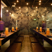
It was this synthesis of traditional and modern elements that Yung and his assistant Keith Chan wanted to emulate. One of the manifestations of this concept is the tinted mirrors used in the restaurant, etched with a Japanese flower pattern.
While the pattern is taken from a traditional Japanese kimono, the treatment of it is very modern enlarged and etched onto mirrors with a technique using acid.
As the restaurant is the first of a chain, the owners wanted a design that could be reproduced easily, but also something that would be distinctive. The tinted mirrors are a distinguishing feature and will be used in all future restaurants so patrons recognise the Kushiyaki brand.
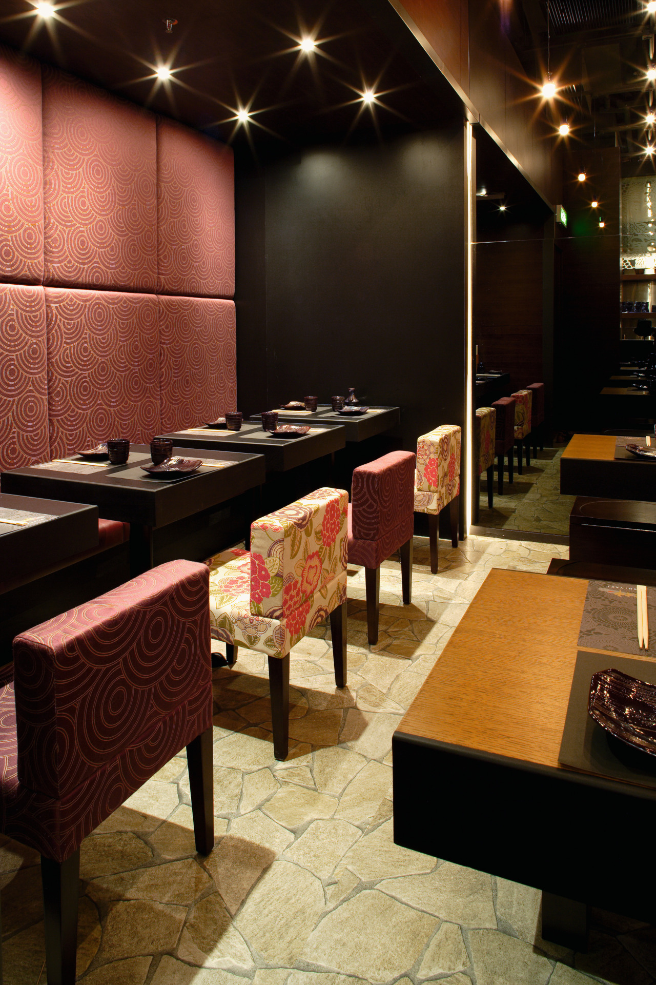
To keep a sense of dining in a traditional Japanese restaurant, small-scale chairs of the dimensions found in Japan were custom made from three different Japanese fabrics.
"Traditional Japanese furniture is about two inches lower than usual, and it is narrower. People in Tokyo are traditionally accustomed to sitting closer to the ground, partly because their ceilings are much lower," Yung says.
The designers had a very tight budget to work with. Using simple hanging light bulbs, black formica and tinted mirrors on the walls, and having furniture custom made helped to keep costs down. The slate flooring that was used in the entrance was also inexpensive.
"The only expensive thing is the tables. We wanted people to enjoy their tactile textures."
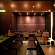
It was not just the budget that was tight, space was also at a premium in this compact downtown restaurant. Bench seating allows the maximum number of people possible to dine at the restaurant, and also ensures that the turnover is as fast as possible.
As Kushiyaki is a mid-range restaurant, the clientele was expected to be mostly teenagers who wouldn't mind sitting close to each other at the long benches.
For people wanting a more laid-back dining experience, a VIP room is provided near the entrance of the restaurant. Patrons sit on the floor on a tatami mat, and the area is defined by a screen of ropes and a stainless steel ceiling. The ropes provide a visual barrier, without completely isolating the area from the rest of the restaurant.
Credit list
Interior designer
Furniture
Story by: Trendsideas
Home kitchen bathroom commercial design
Classic dovetails contemporary
Small space, big impact
Continuity meets subtle separation


