Site’s unusual aspects used as design inspiration for contemporary new home
Decision to place guest rooms in a basement level rather than adding a second storey gave greater flexibility to the design of this bold and innovative home

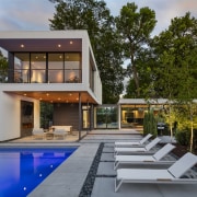


A deep and narrow L-shaped lot, with its prime lake and city views right at the back of the site doesn’t sound like the ideal starting point for designing a new home.
But being presented with just such a scenario didn’t phase Peterssen/Keller Architecture principal Gabriel Keller.
“When we looked at the site, we decided to takes its unusual aspects and use them as design inspiration and to our advantage,” he says.
Given the narrow frontage, and the way the site stepped up along its length, Keller says the home was not really going to engage with the street or its neighbours – something that suited the owners who are very private.
“This played into the site working well, because we could pull the main living areas back to accentuate the view, and could separate them from the street.”
Early in the planning process, both the designer and the owners determined that the master bedroom should have the best views – which meant positioning it on an upper level.
However the owners didn’t want the rest of the home to be a two-storey structure.
“They are empty-nesters with grown-up children who visit only occasionally, so they didn’t want to place guest rooms on a second level. Instead they wanted a basement level.”
Peterssen/Keller’s response to this specific combination of site characteristics and owner requests is a home that in itself is bold and innovative.

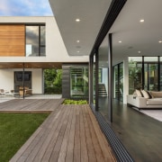
The plan consists of three pavilions – garage and entry in the first, the single level main living pavilion in the second, and the master suite in the back pavilion.
Excavating the site allowed two guest rooms plus media room, storage and mechanical plant to be placed under the main living spaces.
But this is not a typical basement level with an underground ambience lacking in natural light and outdoor connections.
“We put garden wells in between the pavilions and planted them with trees and undergrowth,” says Keller. “These bring light and landscape into the lower level so it doesn’t feel like being in a basement.”
The garden/lightwells have another advantage – providing a transparent link between the pavilions.
“From the lower level, you can look up to the living room, or from the living room you can see over to the study. It’s unusual to be in a house that looks in on itself.”
Having the main pavilion only one storey gave greater flexibility to the design of the master suite occupying the entire upper level of the third pavilion.
“Because of the orientation to the view, we knew it was going to be a glass box too. Architecturally, it’s a stucco plane that has been folded over, like a piece of folded paper. And then the folded structure is eroded to hold the expanses of glazing.”
Beneath the master suite is an outdoor room complete with a fireplace set into a support wall for the upper floor. Two slim, black steel poles provide support on the opposite side, so that the master suite appears to hover above, while the pool stretches out in front.

Alongside the predominant stucco components, black steel panels and cedar complete the material palette used for the home’s exteriors.
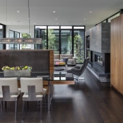
For the interiors, dark-stained white oak floors and white walls and ceilings create a restrained backdrop.
A series of sliding glass panels allows one side of the main living pavilion to be fully opened up to a deck and garden, that also connect to the outdoor room.
The opposite side of this pavilion also appears at first glance to be a glazed wall, with freestanding units – the fireplace, cabinetry and the kitchen – set against it. In reality these units are walled behind with the glazing just framing them.
Keller says that, together with the two light wells at each end, it feels like there’s glass all around you when you’re inside the main living pavilion.
“I didn’t anticipate the impact this would have until you’re actually inside the space. It’s a bit reminiscent of Philip Johnson’s Glass House.
“But it still feels like a private experience, even with all that exposure.”
Credit list
Design
Builder
Landscape architect
Roofing
Skylights
Wallcoverings
Lighting
Kitchen cabinetry
Oven, cooktop, refrigeration
Interior design
Structural engineer
Cladding
Flooring
Paint
Fireplace
Countertop
Dishwasher
Story by: Paul Taylor
Photography by: Paul Crosby
Home kitchen bathroom commercial design
More than an addition
Best of both worlds
Eclectic meets elan
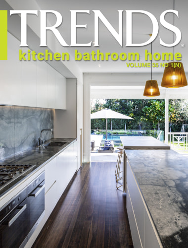
Home Trends Vol. 35/1
We talk a lot about kitchens today being at the heart of a home – a focal point where everyone can gather and be part of...
Read More