Rough diamond
Once a band rehearsal space, this loft has been re-invented as an expansive, open-plan, four-bedroom apartment
The rejuvenation of old office buildings into loft-style residences presents a range of challenges the primary one being the creation of a space that can accommodate modern living. This can be tricky given that these buildings were initially designed for a completely different purpose.
This six-storey neoclassical building, originally built in the 1850s, has a cast iron and limestone facade, though its construction is primarily timber. And because it is hemmed in by buildings on either side, windows are limited to the front and rear.
When architect David Howell bought one of the floors to re-fit for his own family home, he relished the opportunity ahead.
"The 280m² space had once been a practice space for an international band and was in a state of disrepair, so I had virtually a blank canvas to work with."
Howell identified his main problems as overcoming the limited natural light sources, and designing an interior that was spacious without make the inhabitants feel like they were living in a large box.
"The windows to the rear of the building are closed off by the bedrooms, so we established a large, open-plan living area that allows natural light from the front windows into as much of the space as possible," Howell says.
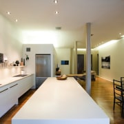
The main entrance opens directly from an elevator into the cavernous living space. This elongated room is punctuated by groupings of furniture, cabinetry and shelving the placement of which delineates the kitchen, dining and living areas.
All other rooms in the apartment feed directly off the living area, and are positioned around its perimeter. In doing this, the architect was conscious of creating elements of discovery and visual interest.
Curtains are used to close off the guest room and the pantry. A nook to the left of the main door is used as a library, while an anteroom on the right leads to the laundry, a bathroom and a storage closet.
"These add a dimension of depth and intrigue, and createthe impression that there is much more space beyond that of the main living room," Howell says.
Floorboards are 12cm-wide black American walnut hardwood. An epoxy resin border was added in lieu of skirting boards, subtly shifting the living space back a foot or so from the walls. The foot of the walls is raised slightly above the floor to give the impression that the space beyond is connected.
The original cylindrical columns, positioned along the central axis of the loft, are made of 150-year-old Oregon pine. Floorboards have been placed lengthways along the path of the columns, serving to visually segment the large living space.
Walls are painted to match the tones in the furnishings. They create a neutral backdrop and allow the colours and textures of artwork on display to have more impact.
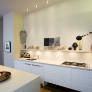
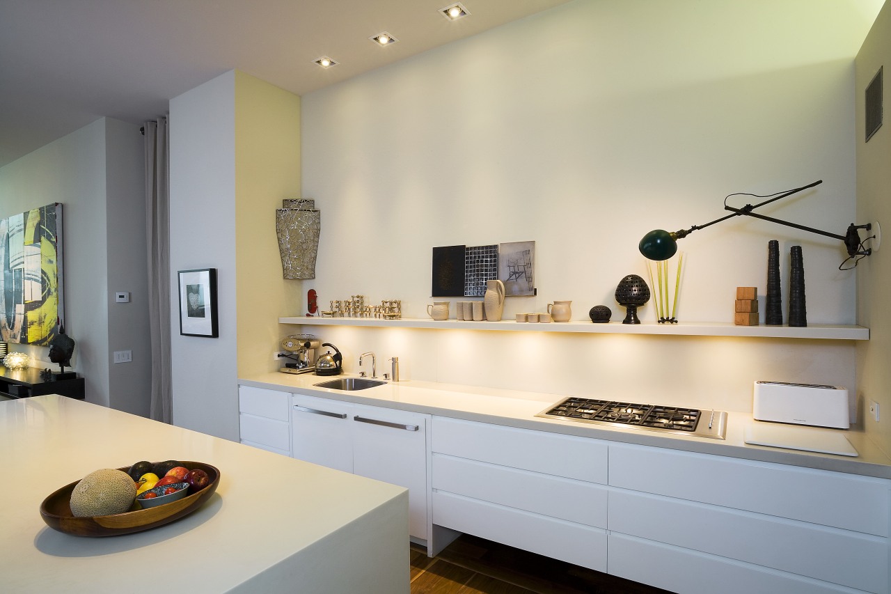
The kitchen is constructed to appear as unobtrusive as possible. And like most of the shelving and cupboards in the apartment, the kitchen island and cabinetry are pared back to create a streamlined appearance.
"We didn't want the kitchen to be a visual distraction, especially when it wasn't being used," the architect says.
A long shelf above the kitchen benchtop is used for displaying small artworks. It also serves to draw eyes away from appliances.
Credit list
Project architect
Kitchen manufacturer
Wallcoverings
Lighting
Furniture
Benchtops
Taps
Cooktop
Dishwasher
Bathroom vanity
Shower fittings
Accessories
Interior designer
Flooring
Paints
Drapes
Cabinetry
Kitchen sink
Oven
Refrigerator
Waste disposal
Taps
Toilet
Story by: Trendsideas
Home kitchen bathroom commercial design
Natural feel, natural outlooks
Walnut and weatherboards
Wonder wall
