Porcelain sheet, marble and wood create an upmarket feel in this master ensuite
Luxurious elements, flowing, organised spaces and a sense of drama all come together in this merged master bathroom and walk-in closet
A sense of luxury in a master suite can take many forms. High-quality materials, finishes and fixtures all play a part, but so can the appeal of a dramatic arrival or an elegant progression through spaces. Then there’s scale and volume. This exotic bathroom has all of these attributes.
The generous master ensuite with walk-in wardrobe forms part of a traditional two-storey house, says architect Sandra Diaz-Velasco.
“We were asked to design the renovation/addition to the wider existing home and make its interior spaces flow naturally. And this combined master bathroom and closet were just one component of the holistic renovation. One owner sought a dramatic space, while the other wanted a luxurious retreat were she could enjoy a bath, shower, and a separate spa tub.”

Prior to the upmarket renovation, the existing master bath and closet had been ill-defined and suffered from lost space in the corridors, poor lighting, and low, claustrophobic ceilings.
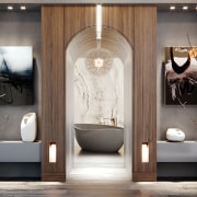
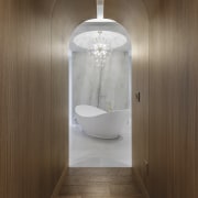
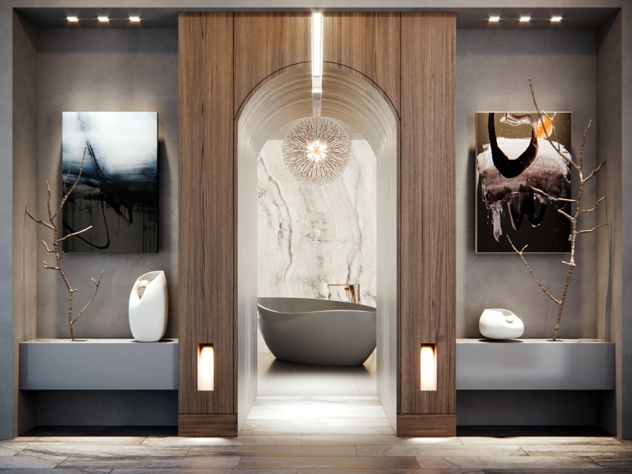
“We improved the layout by integrating the master bath with the walk-in closet, and creating a wood-panelled entrance connecting the master suite with the rest of the home,” says Diaz-Velasco.
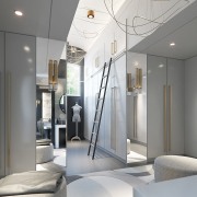
“The ceilings were reworked to achieve taller, vaulted spaces, and the dressing area, make-up station, and closets were united in one warm, open space flooded with natural light from tall windows.”
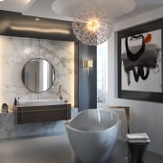
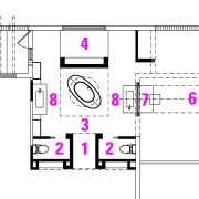
Framed by a wood panel arched entry, a curvaceous slipper spa bath is the centrepiece of the bathroom, highlighted by a chandelier set into a rounded ceiling alcove directly overhead. Identical his and hers vanities are positioned symmetrically on either side of the bathroom, while the shower area is at the back of the space. Behind the blade wall supporting the right vanity is the generous walk-in wardrobe. The his and hers toilet cubicles are set out of sight to left and right behind the entry walls.
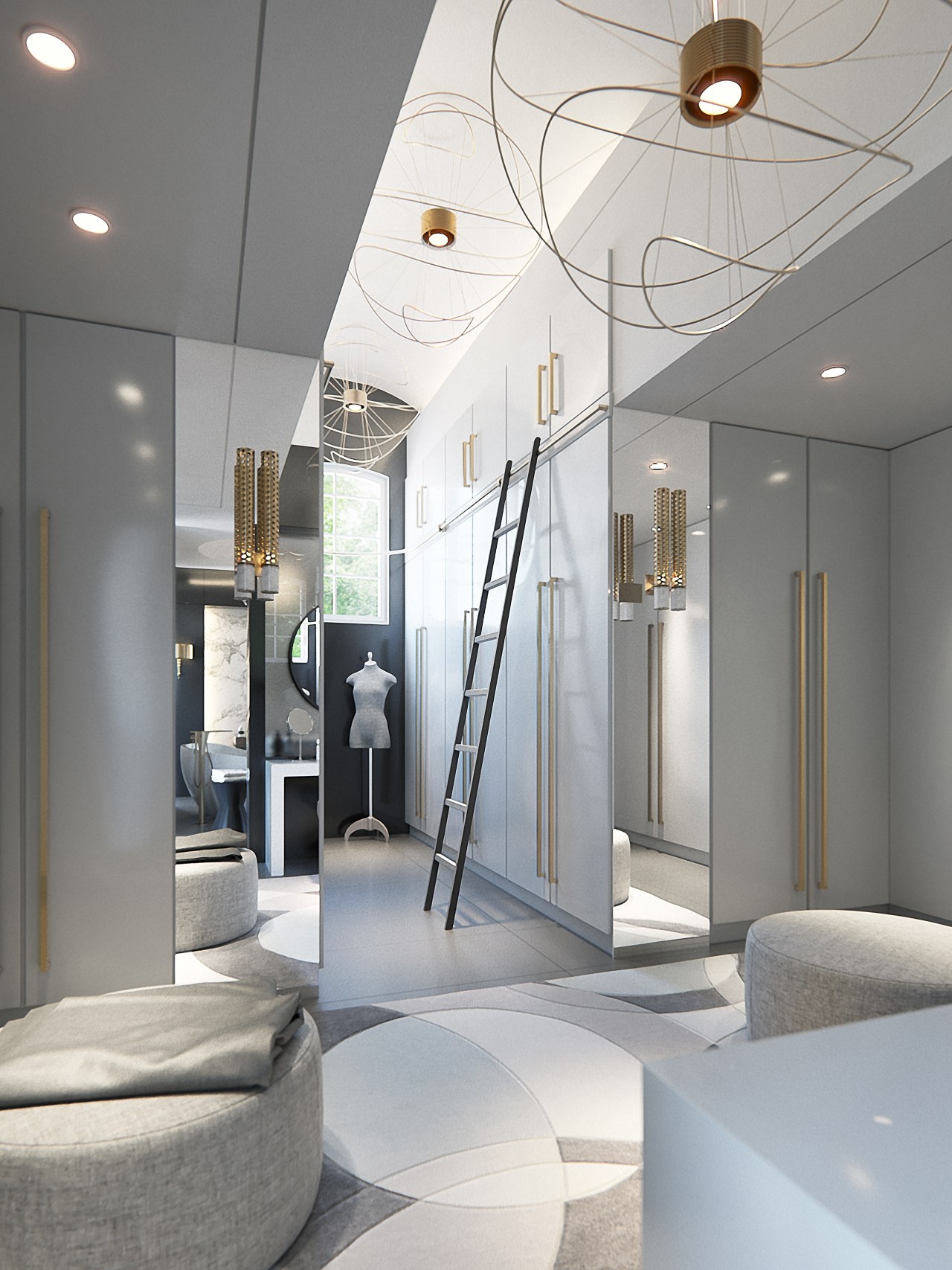
Within this refined, cleverly divided space, materials such as natural grey marble floor slabs and walls in onyx-look porcelain sheet add to the overall sense of luxury. Diaz-Velasco chose modern, sustainable materials where possible – such as the exceptionally slender wall sheeting.
The two custom vanities and make-up table add contemporary accents, while the top-mounted, rectangular vanity sinks and brushed gold taps add to the room’s crisp, opulent air.
If all this wasn’t enough, the lighting and circular mirrors also work their magic – helping to soften the ensuite’s right-angled architecture.
“We introduced a balanced interplay of natural and artificial light to provide cascades of gentle, softening highlights. Plus a careful placement of artwork and mirrors contributes to the warm sense of charm and relaxation.”
Credit list
Principal architect
Cabinet company
Vanities
Sinks
Taps
Flooring
Toilet
Awards
Builder
Tubs
Makeup table
Cabinetry
Shower fittings
Wallcoverings
Lighting
Story by: Charles Moxham
Photography by: Eugenio Willman and Juan Pablo Estupinan
Home kitchen bathroom commercial design
Small space, big impact
Classic dovetails contemporary
'Worthy of Architectural Digest'
Home Trends Vol. 35/3
There's a sense in which we've established a layout plan that is the basis for nearly all new kitchens – one in which th...
Read More