Past is present
Both the design and material palette of this new Millbrook show home reference the original gable-roofed farm buildings that once stood on the site


There was a time when new subdivisions were allowed to develop in a higgledy-piggledy manner, with no thought given to an overall design plan.
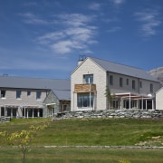
Contrast this with the latest development at Millbrook Resort near Queenstown and it's easy to see why strict covenants are now de rigueur for prime locations.
This show home is one of 13 houses to be built in the first stage of a carefully conceived master plan development that maximises Millbrook's natural amphitheatre setting and spectacular views of the mountains and golf course.
The houses in Coronet Square, designed by Haden Emslie of Haden Emslie Architecture, are similar to other properties at Millbrook.
"Around 150 years ago this land was a wheat farm," says Emslie. "The master plan for the Millbrook development references the original farm buildings that once stood on site. For example, houses are grouped in clusters and every building has a gabled roof with a 37° pitch. The rural vernacular extends to the material palette, which includes local schist, rusticated weatherboards and solid plaster."
Emslie says the unadorned facade on the end of the show home helps define the strong form of the gable. This form is reinforced by recessed windows that add visual depth to each elevation. A chimney on the outside of the house also adds a sense of substance and helps relieve the expanse of textured plaster wall.

As with the other houses in Coronet Square, the show home comprises two main volumes. The smaller wing accommodates a guest suite, which is joined to the house by a flat-roofed linking element that also houses the entry.
"Each house is designed to maximise the view, while also providing privacy from neighbouring properties," says the architect. "The houses are set on a knoll, in a terraced, koru-shaped cluster that makes it easier to gain privacy."
A simple layout defines the interior, with the ground floor of the main volume accommodating an open-plan kitchen, dining and living area.
Interior designer Jean Foster of Foster and Burke Interior Designers says the interior was designed to appeal to a broad spectrum of potential purchasers.
"But I didn't want it to look too impersonal, so it has been infused with the human touch. The art works, for example, include Picasso and Matisse prints of line drawings, rather than heavy landscapes."
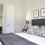
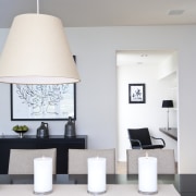
Foster opted for a mainly monochromatic palette with bold patterned wallcoverings in circulation areas.
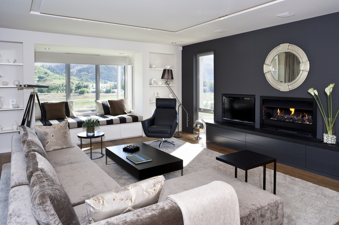
"Because the winters here are long and cold I wanted the interior to feel warm and cosy, without being too cloying. For this reason, there are curtains or shutters in most rooms, rather than blinds. While we have introduced blinds in the living area, they are covered with a natural sheer fabric.
"Most of the surfaces in the house are a sandy beige or off-white, but we introduced a dramatic charcoal wall to the living room. The dark shade carries through to the circulation areas, creating visual continuity. The charcoal also provides a gallery space in the hallway."
The kitchen, designed by Rachel Barnes of Ingrid Geldof Design, continues the light and dark theme. Lacquered off-white cabinets are contrasted with dark-stained oak veneer, which echoes the grain of the oak flooring.
The bedrooms feature a similar monochromatic palette.
Credit list
Interior designer
Landscape designer
Kitchen manufacturer
Cladding
Heating
Audiovisual equipment
Kitchen cabinetry
Ovens and cooktop
Refrigeration
Kitchen and bathroom designer
Builder
Roofing
Flooring
Furniture
Blinds
Benchtops
Ventilation and dishwasher
Story by: Colleen Hawkes
Photography by: Jamie Cobeldick
Home kitchen bathroom commercial design
