Modern face-lift
A contemporary interior has been created in this colonial home


People buy houses for all kinds of reasons. But that doesn't necessarily mean they like everything about it.
The owners of this colonial house loved the size and location of their new home, but didn't care for the interior, which included colonial detailing such as crown moldings, brass fixtures, and raised panel doors.
"It looked too much like a cookie- cutter home. We wanted it to have more individual character about it," they say.
Architect Andreas Charalambous from Forma Design was asked to make some subtle, yet appropriate changes.
From the outside, the house appears to have changed very little. Multi-mullioned windows were replaced with large panes of glass, a flush front door added, and brass fixtures replaced with chrome.
The interior, however, was gutted. Kitchen and bathroom fittings, stair railings, lighting, dark floors, and colonial detailing were all removed.
An unused library/music room off the foyer was taken out to create a more open space. Guests are now greeted by a small, informal seating area and a colorful Henri Matisse painting on the wall.
The home's dark oak floors were stripped back and lightened with a natural water-based sealant.
A new oak staircase with maple-capped steel railings replaced the original carpeted staircase and picket stair railings. The maple matches the color of the floors, while the painted steel matches the color of the accent wall in the foyer.
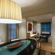
The living and dining rooms off the foyer are the only rooms in the house to retain their existing crown moldings. "We kept it in these two rooms because they are more formal and used for guests. The rest of the house is a lot more casual," says Charalambous.
By enlarging the opening between the two rooms, guests are able to circulate more freely when the owners entertain.
Forma Design custom made the dining table, buffet and mirror in the dining room, and the rugs in both rooms.
The dining table, made from maple with an inlay of sandblasted glass, was designed in an oval shape to work in with the principles of feng shui, and comfortably seats up to eight people.
"The space is treated in a very modern way, so you could put in any furniture you liked and it would work. In this case, the clients' taste was very modern," says Charalambous.
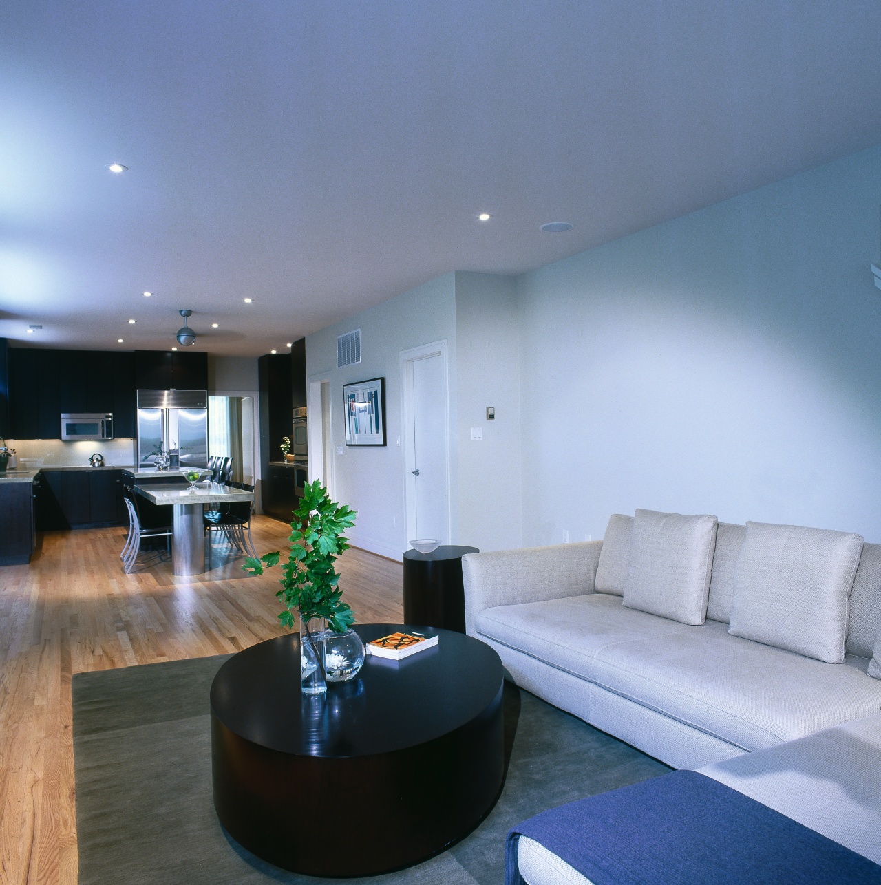
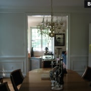
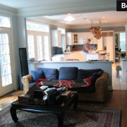
In the original house, the kitchen was separated from the family room by a low wall. There was an opening there, but the two rooms did not communicate.
The wall was knocked out to create one large living and entertainment area, which is reinforced by the continuation of the wood flooring in the kitchen.
The lower kitchen cabinets were replaced and new full-height upper cabinets added. These were finished in a chocolate-stained wood to match the furniture in the family room.
The kitchen island was extended to create a cantilevered dining room table with the same olive-colored concrete top as the kitchen countertops. It is supported by a stainless steel column, which adds to the modern look of the kitchen.
Incandescent lighting was replaced with halogen lighting, and hanging copper pots and pans replaced with a stainless steel fan to give this space a further boost.
The rug and concrete fireplace surround in the family room were designed to match the kitchen countertops.

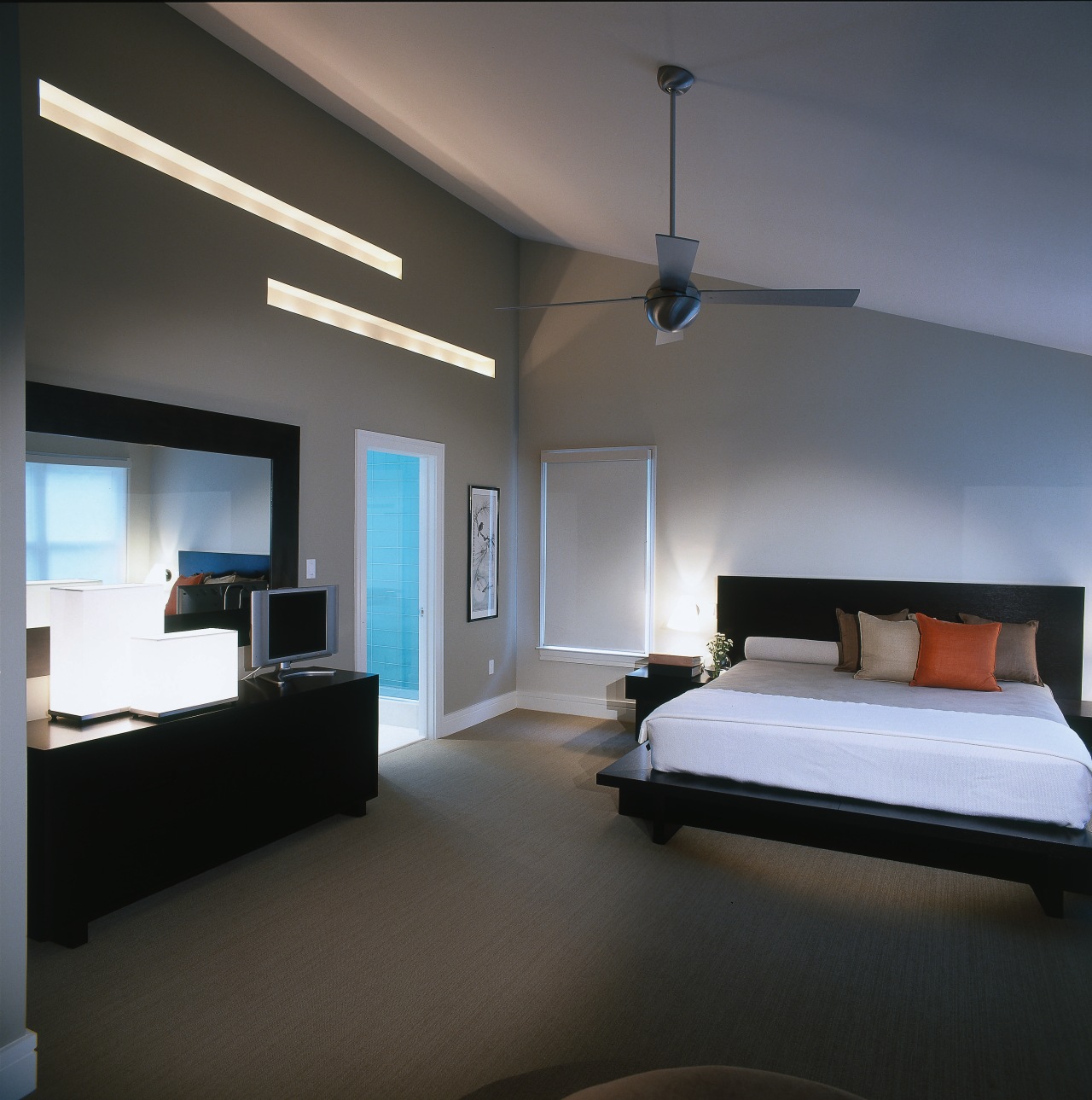
Upstairs, the home was modernized with new carpet and furniture, and made brighter with additional lighting.
In the master bedroom, wall sconces were installed on the wall either side of the bed and two cut-out strips of light added over the door between the bedroom and bathroom.
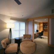
The master suite connects to a study, which used to have narrow double doors. This doorway was widened and replaced with sandblasted plexiglass sliding doors, which allow more light into the study.
Freestanding furniture was replaced with his-and-hers built-in desks, vertical bookcases and filing cabinets.
Because the bedroom/study was such a large area, a small seating area suitable for reading was established between the two spaces.
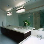
In the master bathroom, a diagonal bathtub was replaced with a straight tub set in a custom-made concrete pedestal. The pedestal acts as a bench in the walk-in shower.
Concrete was also used for the bathroom vanity tops, which sit over floating cabinetry, and were stained the same color as the kitchen cabinetry downstairs.
Full-height mirrors were added to make the room look bigger, and the cut-out strips that add light to the bedroom add light here too.
The finished result is a home that has clean lines and flowing spaces, yet has retained some of its original character, says Charalambous. "The quality of the space is consistent throughout. It flows well and makes the house feel more spacious."
The owner says even though the home has a modern design, the extensive use of wood still gives it a warm feeling.
Credit list
Builder
Paint
Furniture
Window coverings
Countertops
Sink
Cooktop
Dishwasher
Vanity
Shower
Tiles
Bathroom lighting
Flooring
Rugs
Kitchen and bedroom fans
Kitchen cabinetry
Backsplash
Refrigerator
Bath
Faucets
Bathroom flooring
Toilet
Story by: Trendsideas
Home kitchen bathroom commercial design