How to double the size of a rundown Mid-century Modern home while retaining the original building’s distinctive structure and character
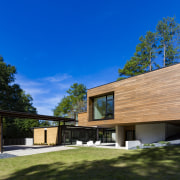
Moving bedrooms and bathrooms to a new structure, set back from the 1950s home means the only physical connection between the old and new is a glazed bridge sitting lightly on the original home’s roof
Over sixty years since they were first built, Mid-century Modern homes can still attract enthusiastic buyers. There’s something about the simple structure and layout, and lack of adornment that still says ‘modern’ all these years later.
Yet some things have changed – such as the type and size of spaces required for modern family living and the development of the surrounding neighbourhood in which these houses were originally built.
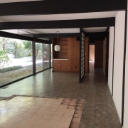
When the owners of the home shown here first visited the property, it was an original 1950s Mid-century Modern still occupied by one of the couple it was built for – and with all its original features.
However, lack of maintenance meant it was in a dilapidated condition, making it ripe for teardown and replacement with a large traditional-style home, such as others in the neighbourhood.
But that’s not the track the prospective owners wanted to take, says architect James Choate.
“They had contemporary taste and wanted to keep it,” he says. “But it was only half the size they wanted for their new family home, and they couldn’t imagine how to add to it without ruining it.”
Choate says this set the goal for his plan for the house – doubling the size, while resurrecting the original 1950s box and minimising the impact on it.

His solution was to build a separate addition away from the existing building, so new and old could be distinctly read.
“By moving all the family bedrooms to the addition, we were then able to go in and edit the original little box – to clean it up and make its lines more pure,” he says.
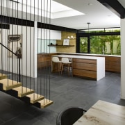
This involved taking out cabinets and a laundry that was inexplicably placed in the centre of the living space, as well as removing walls for the kitchen to extend into the bigger, more open area it needed.
The result is a large rectangle of uninterrupted space from one end to the other, which accommodates all the family living functions.

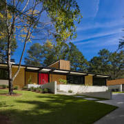
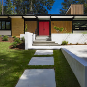
The original great bones of the house still feature, with yellow brick walls on the front and side elevations, and the exposed wood post and beam structure having been extensively restored.
All original window openings were retained – including the full length wall of glass opening the home to the back of the property – but with the existing single pane glass replaced by double glazing.
The front elevation of the house was restored and opened up to the street with the removal of a carport that had sat in front of it. It has been replaced with a more discreet, detached garage to the side.

While the addition is also a box-like structure, the use of stucco and cypress on the exterior contrasts with the original.
And where once there was a small concrete patio and overgrown backyard, there is now a large outdoor living area and pool sitting between the two buildings.
Choate’s final part of the design challenge was how to connect the new structure to the old.
“Our goal was for the connection to touch the original building as lightly as possible."
His solution was to raise the addition on a podium, allowing the circulation link to sit above the existing house, with a glass bridge passing over the pool and across to the addition.
“There’s just a small slot in the roof, and the stair extends down from this. So it’s literally just one little finger reaching over and touching the roof, and then dropping down into the room.
“Suspended with steel rods, the open-riser stair is transparent enough not to impede the openness of the main living area and its unbroken expanse of windows.”
Credit list
Architect
Builder
Kitchen design
Flooring
Pool
Lighting
Furniture
Countertop
Faucet
Refrigeration
Waste disposal
Vanity countertop
Tub
Structural engineer
Interior designer
Cladding
Windows
Paint
Blinds
Kitchen cabinetry
Splashback
Oven, cooktop, ventilation
Dishwasher
Bathroom cabinetry
Basin
Faucets
Story by: Paul Taylor
Photography by: Phillip Spears
Home kitchen bathroom commercial design
Continuity meets subtle separation
Classic dovetails contemporary
Small space, big impact
Home Trends Vol. 36/1
While a bathroom may no longer be regarded as 'the smallest room' in a home, the extra space now allocated to it doesn't...
Read More

