Heritage-protected elements and contemporary improvements are merged in this renovation
Four level house remodel by designer Charles Alexiou brings indoor-outdoor flow, larger windows and improved interior connections
The constrictions of classic forms can often bring out the best creatively in artists and poets. And similar can be said for architects. Having to work in with heritage building guidelines can be just the starting point for design innovation.
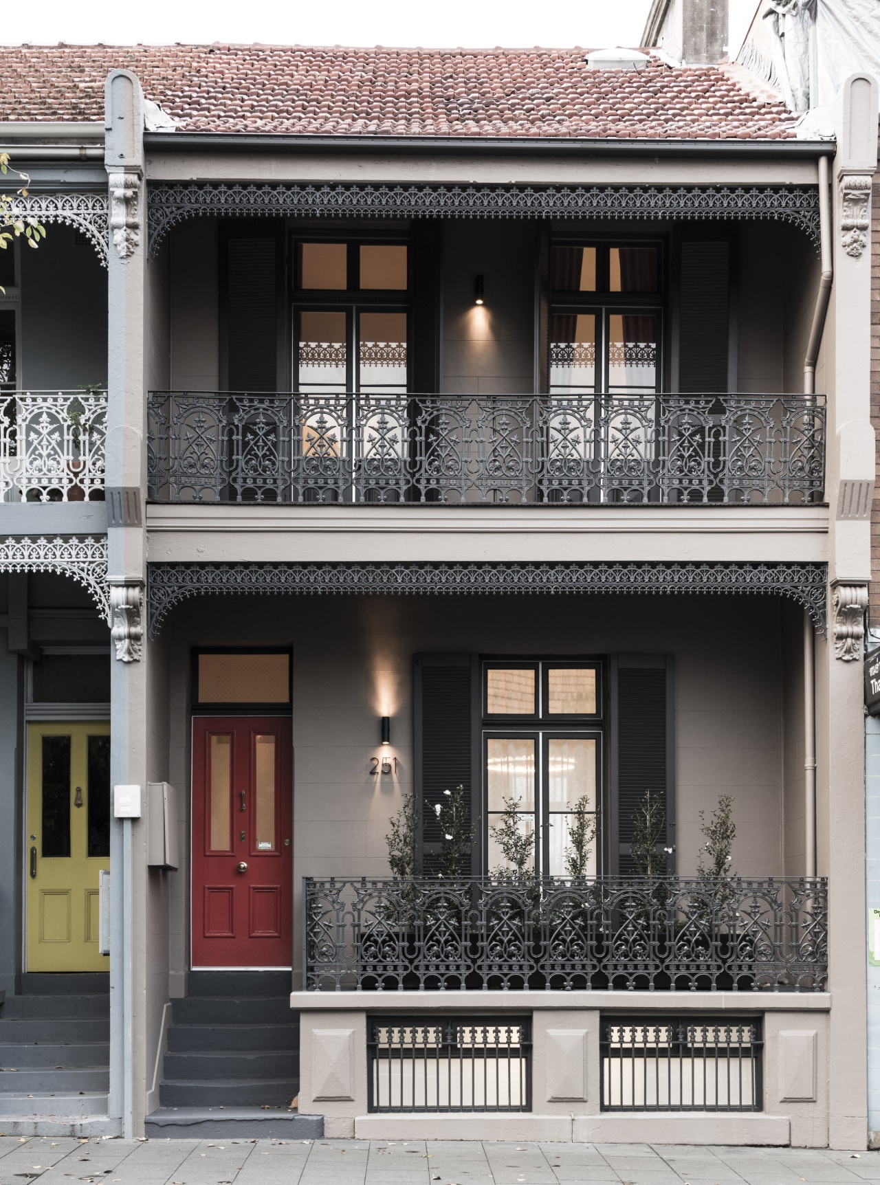
The owner's wish list to designer Charles Alexiou for this four-level terrace house rethink was quite long. While retaining the protected front facade, existing roofline and the ceiling heights, he was to reconstruct the damaged rear facade and open up the interiors to light and views. Bedrooms and bathrooms were also to be reconfigured and expanded and a new kitchen introduced in the heart of the home. Other work included reconsidering a section of the staircase and adding a pool, spa and garden to the rear.
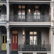
Outside, the front facade was restored and painted while the rear face was reinvented in a modern composition with broad window openings, using grey aerated concrete, says Alexiou.
"I designed fins around the wood-framed windows to bring visual and acoustic privacy. The small Juliet balconies to one side also had to be retained and integrated into the design."
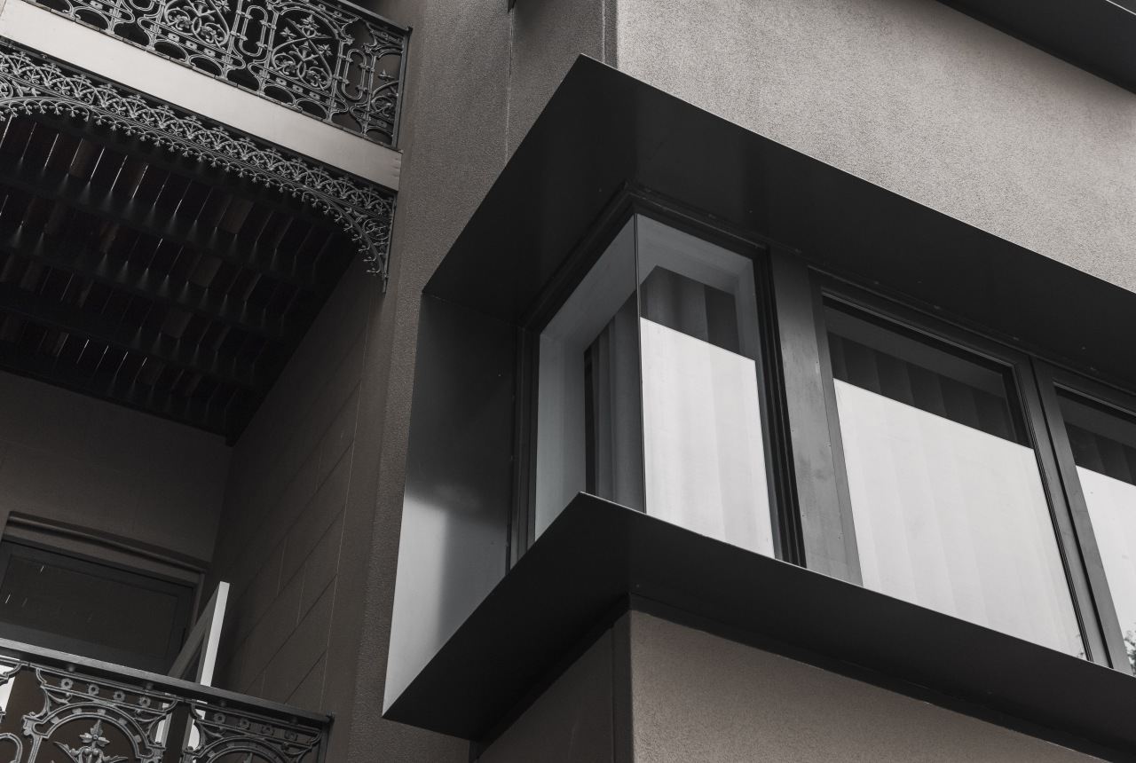
Working with the immovable roofline, the designer expanded the existing dormer to again capture more light and views. Other exterior work included adding the pool, spa and garden to the rear, with the updated carport beyond.
The interior remodel, however, was even more comprehensive. As the house slopes down from the street, barely visible basement windows seen at the front become part of a full ground level at the rear. The kitchen at this level was removed and relocated above to the first floor, freeing up space for an expansive games room and a larger informal lounge with a generous indoor-outdoor connection out to the pool and garden at the rear. A stair landing was also added at this ground level, replacing an unsafe, overly steep section of the staircase.
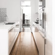
Now better positioned a floor up on the first level, the contemporary new kitchen is central to day-to-day family life with easy connection to the reworked dining area and lounge.
"As a result of earlier work, the back rooms of the home are set down a few steps and we retained this tricky configuration to preserve heritage ceiling height limitations. Playing this up, we created a visual link between the lounge and new kitchen using decorative breeze bricks allowing light to flow through the rooms."
On the second floor, a sitting room was reworked to add a bathroom for the existing bedrooms on this level and a welcome study, or parent zone there are six children in the family.
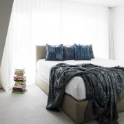
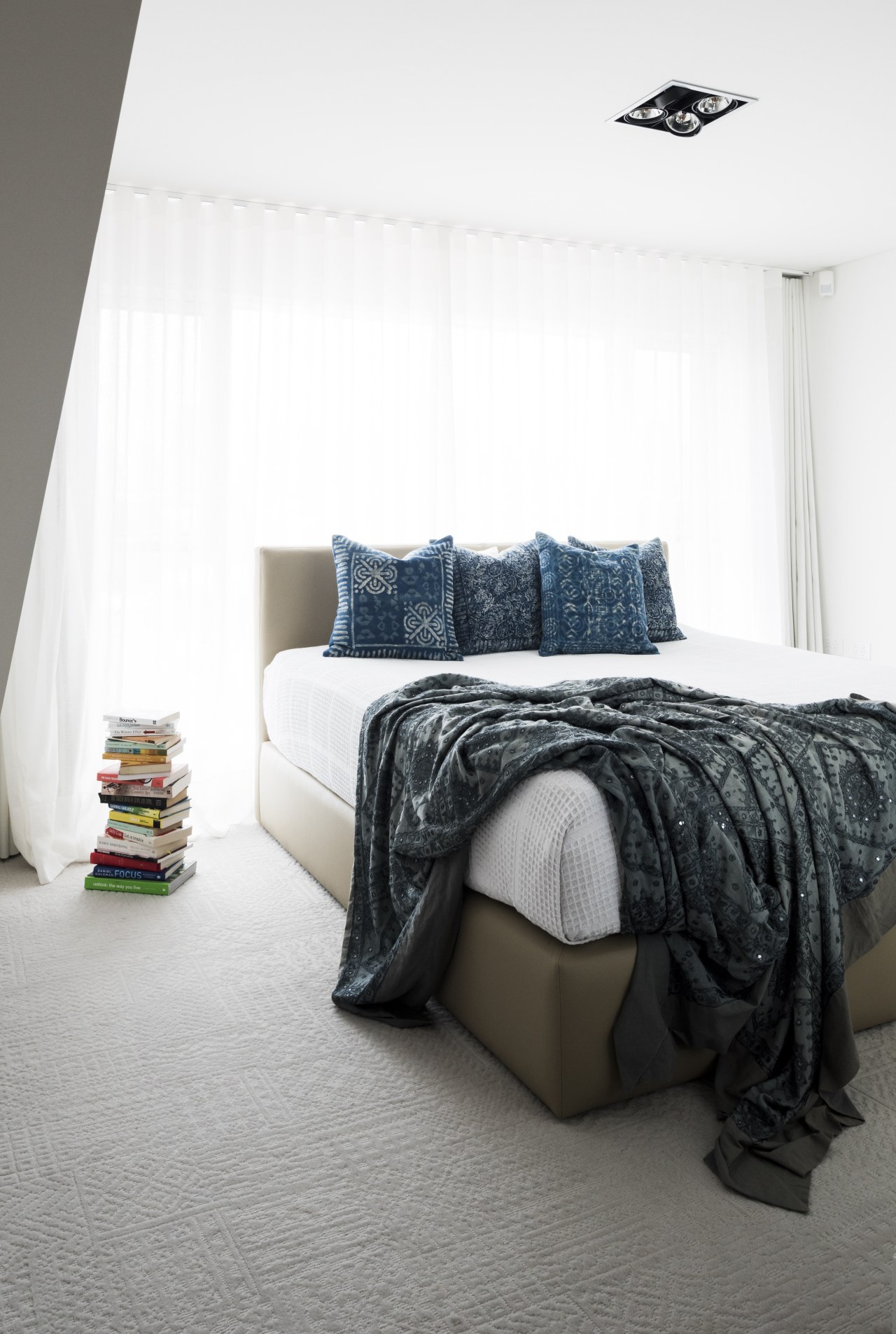
"On the top floor we delved further under the roofline to gain more space for the expanded and reconfigured master suite. To achieve wardrobe space, we faced the bed looking inwards but added mirrors on the wardrobe that reflect the city views capturing these from the bed was another client request," says Alexiou. "The facade of this house remains almost the same, but nearly everything behind that has changed."
Story by: Charles Moxham
Photography by: Tom Blachford
Home kitchen bathroom commercial design
Small space, big impact
Tranquil waters
Continuity meets subtle separation
Trends Vol 32 No 2
If you're planning a new kitchen, you won't want to miss out on this latest edition of myTrends HOME – we've got all the...
Read More