Five linked pavilions resembling farm buildings add up to one luxury home in a rural setting
From a distance, this rural home resembles a group of classic farm buildings while closer up, the strong architectural forms reflect a more modern sensibility
Great architecture will always respond to its setting – as perfectly exampled by this home by house designer Mark Wilson.
Located on a rural property, the home is understated in the setting – from a distance looking like a group of classic farm buildings. The barn-like individual pavilions, combined with their low profile, downplay the presence of what is in reality a generous 500m² family home.
“Because we wanted the home to be low-slung, so not too imposing, we created all five pavilions with the same span which in turn gives them all the same height,” says Wilson.
However, this is only half the home’s design story. On approach, the home reveals a more modern sensibility, with the pavilions having sharply defined gable ends in poured concrete. Similarly, the crisp lines of the standing seam steel roofs also evoke a contemporary vernacular.
“And the joinery style also contributes to this sharp look,” says Wilson. “It sits seamlessly as if there is no defined interior or exterior break.
Adding to the strong, simple look, the house is two-tone in colour. The roof, garage doors, and window joinery are in a dark Ironsand colour, contrasting the dominant white wall finishes.
While the grouped exterior building forms have a rustic echo, once inside the front door, this home is all about modern, luxury living.
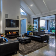
Past the three-car garage pavilion, the home is entered from the side. The home office, which is used for client meetings, is directly to the left of the front door, keeping the rest of the house private. The front of this north-facing pavilion contains the formal lounge.
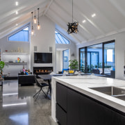
However, walking straight ahead visitors arrive instead at the central informal living pavilion, which includes kitchen and dining.
The home also has 60m² of covered outdoor living space and this, along with the large pool, extends northwards from the central volume.
At the other end of the central living space there is a link to a tucked-away rear pavilion that includes children’s bedrooms and a dedicated teen lounge. A sliding door can separate off this spacious, elongated wing to the benefit of either parents or other family members.
Continuing straight ahead instead you arrive at the private fifth pavilion, home to the generous master suite and a guest bedroom.
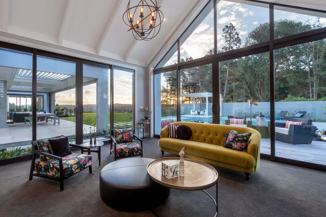
As well as facilitating a flowing family life, the contemporary interiors also respond to the exteriors. While the roofs are fairly low from the outside, taking the ceilings right up to the roof forms creates airy gabled interiors. Even the semi-rustic ceiling beams are a playful inversion of the standing seam roof. Plus the kitchen is in Ironsand-toned cabinetry with touches of white – an inversion of the home’s exterior palette.
In terms of heating, the masonry home’s concrete floor slab operates as a heat sink, absorbing heat during the day and returning it to the interior at night. This passive heating is supplemented by hydronic underfloor heating and gas fires – two indoors and one out.
See a full list of contributors to this Masonry Design project. below:
Credit list
House designer
Engineer
Landscape designer
Kitchen manufacturer:
Cladding
Internal hinged doors and cavity sliders
Paints
Heating
Sink
Refrigeration
Basin
Vanity tapware
Pool
Builder
Interior design
Kitchen designer
Roof
Insulation
Carpet
Home automation, audio visual, security
Dishwasher
Shower stall
Pergola louvres
Story by: Charles Moxham
Photography by: Mike Hollman
Home kitchen bathroom commercial design
In tune with the land
Light-hearted by the sea
Surface attraction
Home Trends Vol. 36/2
The selection of materials is a key element in the design of a new kitchen. Not only will they dictate the aesthetics of...
Read More


