Design stage for renovated bathroom is set right from the adjacent master bedroom
Lush jungle wallpaper, cool black steel and a calming white all come together in a bathroom that combines a relaxed, natural feel with maximum functionality

One great thing about bathroom design – and in fact interior design generally – is that it’s easy to have an emotional response to, say, a colour scheme, elegant vanity style, or even a lush wall finish.
As part of this master ensuite rethink, by designer Carla Molyneaux, the jungle-look wallpaper alone creates an exotic feel – even when glimpsed from the bedroom.
“Traditionally, New Zealand bathrooms were often tucked out of sight on the colder side of the home,” says Molyneaux. ”However, hidden away and uninviting was something the homeowners didn’t want in their new bathroom.”
Part of their design brief was that they didn’t like cold, clinical spaces or cleaning glass. Plus their existing bathroom felt box-like and always on show.
And the resulting renovated bathroom couldn’t be more removed from all that.
“Setting the scene, we chose a green textured wallpaper for the bedroom and a deep forest paint for the ensuite sliding door, the door surround and the skirting."
“The wallpaper has a relaxed, natural feel, while the dark green door surround frames the entrance to the bathroom, enticing you in.”

In another tonal connection, the two black bedroom pendants are a precursor of the reworked bathroom’s new black vanity frame and handles, and wider detailing.
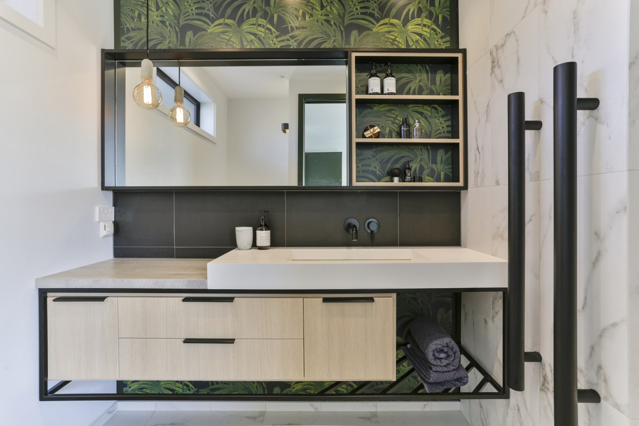
“The lush Palmeral jungle wallpaper, by House of Hackney, gives the ensuite its visual explosion,” says the designer.
“Playing off this lead surface, the vanity is grounded with the use of cool black steel. Starting out as a negative detail under the concrete-finish vanity benchtop, the dark metal then continues downwards and floats under the cabinetry to form an open storage rack for towels.”
The under-cabinet racking is oriented on an oblique angle to catch the eye.
“Storage is always paramount in a bathroom. Here, display shelves set to one side of the wall mirror allow the owners to store daily items within easy reach. Plus, generous, intuitive drawer storage keeps the space looking clean and organised.”

The rectangular, white benchtop basin works in well with the linear nature of the vanity and connects with the white marble shower and wall tiles, creating a fresh feel.
“In addition, choosing the white tiles worked in well with the tight budget, as it meant we could include some white painted walls without there being an abrupt visual divide between tiles and paint, for an overall clean, uniform look.”
Lastly, the walk-in shower provides a private shower experience, with the long niche recess offering plenty of shelf space without breaking up the stall’s clean lines.
Credit list
Designer
Benchtop
Taps
Shower fittings
Accessories
Wallcoverings
Splashback, rear wall of shower, shower niche
Vanity
Basin
Shower stall
Toilet
Flooring
Lighting
Awards
Story by: Trendsideas
Photography by: Jamie Cobel
Home kitchen bathroom commercial design
In tune with the land
Light-hearted by the sea
Surface attraction


