Contemporary new house by Dencity with Egyptian limestone siding
Modern new home in Atlanta by Staffan Svenson features Egyptian limestone exterior, overlapping planes, cut-outs, double-height void living area

Some settings are just so magical, you want to ensure every aspect of the view is maximised from all sides. But when the site needs to accommodate a large house, there is potential for a conflict of interests.
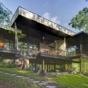
The solution for this house, designed by Staffan Svenson of Dencity LLC, was to introduce a transparency to the architecture. This not only allows glimpses from the front of the house right through to the woodlands and lake at the rear, but also helps to reduce the perceived size of the building, says Svenson.
"The owners, Shelly Justice and Mike Kohlsdorf, had a preference for a low, horizontal house on the steeply sloping site, but the sheer mass of the house could have been overpowering."
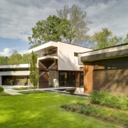
To solve this potential problem, the architect designed three separate volumes, linking them via a central circulation spine that runs parallel to the contour of the hill. The central vertical volume accommodates the living areas, with a guest suite above, while the bedroom wing is on the right and the garage wing is on the left.
"There was a lot of manipulation of the geometry of the house, layering, folding and overlapping elements to help break down the mass," says Svenson. "It stops the house from looking like a large box, and the shelves created by the overhangs reflect light back up to help lighten the overall look of the facade.
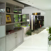
"We also punctured the solid stone wall that curves right along the front of the garage wing and then slips inside the house. This cutout allows a view right through the house and through other cutouts in the kitchen cabinets to the lake on the other side. In fact, there is a considerable transparency to the entire central volume."

Svenson also created a strong sense of arrival, providing a bridge that crosses a void beside the front door, and adding a contemporary water feature to the wall.
"There are spaces between the slabs of limestone on the bridge so you can see through to the void below," he says. "With this house, there is always a sense of something lying beyond."
The void at the entry rises above a courtyard that leads off the room on the lower level. The architect says this not only creates a much more dramatic entry, but also helps to bring natural light into the downstairs living space, so it doesn't feel submerged.
A change in the material composition of the house adds further visual interest and helps to define the different functions within. A heavily ribbed curved Corten steel element at the front accommodates a powder room on the main level and a bathroom below, while cypress cladding defines the equally private bedroom wing.
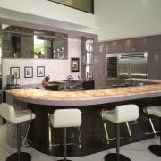
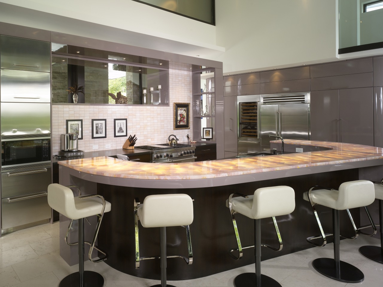
On the interior, the large, open-plan living space opens up to the view, with a double-height void above the kitchen adding to the sense of drama.
"With most kitchens, we like to bring down the ceiling and create a more intimate space," says Svenson. "Here, we did the opposite we opened it right up. The owners were adamant they wanted a real wow factor."
Shelly Justice, who was responsible for the interior design and furnishings, says that right from the start she wanted something different, a home that would be a conversation piece in its own right.
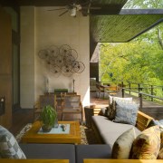
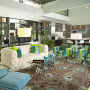
"It needed to have a certain amount of sex appeal," she says. "And I am not afraid of colour I love it. There is an eclectic look to the furnishings, with a lot of '70s vintage pieces mixed in with new items. I treated every room differently, but there is a definite sense of flow."
Justice chose muted pink-toned high gloss cabinetry for the kitchen. The colour complements the pink quartz countertops and the two-toned Surrey limestone planks on the fireplace surround. In keeping with the sense of transparency, the fireplace is double sided, which allows a view right through to the lake.
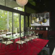
Seating areas are highlighted by custom area rugs, with the dining area also defined by a black-tiled wall and floor.
But despite the expansive glazing right through the house, wall space has also been maximised, to best highlight the owner's extensive art collection.
Credit list
Interior designer
Builder
Siding
Dining room chandelier
Dining room furniture
Blinds
Countertops
Fireplace
Structural engineer
Cabinet company
Roofing
Flooring
Heating
Audiovisual and home automation systems
Kitchen cabinets
Backsplash
Story by: Trendsideas
Home kitchen bathroom commercial design
Radical yet respectful
Sculptural centrepiece
With deep affection


