Connection, privacy and confidence
This bold home utilises every surface and orientation to optimise the owners' connection to their setting – size is downplayed while sustainability is to the fore
Designed by Marcus Stufkens, Stufkens+Chambers Architects
From the architects:
This forever home responds to the elderly owners' needs for a single level home that could accommodate their mobility constraints.
A sloping site set in the Cashmere Hills, in a relatively new sub division, created challenges for this access, with a solution of both direct and meandering paths to facilitate both access into the building and connections to the entire site landscape.
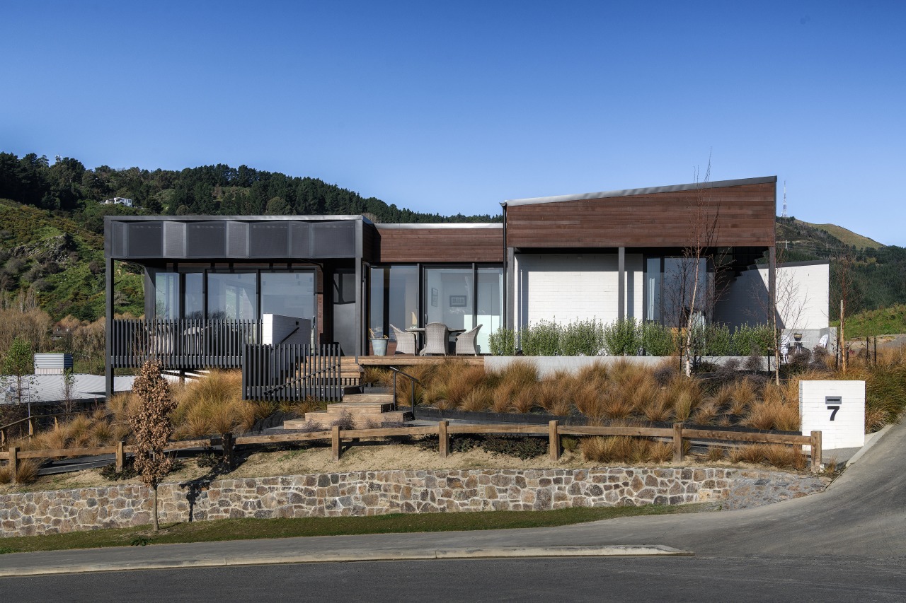
The house sits elevated above its tussock-filled site, in a manner allowing it to be anchored to the site as well as achieve a sense of floating above it.
Engagement with the exterior space from the internal spaces was a critical brief item and this was achieved via a seamless natural extension of the living and bedroom areas.
The site has lushly planted hillside surrounds/backdrop, with visual connections to the local adventure park/mountain bike tracks.
While it is a limited sized parcel of land, the elevation has available orientation to the north for access to the sun.
The home sits seamlessly on the site rising from the sloping street berm with connection, privacy and confidence.
Outdoor spaces are a mix of private and sheltered, to spaces that are open to and engage with the streetscape adjacent.
Very tight daylighting controls on the site, due to the sloping nature and orientation of the site, proved complex.
However, these were overcome through neighbourly discussion and mutual agreements.
The building mass is broken up into smaller volumes, with differing orientations and roof forms, to allow the home to nestle into the sloping nature of the site.
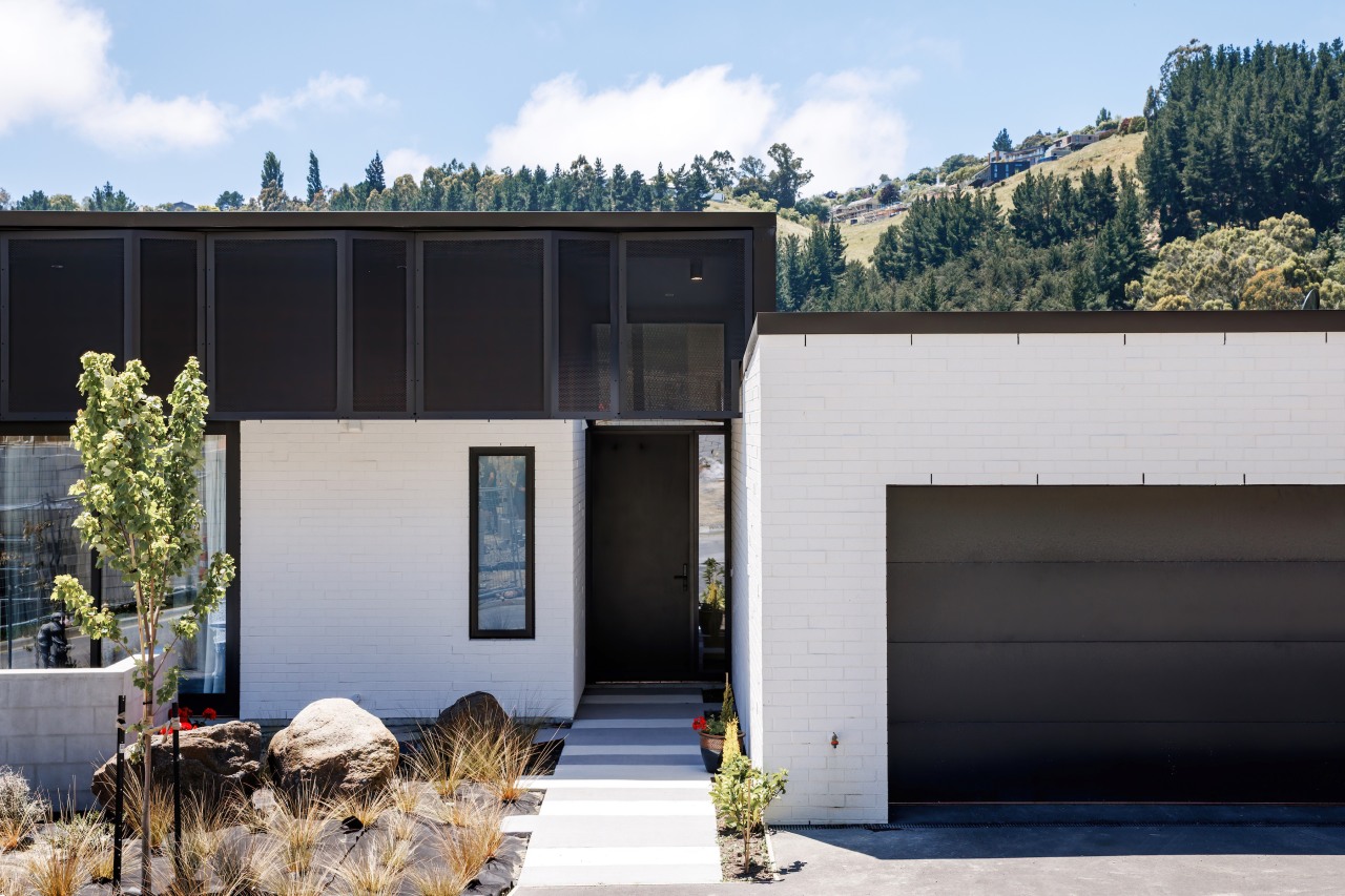
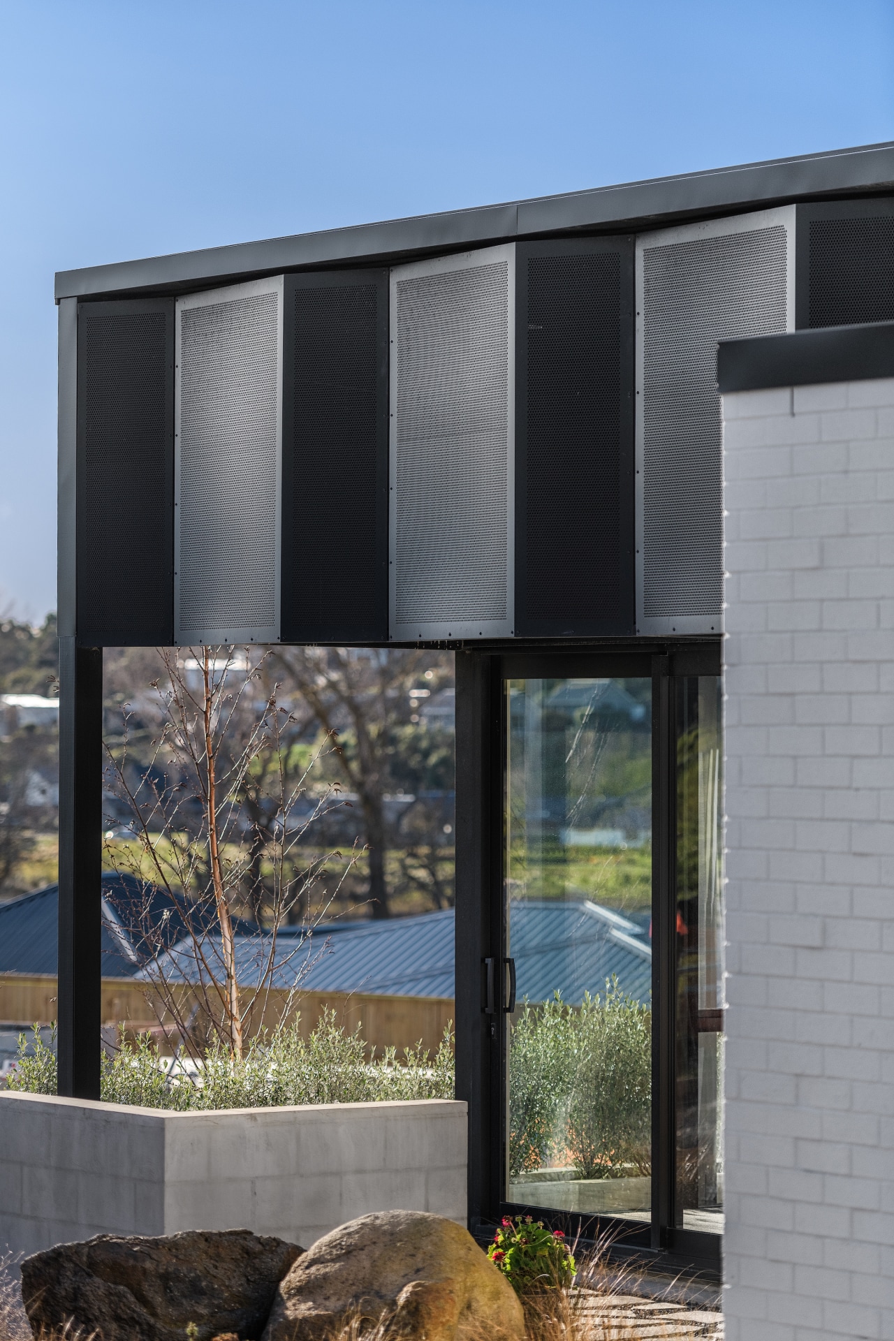
The brick veneer grounds the building, forming a base for a horizontal weatherboard layering of the roof structure – bringing the scale of the building down and elongating it on the site.
A desire to reflect naturally occurring shadow/textures of the trees, rocks, and relic slips (areas affected by ground features formed by a past landslide) on the hillside.
Adhoc placed brick seconds assimilate plays of shadow and light both from a distance, and from close at hand, with a grit additive added to the paint system.
Perforated metal screens with faceted forms reflect the valleys and ridges of the hills beyond.
These provide sun-glare and heat mitigation to northern and western internal spaces.
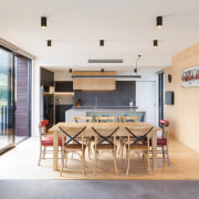
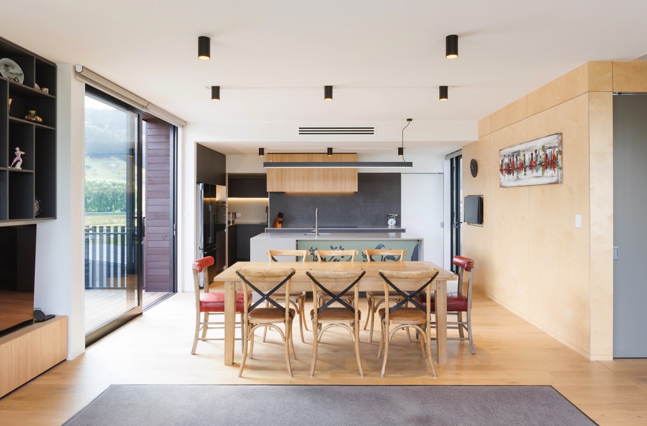
The internal palette of materials brings in 100% wool carpets, the natural warmth of prefinished birch ply and tiles drawing on the hillside rock colouration.
The structure is a hybrid of steel and timber frame construction, with two thirds of the footprint as shallow concrete mass foundation and rib-raft floor and the remainder as timber subfloor supported by timber piles, reducing existing contour disturbance.
This method of construction was selected due to economics and the need for a lightweight structure to overcome the need for excessive excavation and mass concrete foundations.
External maintenance is kept at a minimum, hence the painted elastomeric coating over brick and powder coating to perforated metal sheets.
The restrained use of cedar does require a re-stain every three summers.
All roof areas are slopping metal profile with no flat roofs or internal guttering, therefore less maintenance to all roof areas.
Sustainability
The project has been orientated and positioned to take best advantage of solar gain and sunlight admittance.
The outlook views from key living areas are varied and enhanced – creating a healthy internal environment and enhancing the wellbeing for occupants.
The materials utilised in the project are those that exhibit low embodied carbon content.
Foundations are shallow concrete footings, while the primary structure is timber with secondary steel elements.
All materials are typical of construction materials used in Canterbury and wider New Zealand.
Materials are generally sourced from local supply chains and locations.
Brick seconds have been utilised for painted bricks.
Windows are double glazed to reduce overall heat loss.
Passive energy design
The house is purposely designed with a small footprint with modest-sized spaces, developed to promote and maintain a higher proportion of greenspace on the site.
Artificial heating and cooling has been minimised by passive design strategies of thermal mass, orientation, shading (large canopy overhangs) and cross ventilation.
Large fully openable sliders provide the owner opportunities to live in a manner that is reactive to the outside conditions.
The energy efficient reverse cycle air conditioning employed can be isolated and operated separately during extreme weather events to minimise energy use.
Story by: Trendsideas
Home kitchen bathroom commercial design
