Classic mouldings and stained glass windows combine with a modern aesthetic in this bathroom makeover
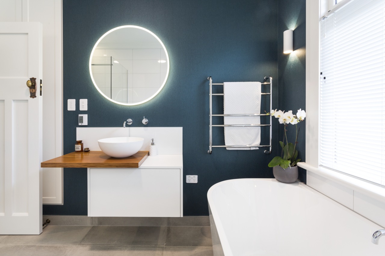
A modern vanity and shower balance the more traditional elements in this bathroom renovation, while a freestanding tub and round mirror with LED lighting provide crossover elements

Renovating a traditional home often requires a delicate balancing act between celebrating the old and making the most of the new. Such was the case with this bathroom, part of a whole-house makeover by Melanie Craig Design.
Following on from their wishes for the rest of the interior, the owners wanted this main bathroom to accentuate the original character of the 1900s home while at the same time adding a brighter, more modern sensibility.
"The existing bathroom was tired and outdated so we stripped this out completely, only retaining and restoring the ceiling mouldings, the door, and the sash window with its elegant stained glass upper panes," says Craig.
While the designer did make some spacial realignments elsewhere in the home, the bathroom's elements stayed in about the same place.

"The new vanity with its cantilevered wood benchtop brings in a bold, clean-lined feature. Its unusual configuration also helps optimise usable bench space in the modest-sized room."
The vanity's sculptural countertop basin echoes the circular mirror above it and, along with the toilet and shower stall, offers another decidedly modern element in the room.
However, some inclusions strike a midway point between the classic and contemporary. The edge-lit round mirror, for example, creates a balance between the past and present as do the soft lines of the freestanding bathtub. Even the chrome heated towel rail provides a crossover between the Victorian and the modern.
"While it's technically freestanding, the tub is designed with a flat side tight against the wall. This way, the tub achieves the sense of freedom of space associated with a freestanding tub but avoids the awkward to get to spaces behind that can be tricky to clean," says Craig.

The choice of clear glass for the shower stall and the wall-hung nature of both the vanity and toilet all add to the room's sense of space. The walk-in shower has a strip drain at the rear.
Craig grounded the bathroom design with large format textured porcelain tiles that have the look and feel of concrete.
"In terms of colour, we chose a textural navy wallpaper for two of the walls. This continues the use of dramatic accent walls in other rooms. The contrasting dark tone here also makes the bathroom's white surfaces appear even whiter and crisper than they are," she says.
Story by: Charles Moxham
Photography by: James Cobel
Home kitchen bathroom commercial design
With deep affection
Sculptural centrepiece
Radical yet respectful
Home Trends Vol. 33/3
While a kitchen's primary role has always been functional – food preparation, cooking and clean-up – in today's homes we...
Read More


