Classic cottage meets modern rear addition in this renovation project
A bold, contemporary addition creates an expansive, light-filled living zone at the rear of this reconfigured 1920s bungalow

When designing a living area extension for a period home, the issue of harmony is always likely to arise. One way forward is to simply celebrate the difference, letting the add-on stand out in bold contrast to the classic lines of the original home.
This 1920s cottage with its prim white weatherboards and traditional hip roof was charming and cheerful prior to this renovation. However, space was limited. The young family required an extension that would give them room to breathe and a better connection to the rear garden.
With the cottage located in a heritage zone, council requirements dictated that the classic front fae§ade be retained. So project architect Tim Dorrington at Box designed an open-plan pavilion to the rear of the property as part of the complex renovation.
"The two-level addition stands out in contrast to the traditional cottage," says Dorrington. "Like many Box designs, the extension takes the form of an expressed post and beam skeleton with steel cross bracing and black cladding all adding up to a crisp, modernist flavour. And if there was any doubt as to where the old finishes and the new begins, the strong contrast from black to white highlights the change."

However, there is one departure from this clear cut difference between the old and new. A garage required as part of the project was built on the side of the home, in the colour and style of the existing cottage. This was appropriate as the garage is also on show to the street and so needed to match the house facade.
"Internally, the footprint of the cottage was reworked to best accommodate the bedrooms and bathrooms a placement that made sense for these smaller, more intimate spaces. The hall staircase was also moved for a better entry experience."
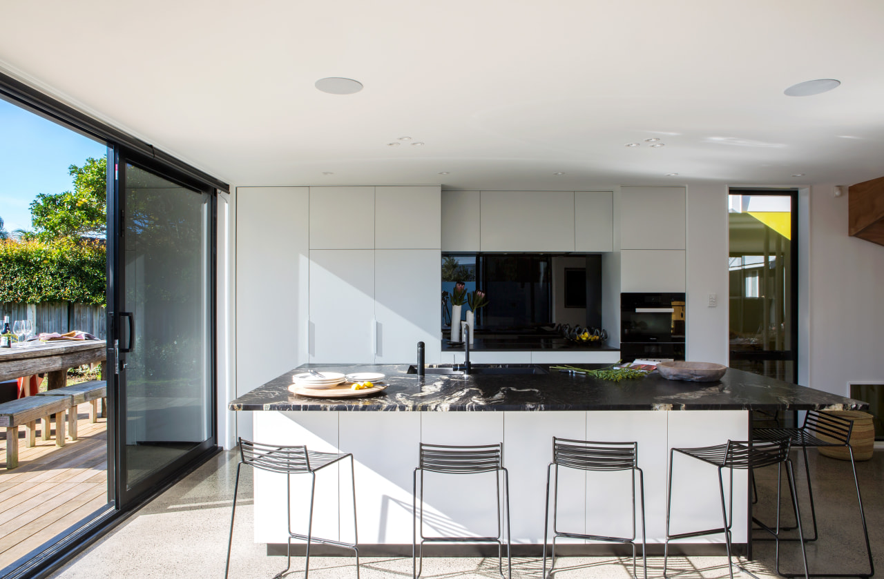
The open-plan extension contains the more public spaces, comprising the living and dining areas, and the kitchen opening to a new rear deck. There is also a media room and gym tucked in behind. Upstairs is the master suite, complete with ensuite, walk in wardrobe and a private deck.
The internal transition between the old and new is as definitive as the cladding. The floor level not only steps down to offer an enhanced relationship with the site, but polished concrete was chosen to contrast with the cottage's hardwood floors.

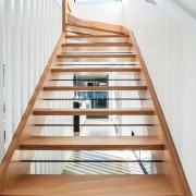
A strong indoor-outdoor link was achieved with large sliding doors opening to the deck, while the sculptural riserless staircase optimises light penetration right through the airy, modern living spaces.
However, when viewed from the street, there's little indication of this contemporary new addition at the rear of the property.
Credit list
Architect
Construction
Pool design
Garden design
Roof
Floor in extension
Paint
Kitchen cabinetry
Countertops
Awards
Story by: Charles Moxham
Home kitchen bathroom commercial design
With deep affection
Curvaceous and connected
Radical yet respectful
Home Trends Vol. 33/4
Home is where the heart is, but what we love about a house varies for person to person. Is your ideal home one with clas...
Read More


