Bright outlook
Extensive glazing and decking, and a large, louvred pergola ensure this 1970s house has an attractive outdoor living area, and a much stronger connection to the landscape


Think 1970s house design and more than likely you will recall ranchsliders, exposed beams and pot-bellied stoves. And then there were the brown, orange and green colour schemes...
This 1970s house was no exception, says designer Bryce Ardern. Its layout was also typical of the era.
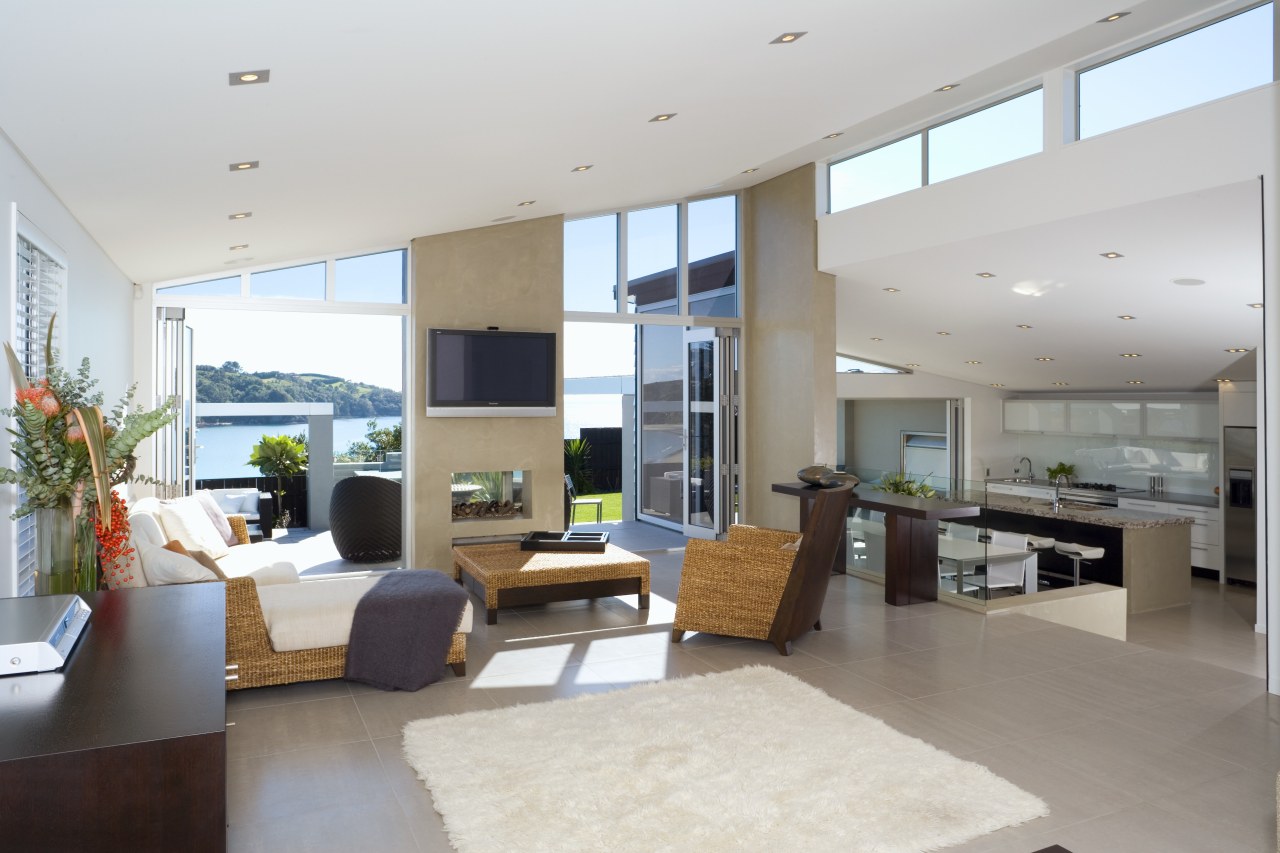
"Despite having a couple of ranchsliders, the house was closed off to the views and the sun," he says. "The kitchen was also very small and did not have a good flow through to the rest of the living area. In addition, with its original exposed beam and Pinex tile ceiling, the interior was dated."
To provide a space that better suited the family's lifestyle, Ardern says the house was effectively gutted. Spaces were opened up to the outdoors, and each other, and the ceilings re-lined to provide a seamless flow. Negative detailing where the ceiling abuts the clerestory windows further enhances the streamlined, contemporary look.
"We retained the home's original footprint, and just extended the kitchen-dining area by 25m²," says Ardern. "However, in real terms, the living space increased by considerably more, thanks to the extensive patios."
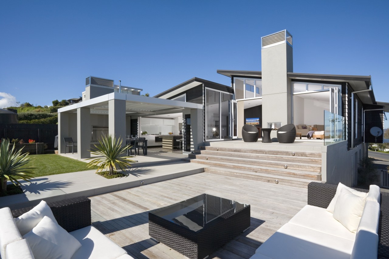
Bifold doors in the kitchen and living room open out to elevated patios that maximise the sea views. Similar tiled flooring features both inside and out, further reinforcing the visual connection.
"With its large, louvred pergola and fireplace, the outdoor dining area is effectively another room," says Ardern. "The outdoor living environment was also enhanced by introducing deep eaves to the roof line, which improve the aesthetics, and provide additional weather protection."
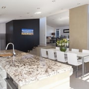
Ardern says the kitchen-dining area is scarcely recognisable from the original layout, which featured a small, pokey, U-shaped kitchen.
"Extending the length of the room meant we could incorporate a long island, with concrete ends that were poured in situ. The concrete introduces some solidity into the timber-framed building."
For a similar reason, the walls beside the dining table are plastered with a similar neutral-coloured finish to the concrete ends of the island.
"This finish creates an effect that is similar to the plane of a tilt slab, which again creates a solid look," says Ardern.
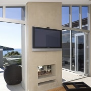
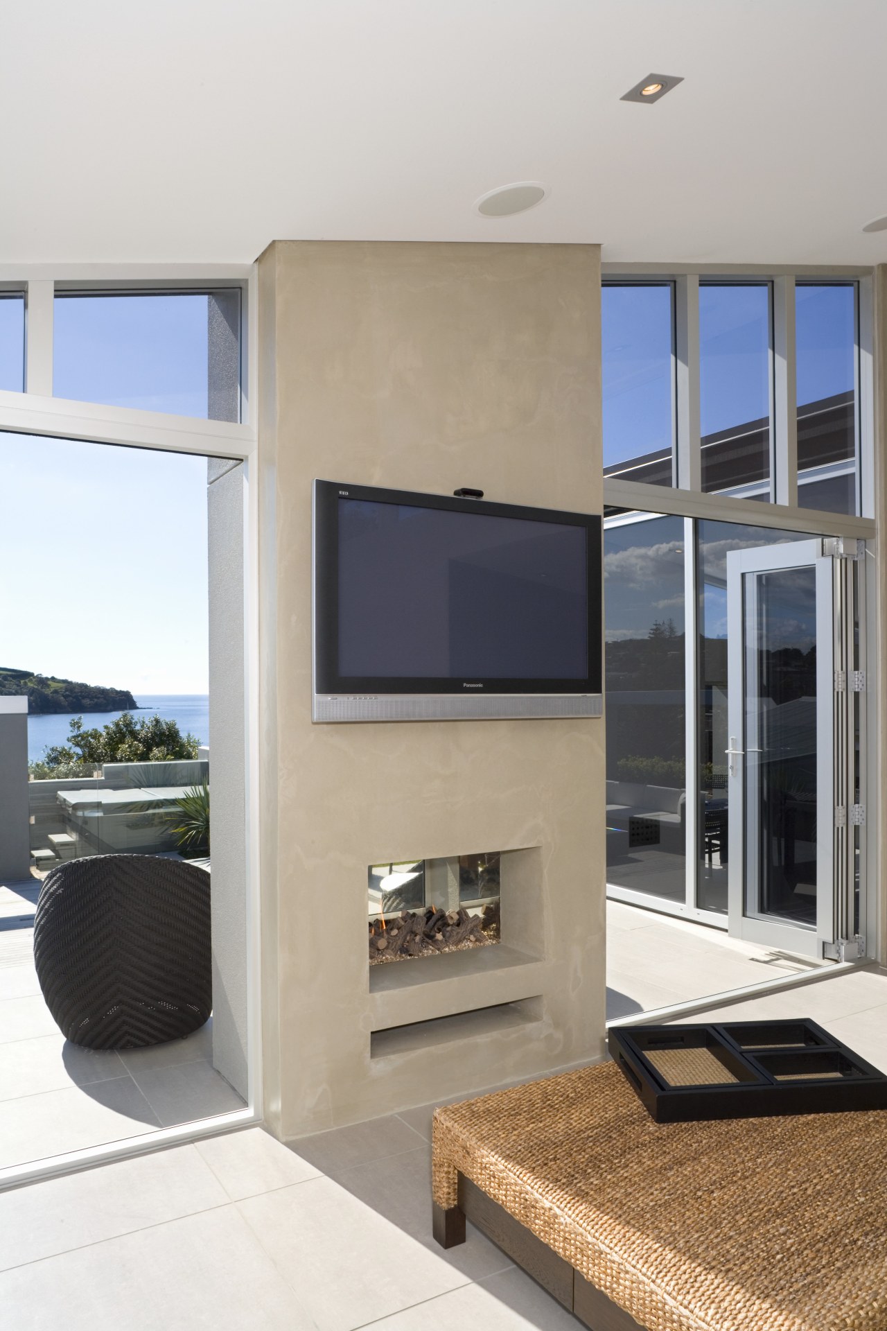
Plastered walls also define the two new chimneys, including the double-sided fireplace in the living room.
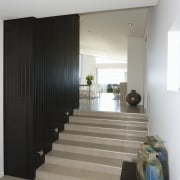
Ardern says the sense of spaciousness created by the remodelling project doesn't just end with the living areas. Other spaces have also been opened up. A formerly narrow stairway is now much wider, while the master bedroom incorporates an ensuite.
To create space for the ensuite, a small bedroom and part of an existing bathroom were converted. This allowed plenty of room for a large, double shower, a freestanding tub, and a solid concrete, cantilevered vanity with his-and-hers basins. Large mirrors further enhance the sense of space.
Credit list
Builder
Kitchen manufacturer
Cladding
Paints
Outdoor furniture
Audiovisual systems
Splashback
Microwave
Dishwasher
Shower enclosure
Basins
Kitchen designer
Landscape design
Roofing
Wallcoverings
Carpet
Fireplace
Outdoor accessories
Benchtops
Refrigeration
Bathroom vanity
Bath
Tapware
Story by: Colleen Hawkes
Home kitchen bathroom commercial design
Milanese spirit
Amongst the trees
A guide to choosing the perfect flooring for your home
