A new level and reworked interiors give this Victorian home modern functionality
Clever internal reorganisation and the addition of another level have transformed this Victorian terrace house, with award-winning results
As is often the case with an older home, an ill-considered earlier addition had to be stripped out before this more thoughtful renovation by architect Julie Firkin could be introduced. The lean-to added to the rear of the house in the 60s had included a bathroom, kitchen and laundry. The extension had been inward looking, noisy and drafty creating a claustrophobic feel.
"While loving her neighbours and the area, the owner initially wanted to upsize to achieve more bedrooms, a relaxed indoor-outdoor flow and contemporary, light-filled living spaces.
"By reconfiguring the rear of her Victorian home and adding another level on top, I was able to achieve all of this in the existing house."
"Responding to by-law limitations on the historic frontage, we had to retain the envelope of the front two rooms and were able to retain the aesthetic of the front room and corridor, as glimpsed from the street," says the architect.
"However, from the living spaces right out to the back of the home, everything has changed."
The house sits on a sloping site, meaning the stud height at the rear is much higher than the stud at the front of the home.
Prior to this makeover, the house was essentially on one level, with the seven steps from the living spaces to the dining area and further steps down to the garden negotiating the dropping ground level.
"With the 60s refit gone we were able to create an open flow to the new rear yard with floor-to-ceiling glass doors and a wall-sized picture window above," says Firkin.
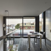
"Inside, we divided up the soaring rear volume created by the drop away in two ways vertically with a new mezzanine level, to be used as a study, and horizontally in terms of ceiling height and use."
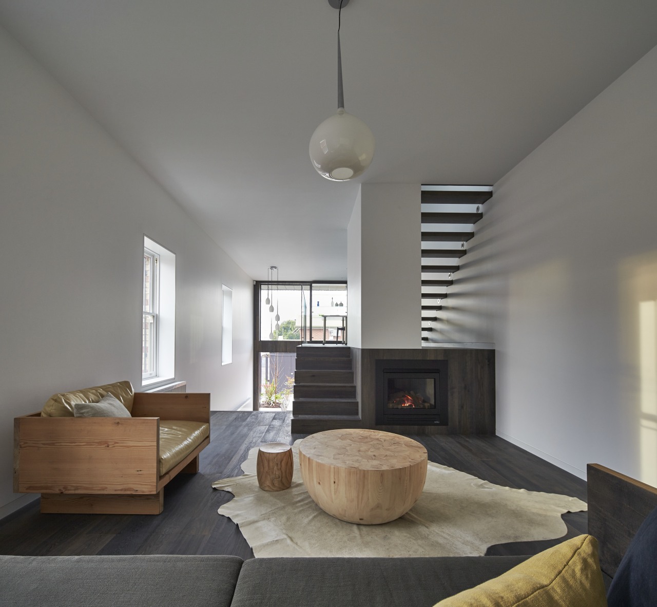
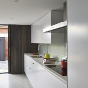
Introducing the mezzanine floor naturally resulted in a low ceiling height directly beneath it and the architect slotted the contemporary, white perimeter kitchen into this central area.
The other side of the rear volume is given over to the dining area. This achieves a refined air from the double-height void that rises above it, past the mezzanine to the 4.5m stud ceiling.
"The sense of internal space is accentuated in other ways, too," says Firkin.
"The open-plan lounge looks down and through the dining area, creating long sightlines. Elements like the stairs and the gas fire are built into the internal formwork for an uncluttered aesthetic."
In addition, the custom riserless stairs further optimise sightlines, and let natural light flood right back through the interior from the newly glazed rear wall.
The simple tonal palette of tongue and groove, engineered oak floor and stairs matched with white surfaces adds to the feeling of space.
Upstairs, past the mezzanine, lies Firkin's other key design stroke a contemporary extra level containing the master suite and a bedroom.
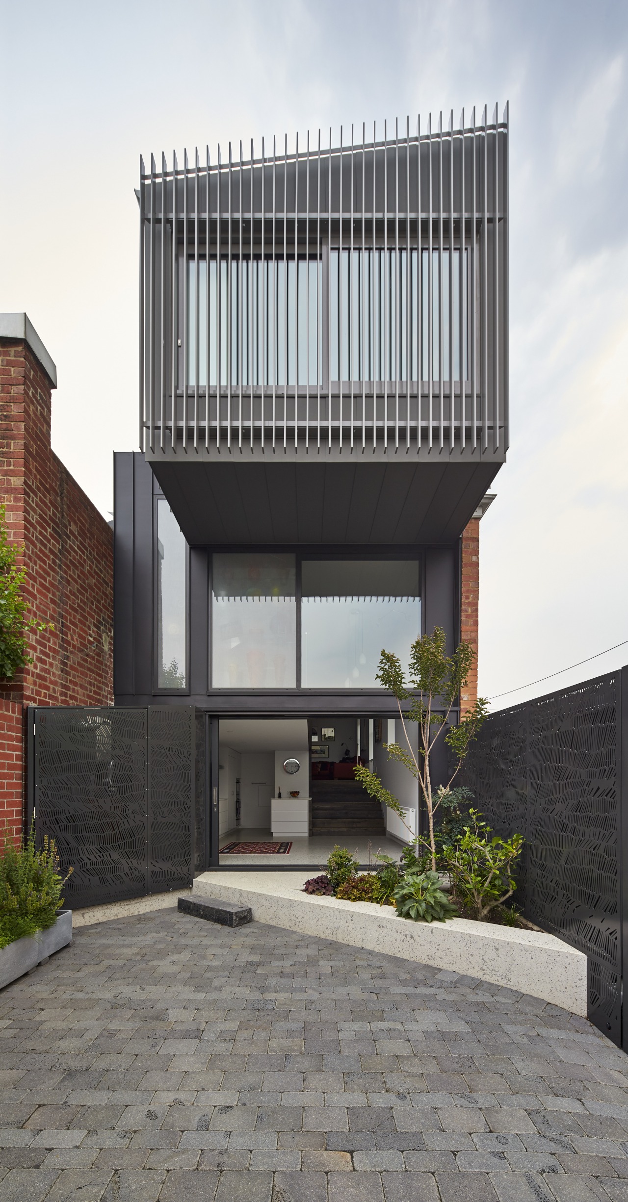
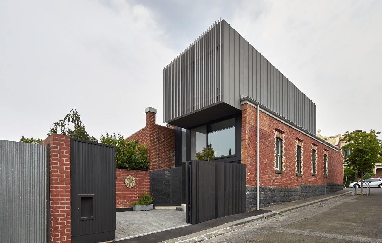
"While the existing cladding is in red brick, we finished the addition in raised seam zinc cladding. Rather than blending in, this offers a striking contrast to the classic facade."
However, a raked roofline plays down the new level from the semi-detached neighbour and the rectilinear form is stepped back from the street at the front, so is not visible from there. At the back, the clean-lined form cantilevers out over the yard, for shade and shelter.
"The home is situated in a bustling inner-city neighbourhood," says Firkin. "So, to achieve a quiet retreat on this master bedroom level, the addition features double-clad construction."
The design achieved a 7-star energy rating, with ESD consultants engaged to advise on sustainable design aspects for water and energy use.
Credit list
Architect
Kitchen design
Landscape designer
Roof
Flooring
Countertop
Taps
Cooktop
Paint
Lighting
Bathroom vanity
Basins
Ensuite bathroom walls
Builder
Kitchen manufacturer
Cladding
Windows
Kitchen cabinetry
Kitchen sink
Splashbacks
Rangehood
Heating
Furniture
Bath
Toilet
Awards
Story by: Charles Moxham
Photography by: Peter Bennetts
Home kitchen bathroom commercial design
Sculptural centrepiece
Radical yet respectful
With deep affection
Home Trends Vol. 33/3
While a kitchen's primary role has always been functional – food preparation, cooking and clean-up – in today's homes we...
Read More


