Facebook

Tweet

Help

Guests will love this relaxing bathroom by Natalie Du Bois
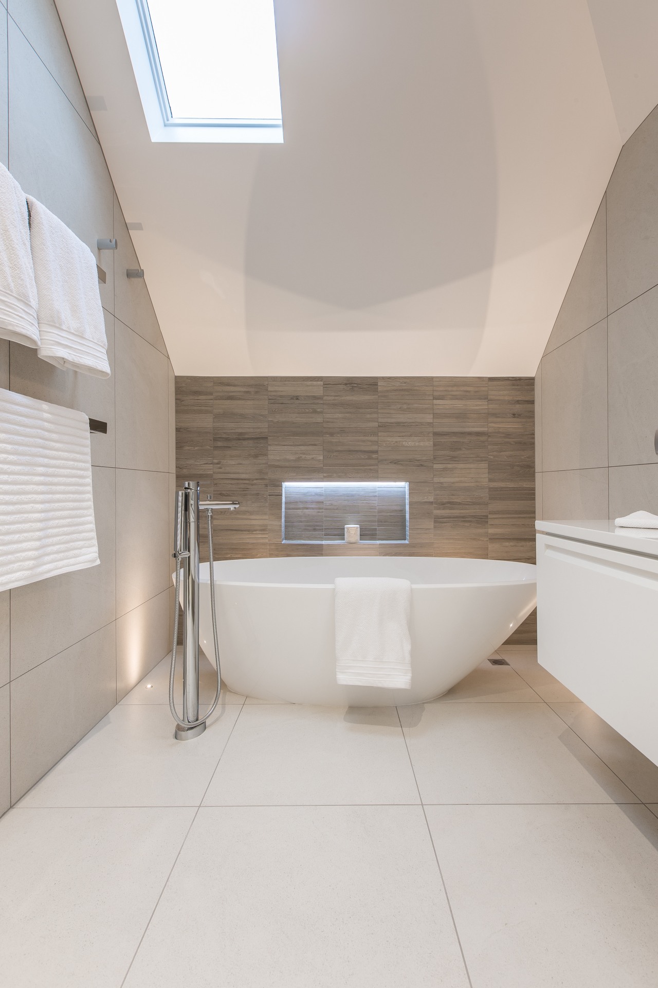
Working with irregular ceiling planes on this project, architecture, bathroom, daylighting, floor, flooring, home, house, interior design, product design, room, sink, tile, gray
Working with irregular ceiling planes on this project, designer Natalie Du Bois both quietened the angles with soft tones and at the same time played off their angular presence with an asymmetrical bath and basin.

Turning a potential negative into a positive is an essential skill for a designer. With this guest bathroom, Natalie Du Bois worked with a ceiling of varying angles. Painting it white downplayed its presence. However, the ceiling also provided a starting point for a playful aspect of the design.

"We achieved a modern, interesting look by continuing the asymmetrical composition of the ceiling throughout the rest of the bathroom. This is seen in the asymmetrical basin and in the angled shape of the Egg freestanding bath."


Simple touches like internally lit wall niches both angle, bathroom, floor, interior design, plumbing fixture, product design, tap, tile, wall, gray
Simple touches like internally lit wall niches both in the showerstall and behind the bathtub contribute to this bathroom's light-filled aesthetic despite it having only one skylight and no windows. Timber-look tiles introduced at each end of the elongated bathroom space provide warmth and a sense of balance.

At the same time, the bathroom's angular lines are softened by Du Bois' contrasting use of curves, seen in the mirror, basin, toilet and bath. One request of the homeowner was for a practical bath for small children to be bathed in, which Du Bois delivered in the form of the low level bath.

Planar surfaces are softened by the introduction of architecture, bathroom, floor, home, interior design, plumbing fixture, product design, property, room, tap, tile, gray
Planar surfaces are softened by the introduction of several curved elements in this bathroom by designer Natalie Du Bois.

"Although there aren't any windows, the bathroom had to feel light and welcoming. To achieve this, we illuminated focal points such as the niches at the side of the shower. Floor lights behind the tub give the bath a sculptural look." 

The side walls have textured timber-look porcelain tiles which give the space a warm natural feel and bring balance to the long, narrow room.

Credit list

Designer
Natalie du Bois
Benchtop
Diamond Stone by Quantum Quartz
Basin
Geo Oval by Vitra
Showerstall
Euroglass
Toilet
Zero by Catalano
Flooring
Brera Bianca
Wall lights
Bari
Vanity cabinetry
Custom by Du Bois Design, finished in ¼ Cardrona by Dulux, with Blum Tandem box Intivo drawers
Bath
Mozzano by Victoria and Albert
Taps
Vado Soho
Shower slide
Hansgrohe
Heated towel rail
Sirocco by DCS
Wallcoverings
Brera Bianca tiles and Teca Intensa Mosaic by Tile Space
Awards
Trends International Design Awards (TIDA) Bathrooms – Winner

Story by: Charles Moxham

21 Feb, 2021

Pocket systems for new space concepts

Home kitchen bathroom commercial design


Latest Post

03 Nov, 2024

03 Nov, 2024

03 Nov, 2024

We know the Specialists

Related Book

Nz3203Minicover - floor | flooring | interior design floor, flooring, interior design, real estate, gray, brown

Bathrooms take centre stage in this latest edition of myTrends HOME – from an expansive master suite with spectacular de...

Read More

Similar Stories