Upon reflection small powder room remodel
White powder room by Archetype
Powder rooms always pose their own design challenges, especially in apartments where they are likely to be internal rooms.
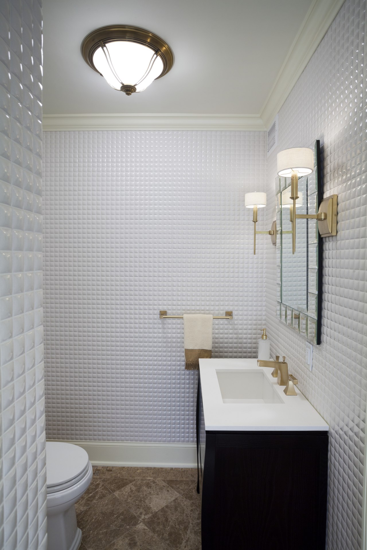
This new powder room, designed by architect Alan Berman and the design team at Archetype Design Studio, with direction the client, replaces the original bathroom that dated back to the '50s.
"The owner wanted the new powder room to feel less enclosed," the designer says. "It also needed to have a much more modern look and be as light and airy as possible, given that it has no windows."
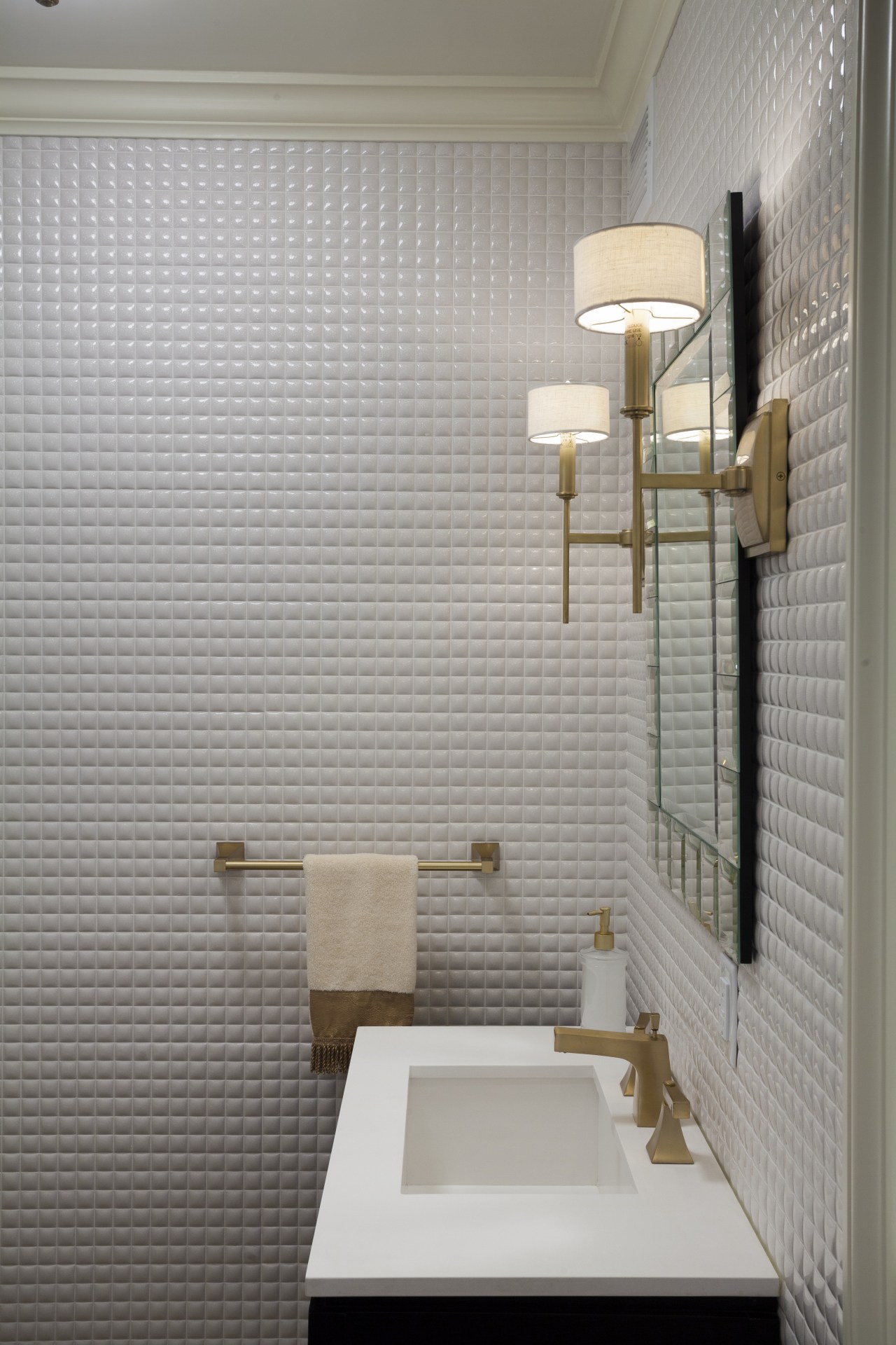
Project manager Ingrid Rancier says the room was gutted and slightly enlarged. The walls were clad in white tiles with a textural finish that adds visual interest and reflects light.
"White walls and ceilings always help to make a space seem larger and lighter," she says.
A new beveled mirror also reflects the light from two sconces and a ceiling lamp.

With its square edges and negative detailing, the vanity has a contemporary aesthetic. A calming Zen influence is evident in the shaped sides and dark wenge wood finish. The cabinet doors feature a subtle pattern of plants and leaves that keeps the look soft.
Laid on the diagonal, the Lite Emperador marble floor tiles have a matching border.
"The diagonal pattern creates a sense of movement, so the flooring doesn't look too staid or square" says Berman. "It doesn't appear to be restrained by the walls, which makes the room seem larger."
Story by: Colleen Hawkes
Home kitchen bathroom commercial design
Trends Vol 30 No 1
Bathroom Trends is dedicated to providing inspirational design ideas, products, services, and information for bathroom b...
Read More


