Thoughtful interior design brings space, light and refinement
This relatively compact, semi-detached home has been given an English, classically elegant aesthetic. Natural light and a sense of spaciousness were also part of the design brief
Designed by Natalie Du Bois, Du Bois Designer Kitchens and Interiors
From the designer:
In an enclave of mostly large, stately homes, my challenge was to ensure this relatively compact, semi-detached, three-bedroom home enjoyed the same, grand ambiance as its neighbours.
I needed to focus on making its 180sqm floor plan (which included the double garage) feel spacious and not seem out of place with the large homes that surrounded it.
The house was originally the owner’s elderly mother’s home. It now had to be re-purposed for the needs of a young family of four.
A previous addition, which included an upper level, comprising a master bedroom, en-suite and a small office, was added in the 1990s, but apart from that, not much had been modified until this recent renovation.
An English, classically elegant aesthetic was the overall look the owners wanted to achieve. Being a semi-detached home, the windows are only located on three sides, so it was very important that the home felt light throughout.
All the rooms have been planned to ensure they feel larger than they are. Keeping the rooms uncluttered, using simple, classic products and materials has ensured a continuous flow and mood.
Each room, however, has individuality, making it an interesting home to walk through.
We began with the kitchen, bathrooms, and powder room. Once the new, functional layouts for these rooms had been established, we could then set about linking them to the bedrooms and living spaces, through colour, ensuring that the hues worked well with the homeowner’s personality and lifestyle.
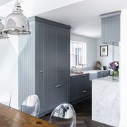
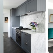
The original kitchen had tall cabinetry both sides, which felt claustrophobic. In my new design, the fridge was moved to the other side of the kitchen, nearer the dining area, giving it a more spacious feel.
The stained timber herringbone floor was positioned to fit centrally between both sides of the galley kitchen. This, combined with the flowing veins of the stone benchtops, draws your eye towards the more spacious dining area, with its abundance of natural light.
The master ensuite was to be one of the most important rooms to the homeowners. They wanted it to reflect a certain feeling of yesteryear, with an air of romanticism.
To give them that feeling of nostalgia, I designed a wall comprising individual antiqued mirrored panels; at its centre, a bespoke-designed, octagonal mirror adds something special and unique.
The walls and floor were then lined with marble tiles. I specified quality English tapware by Perrin and Rowe throughout the home which aided towards giving a timeless effect to the petite home.
The powder room, with wallpapered walls and blue ceiling and trims, reflects a moodier feel, which provides an interesting and memorable experience for guests to enjoy.
The master bedroom’s bespoke wardrobes were designed so every storage need was catered for –from specialised belt and tie storage, to pull out shoe shelves with practical scalloped handles which help glide the Blum drawers effortlessly.
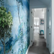
I specified a soft grey sheer fabric for the drapes with a double layer effect for privacy and romantic relaxed Roman blinds which create a cosy area to sit and relax in. The hallway has an exciting large scale scene mural Designers Guild Wallpaper that adds a fresh and vibrant effect.
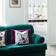
We chose Resene paint throughout the home, double alabaster white, as the base wall colour in the house, in order to enhance and showcase bold and bright furniture, then added blue, grey and charcoal tones to the built-in cabinetry and walls. Using the same colour, with various depths of tones, gives the home a flow and continuity.
The bright accent furniture pieces are highlighted instead of being overpowered by the colours around them.
Credit list
Interior designer
Kitchen designer
Main floor
Bathroom tiles
Paint
Building work
Bedrooms
Wallcoverings/wallpaper
Dining table and chairs
Designed by: Du Bois Designer Kitchens and Interiors
Story by: Trendsideas
Photography by: Michelle Weir
Home kitchen bathroom commercial design
Vibrant spiral stairs improve penthouse connections
Silver moons rising
Radical yet respectful

