That's entertainment
Forget the big glass box and ranks of cars at this showroom it's all about the experience, the atmosphere and the promise of a lifestyle
While your standard car sales experience might involve a sea of vehicles, and an atmosphere not too far removed from a crowded supermarket car park, at the other end of the spectrum those retailing luxury brands have realised that success is about both perception and performance. When it comes to driving the brand, it all begins at the showroom. These new temples to the automobile are a crossover point where the lines between lifestyle and product converge.
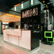
In Singapore, Kingsmen Exhibits defined a new image for Mini Singapore when TransEurokars was appointed as brand representative. In early discussions with the new investor, creative director Brett Cameron quickly identified that the Mini brand demanded a destination. Unlike many new showrooms, which are simply rolled out according to a template, Cameron was able to take previous best-practice guidelines from Mini, and extend and develop them.
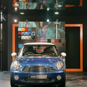
"Mini had a number of prerequisites, including the city' concept for displaying cars at 90Ë to each other, and the incorporation of its systemised retail shop fitting system," Cameron says.
"But the main element in the company's printed media is the frame concept that focuses the viewer's attention on a new product or message. I wanted to turn this into a real experience."
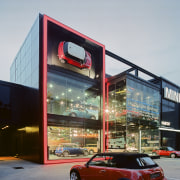
To this end, two exterior frames fitted with LED lights were incorporated into the exposed steel and glass exterior of the newly built structure.
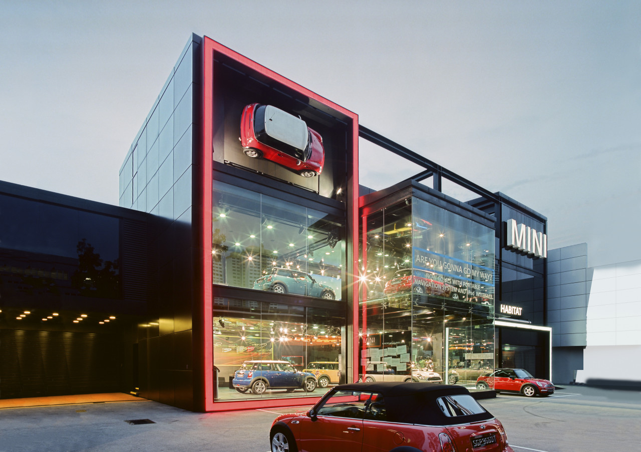
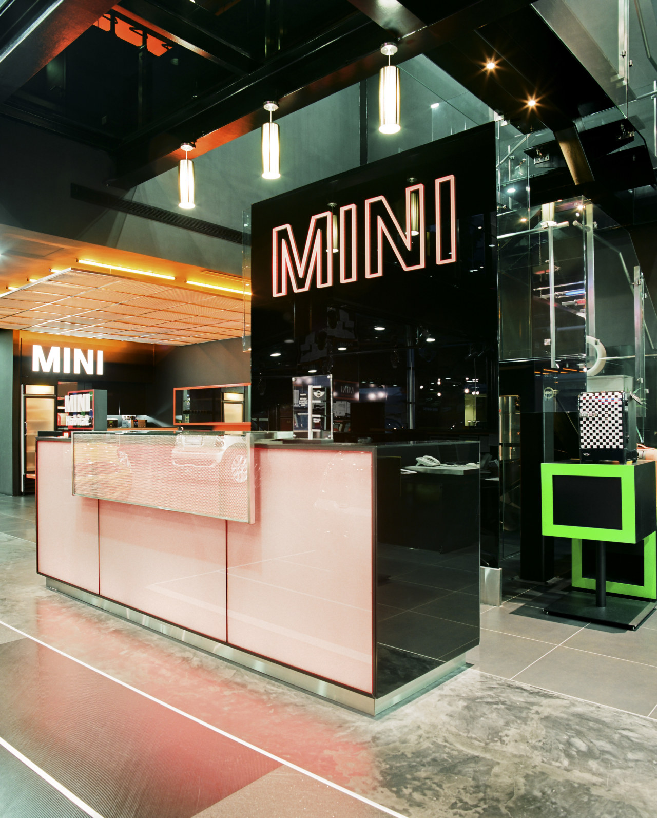
"Each represents the two distinct personalities of Mini," says the designer. "The white frame under the white wordmark, set against black glass, represents the premium quality of the cars: the engineering, the performance, and all the other elements consumers expect from a company owned by BMW."
The other frame acknowledges the diverse personalities of Mini owners. Pictured on these pages with a red surround, this frame can be reprogrammed to display an almost unlimited array of colours. A large panel at the top of the frame can be opened to create a window for the rooftop event space, or closed to display a fibreglass replica car.
"We can place graphics on the glass to highlight products and offers, and the entire frame has fixings to carry a full-height banner," says Cameron. "We wanted to make it easy and relatively inexpensive for the dealer to alter the impression of the showroom, and to create an expectation of change amongst the customers."
For practical reasons, Cameron opted for a multi-storey building, allowing views into the structure despite the car parking area in front of the building.
"Cities and road networks today are not on a single plane, they are multi-dimensional. We wanted customers to experience and appreciate this as they walked through the interior spaces, and up and down the glass stairs."
Kingsmen Exhibit's history of retail and exhibition interior design stood the firm in good stead when it was considering customer interaction with the architecture. As well as fine-tuning the look, careful consideration was given to the feel, through the textures and temperatures of the materials; the smell, through the use of lemongrass in the planter across the front of the property; and the sound, with speakers positioned in the car park and throughout the building.
"From a practical point of view, we were able to use our knowledge of a event and exhibit set-up and staging to pre-empt specific needs. For example, much of the infrastructure necessary for staging events is built in, such as multiple lighting points, varied reception areas, and access to the rooftop function space that doesn't require the showroom to be open, thereby reducing staffing costs and security," says Cameron.
This rooftop garden, together with an adjoining multi-purpose space, forms the backbone of the lifestyle and function ideal Kingsmen created. The garden features designer furniture and a serving space styled like a high-end kitchen. Kitchen counters are reinforced, and can also be used as platforms for dancers, fashion shows and live music.
"Such features are props that support the lifestyle experience the company wants to portray. Once the experience has been enjoyed, it's a natural step to make a purchase, with the desire to prolong the experience."
Credit list
Designer
Architect
Civil engineer
Quantity surveyor
Facade
Paints
Office furniture
Additional furniture
Project team
Construction company
Mechanical and electrical engineer
Ceiling
Flooring
Lighting
Reception furniture
Signage and graphics
Story by: Mike Barrett
Home kitchen bathroom commercial design
Commercial Design Trends Vol. 24/4
This edition of Commercial Design Trends celebrates knowledge with an array of educational and research facilities that ...
Read More