Strength of vision
Originally a typical institutional workplace of the 1960s, this university building is now a testament to new technology and the innate appeal of raw concrete

The adaptive re-use of existing buildings is increasingly seen as the best use of resources, although such projects invariably require innovative architectural solutions.
For the designers of the new Massey University School of Engineering and Technology in Wellington, the refurbishment of an existing concrete building on campus provided just such an opportunity. Architect Guy Cleverley says the building was a good example of educational facilities built in the 1960s.
"With its cream, pink and pale teal-blue interior, the building was extremely institutional. It was also hard to get a sense of the spaces we could create, as there were many low ceilings and internal rooms.
"At the same time, however, the building was a particularly good example of the very solid, in situ concrete construction that was common during this period. Architecturally, it was a very interesting building for its time. There were four shear walls comprising 200mm-thick, post-tensioned concrete slabs, and very high spandrels."
Cleverley says the fit-out needed to reflect the university's vision for the engineering school, which is a new flagship course.
"The school has a strong industrial focus mecatronics, for example, is one area of specialisation. The fit-out needed to reinforce this direction, while at the same time providing an appropriate human scale."
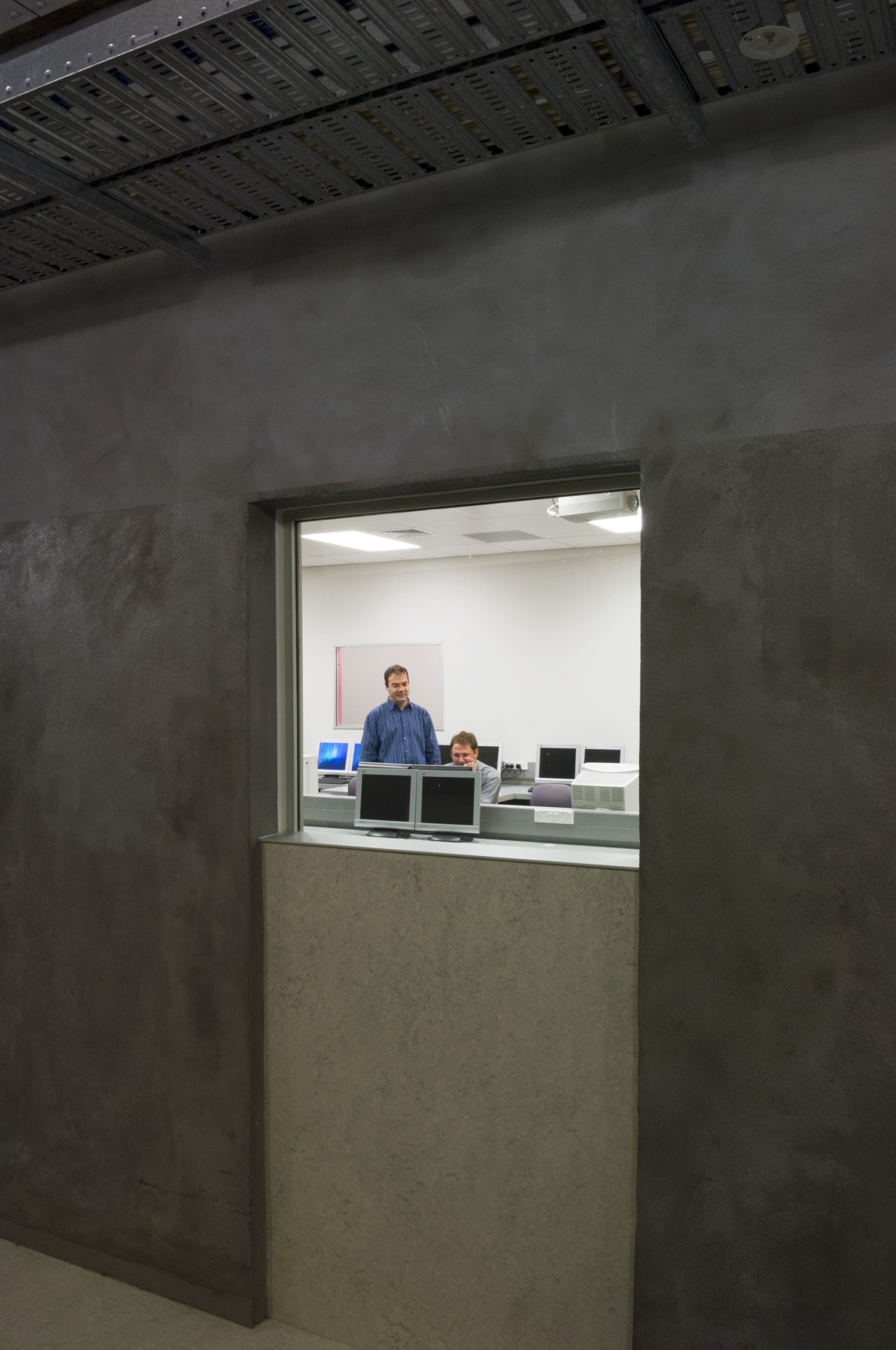
To this end, the interior was gutted, and the walls stripped back to reveal the original raw concrete and high ceilings. The shear walls, two of which required rock anchors, were strengthened by an additional 200mm of concrete cast onto the side of each wall.

The interior layout was largely determined by the structure and by what could and could not be moved, says Cleverley.
"It was also determined by the need to provide an easy flow through the building, and the need for secure areas that could be closed down after hours."
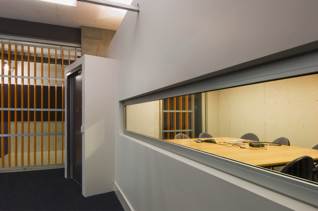
To ensure the reception area would be readily identifiable, it was positioned at the top of the stairs, on the main arterial route through the building. Rather than provide the usual two sets of doors, the designers installed a large sliding door. Painted orange, the door is a distinctive architectural element. Its open grille design allows the reception area to be secured after hours, yet the reception remains visible to students moving through the building.
"The slats of the grille are not evenly spaced, being closer together at one end," says Cleverley. "This was a way to play on the perspective the slats look the same distance apart as you approach the door."
Another touch of whimsy is provided by the sculptural computer cabling that helps to separate the reception desk from the adjacent corridor. Originally designed to conceal computer wiring, the sculpture enhances the high-tech look. Similarly, the green panelling in the reception area, which is comprised of recycled electronic circuit boards, reinforces the theme.
Cleverley says a lot of emphasis was given to both natural and artificial lighting throughout the building. In the reception area, uplights illuminate the ceiling and help brighten the overall space. Commercial lighting below the main signage adds further visual drama, and was a cost-effective option.
"The lighting reads like a continuous wand of light that runs across the space," he says. "In the long corridor, we have introduced traditional street lights, which provide good ambient light and also help identify this as the main thoroughfare through the building. This is a very long passage and the march of the street lights provides a sense of scale and breaks down the apparent length."

To help punctuate the long corridor, the flooring features alternating black and white Marmoleum. Openings in the solid concrete walls lead to teaching spaces and toilet facilities. The floors in these areas also change colour, helping to signpost the different spaces.
"This part of the building has a very gritty, urban feel, but the colour pulls it up, so it's not so industrial," says Cleverley.
The designers also provided quirky wallcoverings to either end of the main thoroughfare one wall features vinyl tiles with green grass images, while the other features tiles of blue water. The designs appear similar to a pixelated computer image, only coming into focus when the viewer is close to the wall.
Glazed cut-outs in the concrete walls allow glimpses of the teaching spaces, and help to lessen the internal nature of these rooms. The long window, for example, frames the view into reception.
"People inside the rooms can see people walking past, so they get the visual stimulus from the outside, which is important," says Cleverley. "In the video conferencing room, there are deep slats on the window, which allow a view out, but make it difficult for people to actually see what is going on inside. This was a way to provide a level of privacy without closing a blind."
To allow for future flexibility, the wiring is routed in overhead cable trays, which further enhance the raw, industrial look.
Story by: Colleen Hawkes
Home kitchen bathroom commercial design


