Remodeled two-storey home has improved flow and increased natural light
The renovation and addition to a home with dark, cramped spaces results in open plan interiors and a new steel and glass extension at the back

When a section of a home suffers from dark, cramped spaces it can fall into disuse as no one's inclined to spend time there. And that was the issue on the compartmentalised ground floor of this two-level home before architect Phongphat Ueasangkhomset unlocked its full potential.
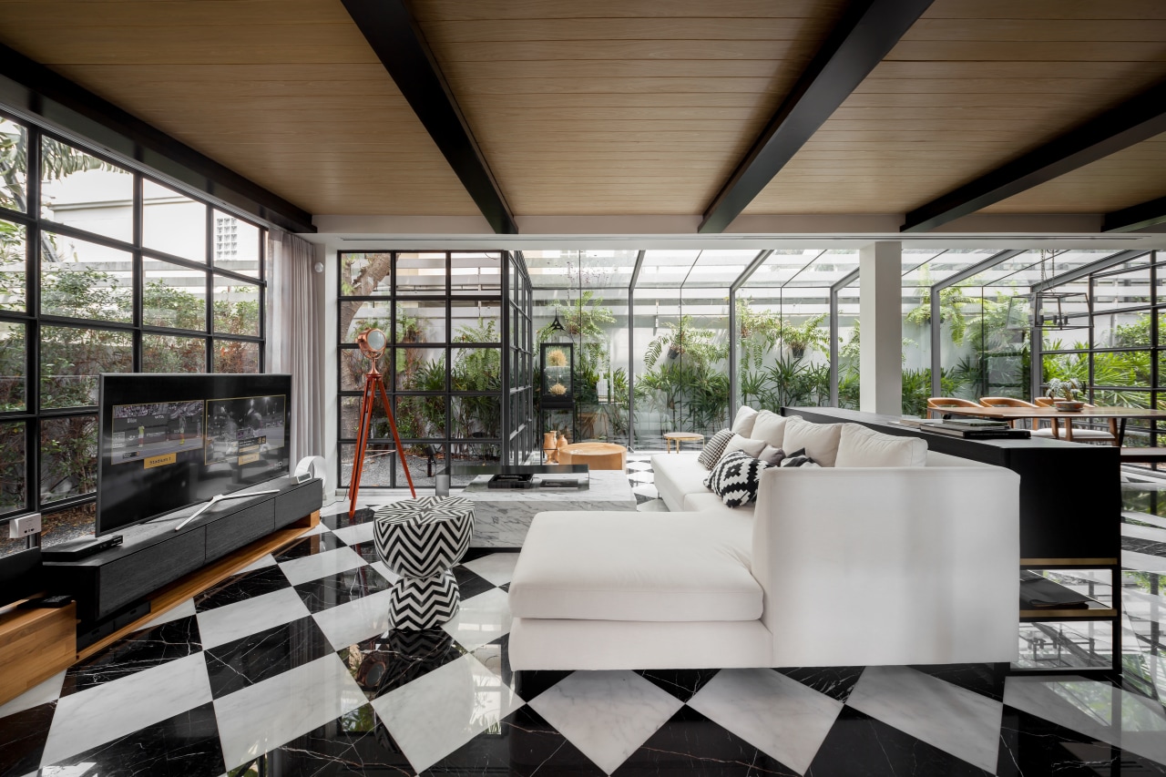
"To create a large, welcoming living space, we knocked out internal walls in this area and added a steel-frame glass extension to the rear."
The glazed extension not only added space, it also brought in valuable natural light which further transformed the feel of the living area and allowed for more passive cross-ventilation.
The pokey kitchen at the rear was reworked, too, and opened up to the living area and to the dining area, which had been relocated into the glazed extension. A large pantry at the end of the kitchen keeps the main benchtops free from clutter as these are seen from the living spaces.
"To complete the new look, we designed a bold diamond floor pattern in black and white marble, and added a warm wood batten ceiling that balances the cool of the marble and steel."
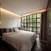
Also on this level, the architect reworked a side lounge, replacing an external wall with steel and glass, and adding a bank of dark wood cabinetry. The cabinetry adds a traditional air to the room, appropriate to its new use as a combined bedroom and living area for the owners' parents who were coming to live with him.
A minor surprise for guests at this ground level is a powder room next to the parents' new bedroom. This has a feature wall tile that reflects a feng shui-friendly pattern, as does the diamond shaped flooring in the main living area.
The existing upper level of the home was reworked to achieve the feel of a self-contained penthouse, consisting of a master bedroom, dressing room, connected bathroom and private living area. The dressing room achieves an air of luxury with a cove ceiling, candelabra and central cabinet.
However, all this work was only part of the architect's transformation of the home in search of increased functionality and living space.
"To add to the overall size of the home, we also simplified the garage area at the front of the home removing an old pole structure and built a new steel-framed, multi-purpose living area level on top of the substantial garage."
The new garage-top space is also connected back to the upstairs of the main home by a steel walkway at the top of a new feature steel stair.
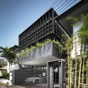
Together with its rearranged interior spaces and the addition, the residence now has a brand new exterior presence that balances the home's sense of strength with softer elements.
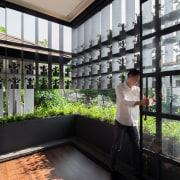
"With the addition facing onto the street we wanted to create a degree of privacy here while still admitting natural light and allowing for views out. Our answer was to add an exterior layer of partitioned metal shelves, with each of the 102 cubbyholes occupied by a single ceramic olive tree pot, all created by local artists."
This geometric facade with its miniature sculptural insertions connects to the new steel framing on the home, and another feature, too a hanging iron staircase. This provides access up to the new multipurpose room one way and the upstairs master bedroom the other.
"The stair's suspended design allows for a small amount of movement that is experienced as you walk up it," says the architect. "However the wealth of metal on the home is balanced by the organic look of the ceramic olive trees and by two ornamental koi ponds one set almost directly beneath the stairs and the other to the side of the now-simplified two-car carport."
Story by: Charles Moxham
Photography by: Ketsiree Wongwan
Home kitchen bathroom commercial design
With deep affection
Radical yet respectful
Sculptural centrepiece
Home Trends Vol. 33/7
While we might all have ideas for the home design that we want, consulting a good architect or designer will also open u...
Read More