Refurbishment of Georgian-style residence accentuates its original splendour
Refinished, repainted and with existing architectural detailing expanded upon, this renovation celebrates the past while accommodating a modern lifestyle
Not all home renovations require major structural changes. For some houses, a keen eye and a lighter design touch can be just as impactful. Such was the case with the sensitive rejuvenation of this single-level Georgian-inspired house undertaken by designer James Doole of Chelsea Group.
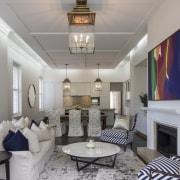
"This 1880s-built residence was rather tired and dark when we discovered it, but the bones of the home, the elegant room layouts, high ceilings, and refined architectural detailing were all perfect," says Doole. "Even a refit of the informal living spaces by the previous owner had been in keeping with the home's interior.
"However, we really wanted this refit to celebrate and accentuate the character of the home and this is evident right from your arrival. Taking inspiration from the ornate driveway approaches I saw on similar-style homes in Beverly Hills recently, we expanded an existing trellis to be a more over-arching arrival feature."
You arrive at the house near the terrace and pool area and then drive on around to the large porte cochere on the other side. The front of the home with the pool had a wealth of architectural detailing while the less viewed side was under-detailed.
"However, we remedied this by faithfully replicating the existing cornices and dentil mouldings and repeating them on the less endowed side of the home."
And to an extent this same approach is repeated on the home's interior.
"While we didn't rearrange things structurally we did strip most walls back and reline them to achieve flawlessly smooth surfaces. In the large entry hall we reproduced panelling seen in other rooms."
One major transformation is seen right from the entrance. Doole took up carpets that had run throughout the home and then fully restored the solid oak floors revealed underneath.
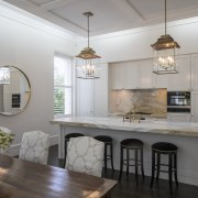
"In the informal living, dining and kitchen space we introduced a larger island and a calacatta paonazzo marble benchtop and splashback further adding to the quiet grandeur of these rooms," he says.
"And the change to classic Shaker panels for the kitchen cabinetry is more in step with the home's ornate wall panelling."
However, in the formal dining area, Doole had to make a decision regarding the wealth of existing dark oak panelling.
"The woodworking was beautiful, but entire walls in a dark wood created a somewhat gloomy atmosphere," he says. "By keeping the wall panels and painting everything white we were able to lighten this key space without losing its magnificent historic presence."
Naturally with a house nearly 140 years old, the bathrooms received a major makeover. In the main family bathroom, marble-look, low-upkeep tile finishes and a classic freestanding tub were chosen to be in keeping with the rest of the home.
Colour and lighting were a big part of the refit too, especially given the scale of the five-bedroom, four-bathroom home.
"We painted the home's exterior and interior in quiet tones to bring a modern, light-filled touch without compromising the great detailing," says Doole.
"Custom lights and chandeliers at strategic points help build on the sense of a rich history."
Credit list
Designer
Blinds
Paint
Splashback and countertop
Oven, hob, ventilation, dishwasher
Shower fittings
Toilet
Builder
Tiling
Kitchen cabinets
Taps
Bathroom vanity
Vanity Countertop
Bath
Outdoor furniture
Story by: Charles Moxham
Photography by: Patrick Reynolds
Home kitchen bathroom commercial design
'Worthy of Architectural Digest'
Small space, big impact
Classic dovetails contemporary
Home Trends Vol. 33/4
Home is where the heart is, but what we love about a house varies for person to person. Is your ideal home one with clas...
Read More


