Performance driven
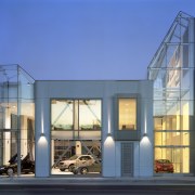
Mercedes-Benz's new showroom nestles snugly into its niche locale. A glass insert encloses an internal street and houses signage visible from an overhead freeway


An internationally esteemed brand will often create a platform of showroom prerequisites and standards to conform to. But environment can impose a few design imperatives of its own, and fortunately with a forward-looking client rules can be bent, if not broken.
Mercedes-Benz's recent design agenda for all its new showrooms provided a response to clear, expansive sites. However, when Huntsman Architectural Group designed the San Francisco showroom, a tight location meant adjustments to the blueprint had to be made.
Large, open-plan spaces, upsized furniture and colourful, freestanding plaster wall signage were all part of the blanket showroom guidelines, says Huntsman Group's director of design Mark Harbick.
"However, our site was modest, surrounded by buildings and had a freeway arching overhead," says Harbick. "An individualistic answer was required and luckily Mercedes-Benz came to the party."
The new building incorporates services and offices as well as a showcase for Mercedes-Benz's finest. The architects drew together five existing buildings in the semi-industrial location, with glasshouse-like insertions bridging the gaps. Retaining the existing buildings helped keep the showroom in scale with its surroundings. The transparent insertions provided a visual point of difference and showed off the cars to best effect.
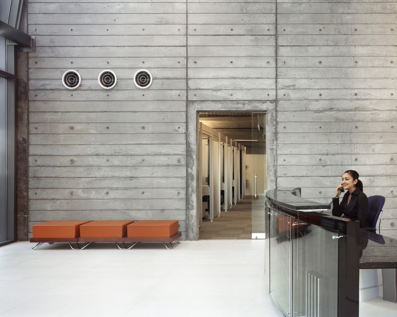
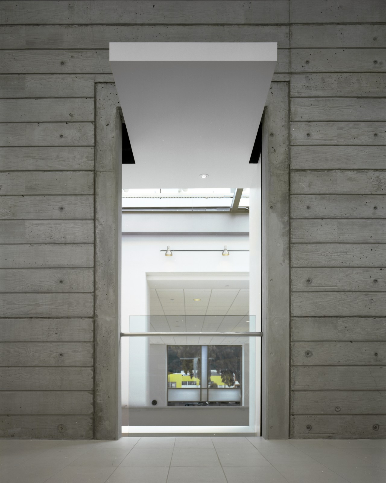
"Instead of one massive space, the cars are show-cased in compartmentalised spaces," says Harbick. "What had been a lane between buildings has become an internalised street evoking the whole driving ethos and providing a vantage point from which pedestrians can window shop the high-tech machines through giant apertures punched through the walls on both sides."

As a response to the gritty surroundings, and echoing the material of the existing buildings, new wall surfaces are in rough-cast concrete not unlike the novelty of a street actually climbing the walls.
Space issues required Huntsman Group to avoid the internal branding wall of the original Mercedes-Benz agenda, subsuming the orange branding colour required into the vivid customer seating. In turn, the scale of seating was brought down, while still using the same furniture manufacturer the client had stipulated.
"Signage was also an issue, with height and billboard limitations in the area," he says. "We circumvented the problem by creating a permissible skylight complete with an internal billboard that reached higher than the adjacent rooftops and was visible from the freeway."
Credit list
Architect
Land-use attorney
Acoustic engineer
Land surveyor
Lighting design
Interior wall finishes
Structural glazing and exterior cladding
Reception desk and signage
Window shades
General contractor
Structural engineer
Electrical consultants
Civil engineer
Flooring
Audiovisual
Water feature
Reception seating
Ventilation
Story by: Charles Moxham
Home kitchen bathroom commercial design

Commercial Design Trends Vol. 24/4
This edition of Commercial Design Trends celebrates knowledge with an array of educational and research facilities that ...
Read More