One out of the box
Bold splashes of orange and a strong, simple design ensure this contemporary noodle bar stands out from its neighbours

Some commercial projects require an architect to not only come up with an appropriate design, but also to help establish a company's branding concept.
John Mills Architects in Wellington faced such a challenge when designing the fitout for the Boxo noodle bar. Project architect Michael Melville says the owners wanted a trendy, contemporary fitout with a clean, strong presence.
"We talked at length about Boxo's image, and creating a striking design that would catch the eye of passersby," he says.

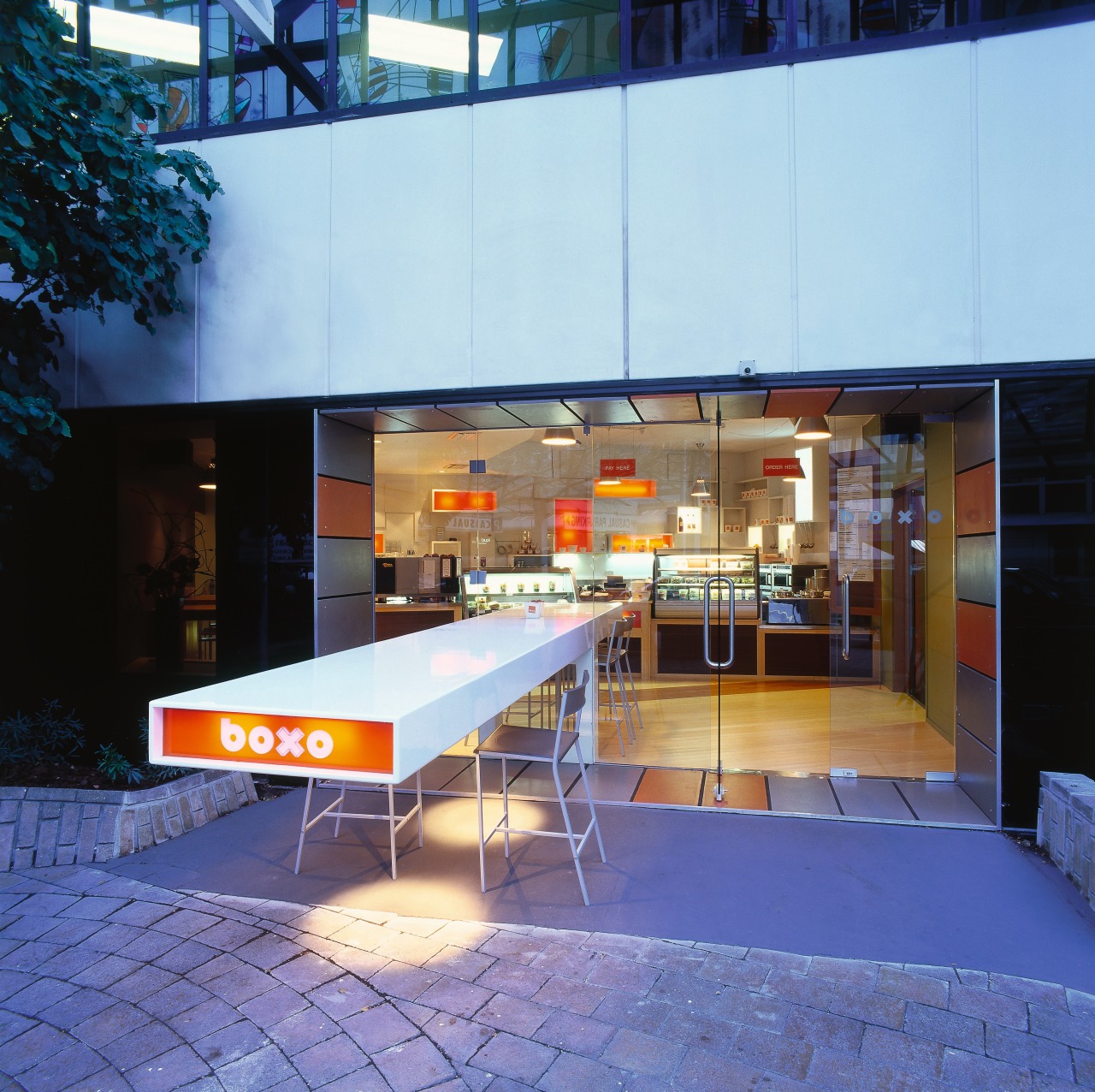
The aim was to devise something that stood out from the surrounding cafes and restaurants, most of which have bifold doors and steel-and-concrete fitouts.
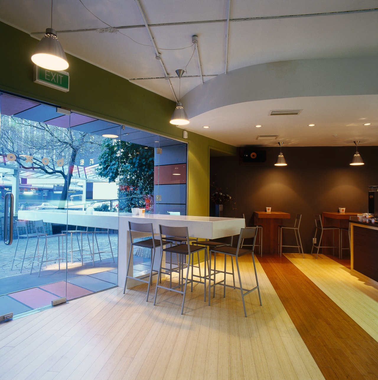
Boxo's solid glass fae§ade, framed with a deep reveal and punctuated by a long, cantilevered table, is a complete departure from its neighbours.
The white banquet table was made on site from rolled hollow steel. Supported by a single H-shaped upright, it was conceived to challenge perceptions of how a table should look, says Melville.

"The glazing and the positioning of the table allowed us to visually merge the inner space with the courtyard," he says.
Another key element that defines the Boxo look is the panelled white wall behind the counter. Inset with rectangular orange boxes and raised geometric panels, it adds a subtle '50s flavour.
In keeping with the simple, striking design and orange-and-white colour palette, the material selection is also limited. Bamboo flooring and joinery is offset by crisp white surfaces and glass elements.
Story by: Trendsideas
Home kitchen bathroom commercial design
Small space, big impact
Classic dovetails contemporary
'Worthy of Architectural Digest'


