On a clear day
Expansive steel-framed windows at the ends of two cross axes in this house provide views in all directions
Country houses invariably have a close link with nature, but few would maximise the indoor-outdoor connection as dramatically as this project.
Architect Trevor Abramson FAIA of Abramson Teiger Architects says this connection was a key driver for the design of the house, which needed to provide a retreat for owners Andrew and Gina Goldsmith.
"It was also essential that the house could accommodate and complement their contemporary art collection," Abramson says. "The architecture needed to have a generous scale, with distinctive vertical elements that would create a strong sense of arrival."
The drama is reinforced by a winding driveway that initially conceals the house, then reveals an element of surprise as it opens up to the house and the expansive country view.
"The house is essentially a modern interpretation of a traditional home," Abramson says. "It's a transitional design with echoes of Italianate architecture in the classical symmetry and roof line. But the detailing is very modern."
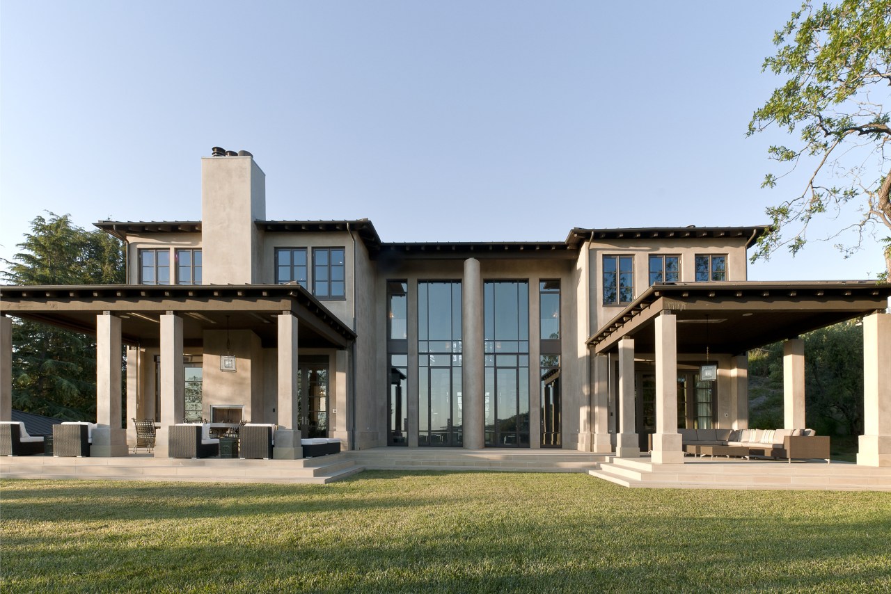
The architect based the design on two cross axes that run from front to rear, and side to side. Each end of these wide circulation areas, including the front entry, features soaring steel-framed windows that allow expansive views of the surrounding countryside.
"The steel windows have a very slender profile, which gives them a delicacy that contrasts with the substantial precast concrete structure and stucco exterior," Abramson says. "I also wanted to provide as much openness as possible, while retaining the sense of a more traditional house. If all the walls were glazed, it would have become a much more contemporary house."
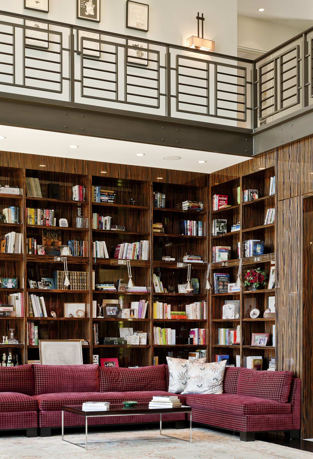
To further enhance the drama, the architect provided high ceilings throughout the interior, and a double-height void in the centre of the house, where the two axes meet.
"This is a rather grand space that the owners use as a library and formal dining area. But the dark brown steel of the windows and balustrade on the upper level, and the dark wood veneer give the room an appropriate intimacy," he says. "The dark steel also allows the view to dominate, rather than the window frames."
Abramson chose not to centre a single window on the main axis in this living space, providing instead symmetrical windows that sit either side of a wide central column.
"I wanted to so something a little out of the ordinary," he says. "On the exterior, the centre of the entire rear facade is defined by a tall oval-shaped column that helps retain the scale and proportion."
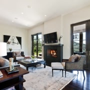
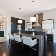
The cross axis within the house leads to a living room andden on the left, and a family room-kitchen on the right.
All these rooms have wide openings that align to enhance the sense of something beyond.
"It's a very formal axial arrangement," Abramson says. "But it provides an easy flow between rooms. Some rooms, such as the den, can be closed off by large pocket doors."
Most of these rooms also open to covered terraces and alfresco dining areas at the rear of the house.
Gina Goldsmith, who is an interior designer, chose a restrained colour palette for many of the furnishings.
"Because every room opens into another one, it was important not to overwhelm the space visually," she says. "From the kitchen you can look straight through the library to the living room and vice versa, so we needed continuity. Effectively, the antique palace rug in the library dictated what we could do, because it sits right in the centre of the house."
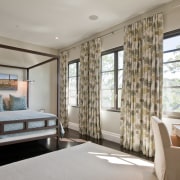
Gina Goldsmith says the light taupe shade of the walls and the linen curtains were chosen to reinforce the tranquil ambience, and to provide a suitable backdrop for the family's extensive collection of contemporary art.
"We didn't want the walls or curtains to compete with the art a lot of the works are bold and very decorative. And although the architectural detailing is consistent throughout the house, we have filled the interior with a variety of furniture styles, from gilded antiques to modern pieces."
Other reproduction items, such as the desk in the master bedroom, have been painted, silver-plated or reupholstered to fit with the interior.
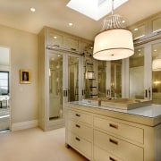
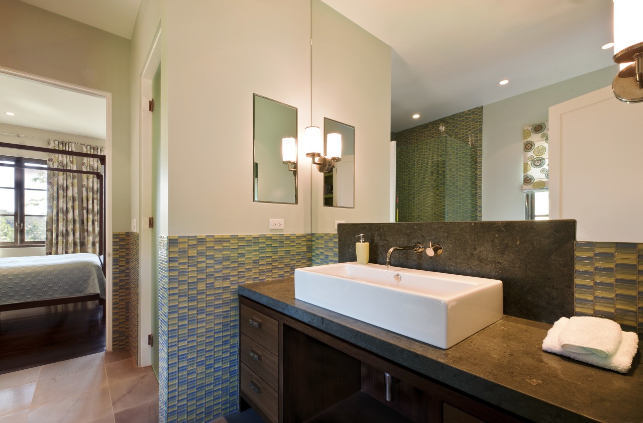
The refined simplicity of the house continues into the master suite and his-and-hers bathrooms. Gina Goldsmith's bathroom has a freestanding, sculptural tub, a chaise and backpainted glass wainscoting in a soft aqua shade.
"The colour on the glass gives the room visual depth, and, like the soft sage tones of the bedroom curtains, provides a link with the outdoors."
Credit list
Interior designer
Builder
Cladding
Wood panelling
Lighting
Drapes
Benchtops
Sink
Range
Refrigerator
Bathtub
Toilet
Bathroom ventilation
Structural engineer
Kitchen manufacturer
Roofing
Paints
Blinds
Kitchen cabinets
Splashback
Taps
Ventilation
Dishwasher
Basins
Bathroom lighting
Story by: Colleen Hawkes
Photography by: Kevin W Smith
Home kitchen bathroom commercial design
