Office fit out for DNV GL Technology Centre, Singapore, by Aedas Interiors
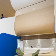
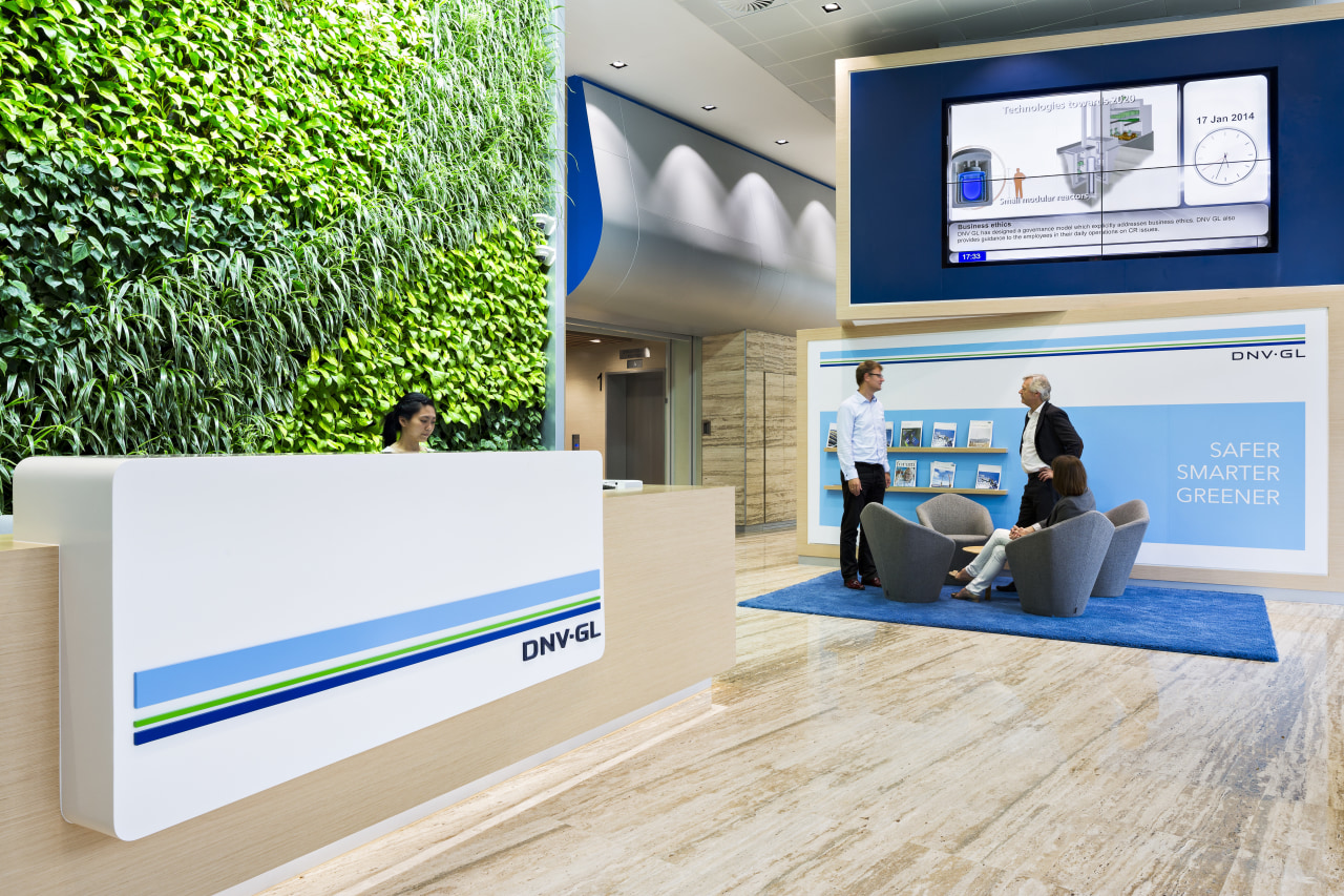
Interior office fit out fit-out by Aedas Interiors, Singapore. Double height reception area, with central staircase connecting all floors.
Mergers invariably spark changes that may include relocation along with a close study of work practices and requirements.
Such was the case when Norwegian firm Stiftelsen Det Norske Veritas (DNV), a company involved in a wide variety of international risk assessment and advisory roles across a range of industries, merged with German-based Germanischer Lloyd, to become DNV GL.
With the need to relocate to a new seven-storey office tower in Singapore, the expanded company's fit-out had to combine several elements, including a green agenda and a strong sense of coming together. When interior design company Aedas Interiors came to the DNV GL Technology Centre project, the client's goal was to achieve a workplace that would reflect the firm's proud heritage, its diverse businesses, and its sense of unity as a global company, says project designer Steven Shaw.
"Aedas Interiors spent several weeks with the different business groups and the leadership team to understand what this meant and how it could be applied to the new building, which had to bring together several business groups previously spread across a number buildings.
"During this period, it became clear to the design team that a key part of the company's social culture was the morning arrival process," says Shaw.
"However, this communal moment' could have been lost in the new building as staff would be able to move directly from the internal carparks on levels two and three directly to their own floor bypassing the fifth-floor reception."
To retain this vital aspect of team bonding even more important with so many previously unrelated business groups coming together the arrival and base building lift strategy was reconsidered.
"We inserted a void and stairs to link staff socially across the four upper office levels. The ground floor is used for external training and levels two and three are for parking. The eventual solution added a second set of lift doors that open directly on to the fifth-floor reception. The lift is programmed so that all staff and visitors arrive here, and then move through the workplace via the stairs in the atrium to capture the sense of community," Shaw says.
"The expanded stair voids also bring a strong sense of visual connection between floors."
The overall design concept reinforces the Norwegian heritage of DNV mainly through the use of colour, details and furniture selection.
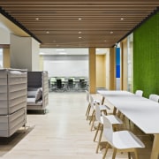
"An emphasis on white and light-toned wood species evokes the Scandinavian feel. This is reinforced through environmental graphics that showcase images of Norway. The columns on each floor are wrapped with graphics of birch trees. These are shown in different seasons on each level and act as wayfinding elements, so visitors know where they are at a glance."
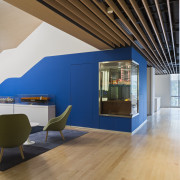
The overall green and blue colour scheme is based on DNV GL's corporate identity.

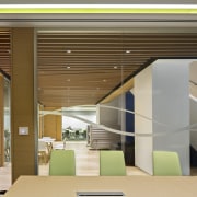
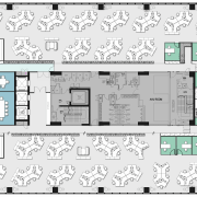
The layout of the desking also facilitates easy staff connection. Low partitioned workstations create an open-plan workplace that allows lines of sight right across each floor. Meeting rooms, quiet rooms and utility areas are located at the core to maximise natural daylight on the desk surfaces. The 120º workstations are used instead of benching to define individual workspaces, while also fostering collaboration and teamwork in groups.
Breakout areas are located on each office floor in close proximity to the atrium. A variety of spaces provides for dining and casual coffee breaks as well as working and informal meetings.
The level seven staff area at the top of the stair void opens to an outdoor terrace and garden, which is used for staff and client functions.
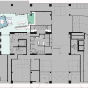
While the upper office floors are dedicated as workspaces, the ground level is used for external training programmes that DNV GL runs for clients. This area is supported by breakout spaces for group coffee breaks and lunches. The adaptable training rooms can be converted into one large room to accommodate bigger groups. Graphics on this floor express the company's four key business groups: Maritime, Oil & Gas, Energy and Business Assurance. The bold images and a video wall are visible from the outside, acting as a giant billboard.
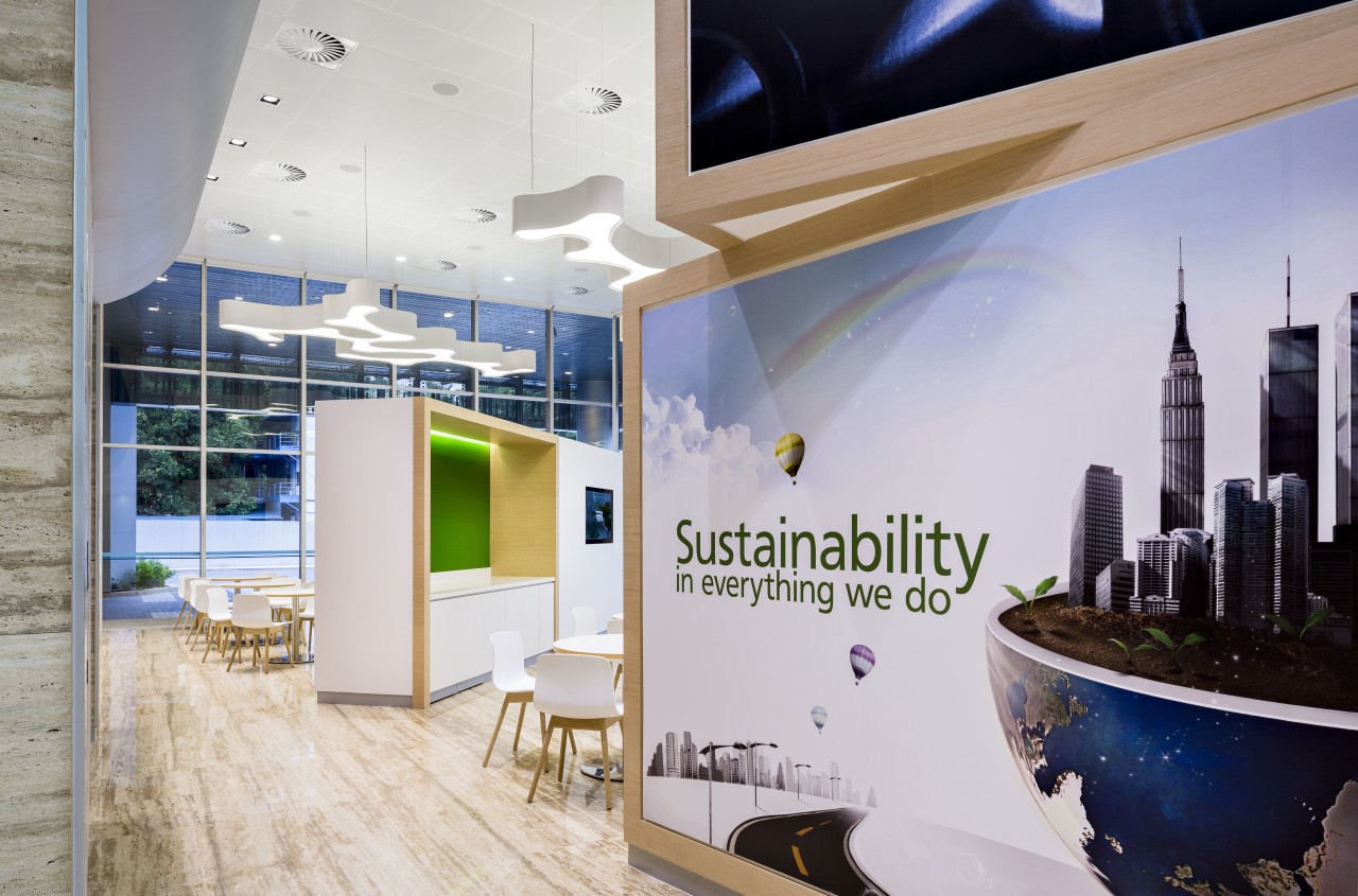
"A primary vision for the client is to have a global impact for a safe and sustainable future," says the designer. "To communicate this message, the facility was designed to achieve BCA Greenmark Platinum for office interiors. Design strategies that were key to gaining this accreditation include efficiency in planning, use of environmentally friendly materials, the installation of a green wall, and the creation of a central waste management recycling collection area."
Story by: Trendsideas
Home kitchen bathroom commercial design
Marvellous in marble
Thrice as nice
The beauty of understatement
Commercial Design Trends Vol. 30/9
Commercial Design Trends is aimed at our professional readers, and showcases commercial buildings. The book features reg...
Read More
