Multi-generational – but not as you know it
A new home for the owner at the rear of a block and renovated original house at the front for her son’s family – with a communal pavilion and garden between
Designed by Austin Maynard Architects
From the architects:
A dramatic rise in life expectancy is considered one of the great achievements of the twentieth century, but there are certain ramifications caused by an ageing population.
In the Australian housing market, already facing pressures of affordability and the shortage and cost of child care and aged care facilities, the changing demographic structure has driven demand for intelligent design response and resolution.
There has been heightened interest in ‘multigenerational houses’ – homes that can adapt to a family’s changing demands; these can incorporate “Fonzie” flats (self-contained, usually built above garages); and, perhaps most enduring and iconic, granny flats.
Beyond its simple definition – self-contained accommodation suitable for an elderly relative – a granny flat has proven to be hugely beneficial in terms of local planning and sustainability, particularly within high density inner city areas.
This includes encouraging infill, maintaining and utilising local amenities and infrastructure and helping retain character.
With many families relying on their parents to assist with young children, a granny flat ensures help is close by, with future potential as an autonomous space for teenagers or rental income for empty nesters.
However, this new home built at the rear of a property with an existing home at front is no ordinary granny flat.
Architectural, highly detailed and beautiful, this bold new home contributes to multi-generational living, but acting in reverse.
Where typically a young family look to accommodate and care for their retired parents, at this address it is the parent who is helping her son and his wife – allowing them the opportunity to live in a house in a vibrant inner-city Melbourne suburb, close to their work, a home they would otherwise be unable to afford.
Terracotta pots
Walking around the owner’s previous home, she illustrated why she wanted to leave it – a small dark courtyard was her only outdoor space, with a few well cared for plants in terracotta pots huddled in the brightest corner.
“That’s what I want for my new home,” she said, gesturing to the much-loved but struggling pot plants.
“I want to stay in my community, and have a thriving veggie garden. How can I have both? Help me find the right block.”
The brief to us was clear. While her kitchen, bathroom and bedroom needed to function well, her priority, the soul of her home, was to be her garden.
In response, we kept the scale small and rational on the new property, to maximise outdoor space.
Her new home spills into the garden, while the recycled brick and terracotta tiling creates a sympathetic background to her flourishing garden.
Communal outcome
Far more than an existing house with granny flat at the end of the garden, the new home and address is, essentially, a communal-living family ‘compound.’
It comprises the two separate houses (one old, one brand new), a shared pavilion and a productive garden, sited on a long block in Melbourne’s inner north.
At the front is the original cottage, now renovated with two bedrooms, a bathroom and an open plan kitchen/dining and lounge.
A shared building is centrally located, a demilitarised zone with laundry and toilet, functioning as a library, guest room, writer’s studio, music room and general social space.
And at the back, with independent entry from the rear laneway, is the new house itself.
Built boundary to boundary (East/West) filling living spaces with northern light, the home comprises living room, kitchen dining, bathroom and study/guest room on the first floor and main bedroom and ensuite upstairs.
True and tested
At Austin Maynard Architects we always aim to maximise space, relate internal spaces to the garden, embrace the street and make the most of laneways.
The site our owner purchased offered potential to achieve all of these ideas and more.
The original house, a timber clad Victorian workers cottage faces the street.
With a thoughtful internal renovation and some maintenance, the existing character was retained and enhanced.
The internal layout was re-arranged, moving the living zones (kitchen/dining/living) from the rear of the house to the front, looking out onto the street and front garden, and facing the sun.
Walls were removed and a new kitchen and bathroom installed, creating a simplified circulation.
Though the front garden and verandah didn’t change in form too greatly, it changed in function – rather that purely ornamental, it’s now a productive, working and recreational space that connects to the life on this friendly, community-rich street.
The two bedrooms and the bathroom are now located in the rear of the home, a quieter and more private location.
Welcome to the compound
The owner had always held a fascination with common shared gardens and linked adjacent houses but lack of opportunity and prohibitive cost meant owning neighbouring properties was impractical and elusive.
At the new address, we discovered another way to achieve communal living.
By creating a type of village square, or what the owner jokingly calls a ‘compound’, she and her son’s family reside individually, in separate homes, on a shared block.
With enough distance and enough garden between each cottage they both have privacy and space, but also the reassurance of help and support close by.
This factor particularly resonates with our owner, who moved to Melbourne from the UK and had herself faced the struggle of working and raising two children without any family support.
Form and materiality
The beauty of the new home at the rear of the property derives largely from the materials.
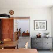
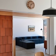
Earthy red tiles respond in tone to the light throughout the day and spill down the walls to meet reclaimed brick.
Beautiful and emotive – a nod to the owner’s love for gardening – the application of terracotta tiles as a wall cladding came from exploring the possibilities of using materials in an unexpected way.
The roof form pop-ups respond directly to siting and sunlight.
The main bedroom upstairs faces east, allowing for morning sun, while downstairs in the kitchen, dining and lounge room, an Eastern facing skylight captures the same early sun, with operable louvres to help with regulation throughout the seasons.
Context
The three elements of building each relate to the context of the suburban area.
The existing house at the front, sitting within the existing streetscape, was left untouched externally, to retain the street’s character and amenity.
The library pavilion is located on the western boundary, abutting a sizeable built form on the neighbour’s side and opening directly onto the garden to maximise the width of external space.
The new-built-home – at the back of the block – has a direct relationship to the rear laneway and sits in amongst neighbouring garages and outbuildings.
The village hub
An important element of the brief from the very beginning was the central building – this freestanding, flexible pavilion, serves as the village hub.
A light-filled, multi-purpose community room, with a pull-down Murphy bed (also used as a projector screen), a laundry and a toilet, the pavilion functions as guest accommodation, library, cinema, writer’s studio, music room and social space.
Comic book details
Architects spend a lot of time detailing the connection between materials. This is important – not only does it create a resilient and robust structure, it also makes the architecture legible.
For example, we often spend a lot of time concealing flashing and capping so that the materials and form are coherent, without the waterproofing details dominating.
However, finely crafted details are also, often, time consuming to construct, which has a direct effect on the budget.
For this home, where the budget was tightly fixed, we decided to take the opposite detailing strategy.
Rather than hiding the flashings and capping, we accentuated them.
Like the thick outlines of a comic book, each form is captured within lines of black steel of various thicknesses, framing and accentuating the tiles and the recycled brick.
Reviving the dying art of line weights, this home is a comic book illustration brought to life by developing pragmatic details designed to drive down construction costs.
Willie Westin wallpaper
A major interior feature of the home is the beautiful wallpaper, supplied by Willie Weston – a local business run by two non-indigenous women in partnership with Indigenous artists, through indigenous owned art centres.
Two designs were chosen by the owner for the walls in her kitchen and lounge: Jilamara Stone and Pandanus Stone add a sophisticated and artistic delicacy to contrast with the earthy, exposed reclaimed brick.

Sustainability
- As with all our projects, sustainability is at the forefront of design with this project.
- As well as incorporating a large productive garden and maximising space on this inner city block, the new house embraces many passive energy design principles.
- The majority of the home’s heating and cooling is passive, through design, materials, and window size/placement.
- Operable windows facilitate cross-flow ventilation as well as exhausting warm air throughout the hotter months.
- The glazing is designed to capture the winter sun and keep out the summer sun while the choice of external fabric window treatments maintains a comfortable internal temperature.
- The fixed awnings and screens are located on northern and eastern windows to protect against the sun with vertical screens to the western face where the summer sun is lower in the sky and harsher.
- The concrete floors contains hydronic coils that heat the slab from within, radiating the warmth throughout the day.
- A northern orientation – utilising as many full height windows as possible – contributes greatly to the solar heating of the slab, reducing the reliance on the heating system.
- The highest quality insulation available – made using recycled glass – was used throughout all internal walls, floors and ceilings.
- Windows are powder coated, thermally broken aluminium frames with double glazing throughout.
- Recycled bricks, cleaned by hand, were used extensively throughout the house, and the left-over supply was used to build the raised garden beds.
- High quality materials such as brick, concrete, aluminium framed windows, metal roofing and terracotta tiles were selected to construct a home that will last and reduce ongoing maintenance.
- Ceiling fans are installed in the living area, library and kitchen to provide efficient cooling during summer.
- Rainwater from all roof areas is harvested and directed to two above-ground Colorbond steel slimline water tanks, for toilet flushing and garden irrigation.
- The design utilises low-energy LED lighting throughout and low energy usage appliances.
- A photovoltaic solar power system has been connected to supplement electricity use, with the capacity for future connection to storage batteries.
- Panels are located on the roof of the original house.
- A large, and well tended, productive garden forms the centre of this communal home.
- Every endeavor was made to ensure the growing of fruit and vegetables was made easy.
- Visible from all parts of the house, tending and harvesting this central garden is a part of daily life.
Credit list
Architect
Builder – new home and pavilion
Engineer
Traditional land owners
Roofing
Paving
Timber flooring
Carpet
Lighting
Kitchen mixer tap
Oven
Dishwasher
Water tank
Modular sofa
Project team
Builder – original house
Surveyor
New home – external finishes
External wall cladding
Internal finishes
Concrete flooring
Paint
KItchen benchtop
Sink
Rangehood
Solar
Air conditioning
Home kitchen bathroom commercial design
Tranquil waters
Continuity meets subtle separation
Small space, big impact


